Changing The Face of Web Design: A Case Study of 25 Years
The World Wide Web celebrated its 25th birthday on March 11 2014 and during its evolution, web design has also advanced in leaps and bounds. No longer do we have to put up with endless clunky text and low-resolution images.
Today’s informative, innovative and easy-to-navigate websites are so commonplace that you’ve probably forgotten what websites looked like back in the 1990’s.
So, let’s take a look at the websites of three major brands, how it was back then and how they look now, to exactly how web design has changed over the years. The journey that they’ve gone through may lead to some inspiration for your own website design adventures.
Web Design Trends for 2014
After spending hours online at different websites, you tend to pick up discernable trends in design. Over the... Read more
Apple
We take a look at Apple’s main page designs through the decades, courtesy of the Wayback Machine.
1997
In its favour, the Apple web design in 1997 included the logo, provided succinct information, and had a clear navigation bar on the left hand side. However, it didn’t have the flair we associate with Apple today; the font is very basic, the sidebar takes up a lot of space and distracts the viewer, and the overall design is crowded.

1999 – 2002
Then, Apple created a professional web homepage design that was so simplistically memorable it formed the basis of all future designs. It featured an eye-catching banner photo supplemented by a few select images below.
Each and every one of these used white space to the maximum effect, whether it was of the latest product or a satisfied client. A simple top navigation bar helped vistors find their favourite product easily.


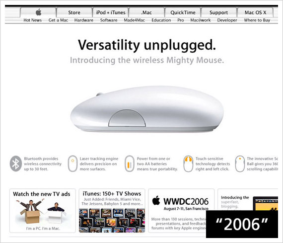
2003 – 2006
During this time, the clean design remained but Apple started to deviate with a black background as well. Either way, the stark backgrounds of the homepages showcased the products very effectively.
And the use of quirky one liners, such as “Introducing Mighty Mouse” reflected Apple’s daring nature.


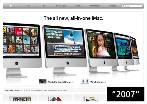
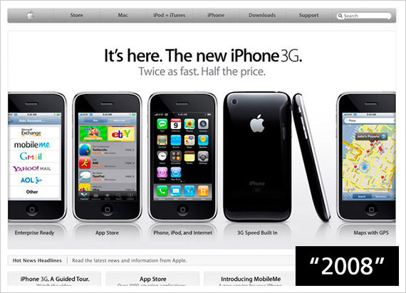
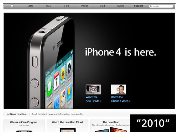
2007 – 2010
The 2007 homepage design got rid of the lower sections altogether – no doubt so that the mobile phone could create an even bigger impact. This continued in 2008 and 2009, but when the iPad was introduced in 2010, the majority of the homepage was devoted to Apple’s newest baby.

2011 – 2013
The main design elements haven’t changed at all. The 2013 web design for the iPad Air does deserve a special mention however – when a product’s unique selling point is its thinness, what better way to show this to the world than with this unusually angled image?


Now
Today’s web design is still based on the simple approach used since the late 90’s. The main photo is compelling but no longer is the product shown in isolation and is instead shown in the hands of real people.
The font is modern and the limited colour palette of complementary colours looks highly professional.

The navigation bar is now firmly fixed at the top of the page to make navigation simple. In addition to using clever words to encourage click throughs (“What will your verse be?”), the four bottom sections show the visitor exactly what information can be found within them, accessible with a simple click.
What did they do well?
Instead of focusing on the hard sell, they focus more on people’s emotions and the concept of inclusive story telling. Web designers who want to create a similar impact with their new websites should showcase their products using real people.
The more customers can imagine themselves using the product, and can see how it will benefit their lifestyle, the more likely they are to purchase it.
GAP
Next up, we look at another major brand, this time in the fashion industry.
1997
Hats off to the designers for getting a clear message across through their design. The top navigation bar, instead of a sidebar, gives more space to showcase the products, and the overall look is clean and simple.
On the downside though, the web designers’ brief was probably to really emphasise that customers could purchase their favourite GAP clothes online as indicated by the logo appearing twice, and the phrases ‘online store’ and ‘shop online’ being crammed into one small homepage.

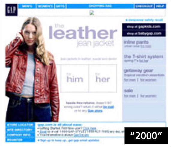
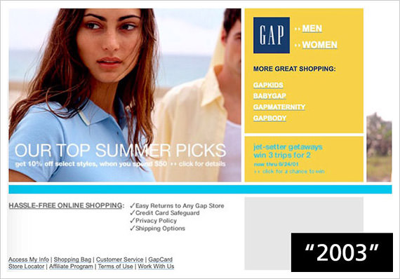
2000 – 2009
By 2000, the web design evolved for the better. It was clearly branded with the GAP logo with the use of an attractive main image and a modest navigation bar at the top. But let’s keep an eye on the navigation bar as time goes forward.
In 2004, the main image worked well as did the GAP logo, now encapsulated in a bright blue box to give it more prominence. But where were the navigation options? Right at the bottom via click-through links. Definitely a step backwards.

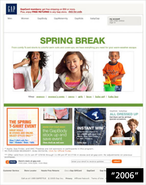
The navigation bar was back at the top of the homepage in 2006. The company now supplied clothes for kids illustrated by the use of child models in the photos. Beneath the main banner photo were 4 different sections promoting a variety of incentives. Unfortunately, the design of each didn’t showcase any connection, leading to a messy and confusing mix, which isn’t easy on the eyes.
In 2009, the main navigation options were cunningly placed in a completely new location – within the main image. Whilst we applaud innovative design, the majority of customers expect to navigate from the edges of a homepage – commonly via bars at the top or less frequently, to the left.

The more difficult it is for the customer to find what they want, the more likely they are to bounce off the website.
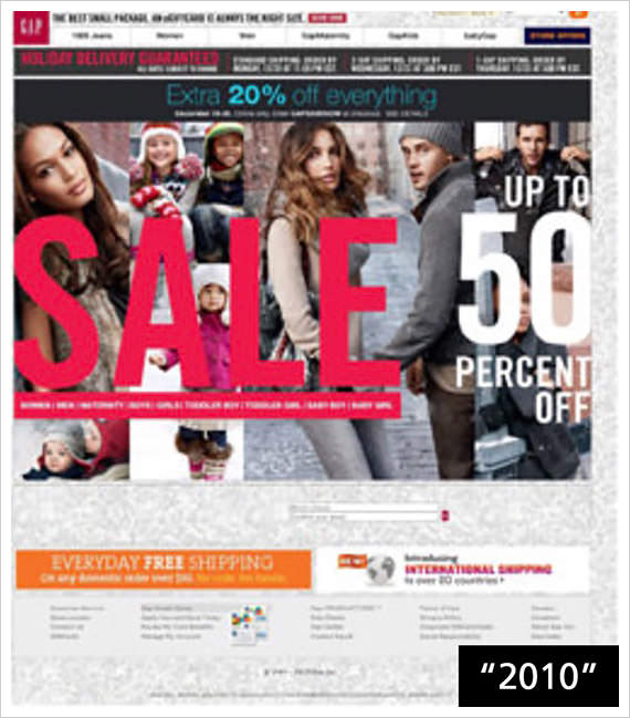
2010 – 2012
GAP finally got the hang of it by 2010. The navigation bar was firmly at the top of the page and has stayed there ever since. The 2010 homepage was also a huge improvement as it used a really eye-catching and well-designed collage of fashionable models.
Perhaps the use of more images on the homepage was a hit with visitors as this persisted in the web designs of 2011 and 2012. However, both of these fell horribly short of target. There was no clear strategy in the overall design, the photos didn’t gel together and the variety of colors were overwhelming.


Now
It seems that GAP has finally taken stock of all its previous efforts and created a website that has a range of great design elements in one pleasing homepage. This website is designed to appeal to the younger generation with its urban feel and choice of main image. The words ‘LIVED IN’ is interestingly split into three parts which captures the visitor’s attention.
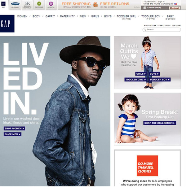
The navigation bar is still at the top of the page providing an easy shortcut to each type of clothing and the search function allows the visitor to find what they really want. The shopping bag sits on the top right hand corner, making it easier for customers to plan their purchase(s), as they move from page to page.
What did they do well?
GAP has gone through a host of web designs to be where it is today, but now designers of e-commerce websites could well follow this example to create an user-friendly online purchasing experience. It’s not always about showing the product from every angle; clever use of lifestyle photos can help the visitor imagine how the product will enhance their life.
Heineken
Lastly, lt’s see how Heineken fairs in web design branding. Images retrieved from Wayback Machine.
1997
The website works well in terms of branding and being eye-catching but by offering the website visitor a huge amount of buttons and options, they most likely caused confusion as to what customers should do next.
There is no clear navigation, way too many fonts, and frankly, the ones superimposed directly on the water droplets are hard to read.

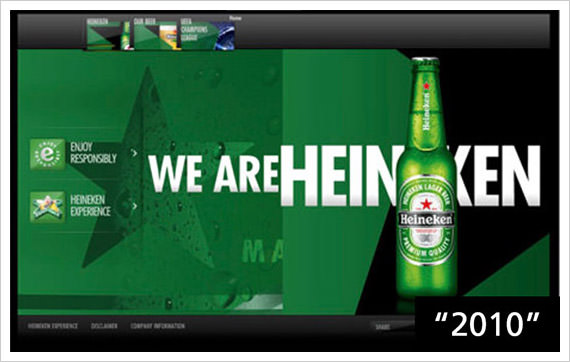
2010 – 2012
By 2010, the Heineken web design had reached the heights of perfection we associate with it today. At first glance, the homepage seems simple but the dark green background uses an effective mix of geometrical shapes and an interesting condensation-drenched star alongside the beer bottle recognised the world over.
Today’s trend for very simple navigation buttons was apparent even then, each supplemented by a visual icon.
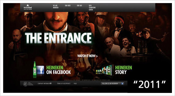
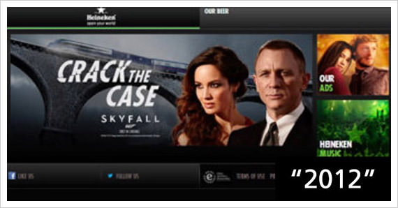
The web designs of 2011 and 2012 follow the same formula of clarity. But they also introduced Heineken’s innovative approach of using videos and association to high-profile movies to help sell more beer!
Now
Each and every page on this website are superbly designed using some great, unique fonts, and thankfully the Heineken green has been continuously toned down since the 1997 version. The web pages are so uncluttered, they are positively minimalistic.

This is then complemented by the several videos featured in their web design – a moving image can tell a thousand words. Instead of a regular drop down navigation bar with options, a thumbnail image of each item is shown instead making it more fun.
What did they do well?
The overall design is modern, lively and bound to appeal to 20 something’s as much as Heineken-loving 60 something’s. The videos fit in perfectly with today’s social media madness and are more likely to be shared, increasing brand recognition across the world.
Web Design Then
From the earlier examples, back in the 90’s, even the biggest companies’ websites appeared amateurish, poorly designed and a far cry from today’s sophisticated web designs.
This can be explained by the fact that web designers faced far more technological limitations 25 years ago such as ridiculously slow internet and limited font options as well as insufficient data about what made a website experience pleasurable for the visitor.
Design trends that died out
As web designers gain more tools at their disposal to create more sophisticated and professional-looking websites, some trends couldn’t survive the conditions and has since faded from use. These include:
- Flash animation – Flash animation on a homepage may be considered dynamic a few years ago but visitors got bored. Flash animation looks cheap and tacky, website visitors don’t like it, and search engine optimization is made trickier when the home page has a flash intro. It’s not for modern website design.
- Background Music – Wonderful beats and ballads, great idea. Jingles that jangle with the nerves, not so much (the 90’s users would know how this feels). Silence is golden when it comes to today’s web design.
- Excessive Content – Some companies felt their website requires plenty of pages explaining in fine detail about their company, their philosophy, and their products. Truth is, too much info can be confusing and be downright annoying – most of us just want the bare facts. In 2014, minimalistic design, and the use of photos and icons replace text-heavy pages.
What Works Today
Today’s most popular and effective websites are truly captivating and memorable, often using evocative images or plenty of humour. They are well-structured and encourage the visitor to make a purchase at every turn. Every website should follow some basic rules to help it get closer to perfection. But if web designers really want to keep up with the times, here are some essential key elements:
- Fixed navigation bars – These might be a fairly new trend but they make complete sense. The visitor can browse to their heart’s content and never lose sight of where they are.
- Unique font – Using an unusual or unique font can really help a website sell its message. Web designers shouldn’t settle for the same-old ones when new and exciting fonts await.
- Sliders – The trend for sliding banner photos is a great one. Each image is large and can really impress the visitor. And as the images automatically change, the viewer is treated to a range of great visuals without having to do a thing.
- Personalized Photos – Unless absolutely necessary, web designers should avoid stock photos and opt for personalised professional photos to do the website justice and make it more unique.
- Call-To-Action buttons– Why settle for boring ‘Contact Us’ buttons when there are a wealth of interesting buttons to choose from? The more captivating the button, the more likely the visitor is to click on it.
- Infinite scroll / card designs – Pinterest may have lead the way with this type of web design, but it is being embraced by many companies, as it is a great way to present individual nuggets of information.
- Flat design vs skeuomorphism – Whether you prefer the flat design so loved by Microsoft (think minimalistic simple icons) or skeuomorphism, which uses more traditional 3D effects, the great news is that both are trending right now.
- Web ribbons– Love them or hate them, these 3D ribbons, designed to hug an information box or photo, just look nice and give a professional finish to any design
Web Design Trends for 2014
After spending hours online at different websites, you tend to pick up discernable trends in design. Over the... Read more
Conclusion
Web designers should also bear in mind the most ingenious and important shift in web design over the past quarter of a century, which is making the website experience as pleasurable as possible. With a lot of brands competing against each other, websites imparting simple facts no longer cut it.
Nowadays, the most popular websites are those that entertain or amaze whilst providing relevant information. The web designs of Apple, Gap and Heineken illustrate this innovative approach perfectly. 25 years of the World Wide Web has taken web design to heights that were never considered a possibility back in 1989. And who knows how far website design will soar over the next 25 years!
Have an opinion on the subject? Share them with us below.