18 Cool Redesign Ideas for Popular Websites
Design plays a pivotal role in the success of a website, acting as the crown to the content’s kingship. It’s not just about looks; design shapes how we interact with content. A poor design can lead to a frustrating user experience and a decline in website traffic.
As web designers, we often face a balancing act. In our pursuit of creating the perfect website, we find ourselves weighing aesthetics against functionality, or functionality against readability. Achieving a design that satisfies everyone on all fronts is a challenging feat.
So, what makes a design stand out? This is a common question among web designers. Some have even taken it upon themselves to reimagine how popular websites like Facebook and YouTube could look, offering fresh perspectives and potential redesigns. In this collection, you’ll see these creative concepts. Whether they’re improvements or not, that’s for you to judge. Dive in and see for yourself!
Facebook Redesign Concepts
Facebook, with over 500 million active users and a staggering 700 billion minutes spent on the platform, presents a significant challenge for web designers. This immense popularity is perhaps why numerous designers have ventured to reimagine the design of Facebook. Let’s explore some of these creative redesign attempts:
Concept Design by Barton Smith
Barton Smith took on a personal project to revamp Facebook, focusing on enhancing its form and functionality. His ‘Facebook Facelift’ features a streamlined, structured, and linear interface, making it more user-friendly and content more easily digestible.
Main Page

Photos Page

Events Page

Contacts Page

Notifications Page

Concept Design by Information Architects
Conceived in December 2006 and later adapted to modern design standards, this innovative redesign of Facebook by Information Architects aims to provide a mail-like application feel. It features a flexible three-column layout that distinctly separates filter, information stream, and reaction. This concept is detailed in their post.
Main Page

Concept Design by Justin Dauer
Justin Dauer envisioned a Facebook interface more akin to a web app, catering to the 175 million daily users and their repetitive interactions. His redesign, coinciding with Twitter’s new app-like UI, seeks to validate this modern approach.
Main Page

Concept Design by Peter Knoll
Peter Knoll’s sleek design significantly enhances Facebook’s visual appeal with improved graphics and a cleaner interface, complemented by elegant typography for better readability.
Main Page

Concept Design by AndasoloARTS
AndasoloARTS’ variation of Facebook, which was even sold, follows a design philosophy similar to Peter Knoll’s but stands out in its own right. This sleek design focuses on minimalism.
Main Page

Concept Design by Jonaska
Inspired by AndasoloARTS’ design, Jonaska’s version of Facebook is uniquely crafted, with notable features such as an integrated status sharing and search box, making it a well-conceived variation.
Main Page

Concept Design by Czarny-Design
Czarny-Design introduces a bold take on Facebook’s design, featuring sexy rounded corners and a slightly altered color scheme. This unique approach asks the question: are you ready for such a change?
Main Page

Myspace Redesign Ideas
Once a titan of social networking, Myspace, now rebranded as My_____, sought to pivot towards being a prime destination for social entertainment, encompassing music, movies, celebrities, TV, and games. Although these redesigns were envisioned for the old Myspace, they offer intriguing insights into what designers believed Myspace could have evolved into.
Concept Design by Rafael Oliveira
Rafael Oliveira pondered how Myspace might look with a clearer, more beautiful interface, yet retaining customization options in a user-friendly way. This led to his project that not only focused on aesthetic improvements but also proposed usability enhancements, inspired by the existing content and structure of Myspace.
Main Page

Channels Menu

Photos Page

Customized Profile Page

Artist Page – Default

Artist Page – Customized

Videos Channel Page

As a global leader processing over 1 billion search requests daily, Google stands as the most recognized website worldwide. Known for its ambition to lead the internet realm with user-friendly products like Android, Gmail, and Analytics, Google boasts a team of top-tier designers. Any attempt to redesign their website is a bold challenge to these experts. Let’s explore this intriguing idea.
Concept Design by Craig Reville
“In light of Google’s potential redesign plans, I’ve imagined my own version of how I’d like to see and interact with Google. I’ve kept the icons and logo relatively simple, as professional icon designers can enhance these further. I prefer the logo in its simplistic form. Feedback is always welcome.”
Main Page

Search Result Page
Search Result Page – 2nd Concept

Image Search Result Page

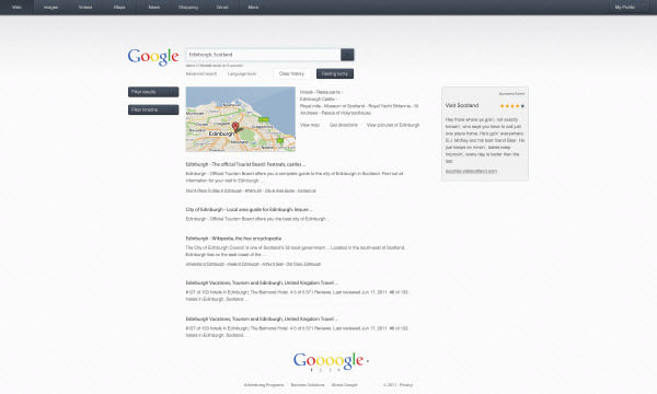
Concept Design by FloxDesign
Envisioning a design reminiscent of Bing but with a more spectacular approach. I would love to see this extraordinary design as my Google main page.
Main Page

YouTube
Positioned as the third most visited global site and fourth in the US, YouTube is a hub for discovering, watching, uploading, and sharing videos. While individual creators are the backbone of its content, notable media houses like CBS, BBC, Vevo, and Hulu contribute through YouTube’s partnership program. Redesigning a site with over 2 billion daily views is a daring endeavor, but these designers have risen to the challenge.
Concept Design by Michele Byrne
This sleek redesign focuses on enhancing the video viewing and sharing experience. While the user interface bears some resemblance to Vimeo, it’s a commendable and unique approach to reimagining YouTube.
Main Page

Video Page

User Page

Video Info

Recommended Video

Concept Design by Josh Collie
“A major issue I’ve found with YouTube over time is the inability to search for videos and read comments without losing sight of the current video. My design tackles this by incorporating three separate scrollable columns for search, video, and comments.”
Main Page

User Page

Concept Design by Thadeu Morgado
This experimental redesign for YouTube’s main page maintains the familiar style but restructures the layout, adding a prominent, sleek slider to highlight featured videos.
Main Page

Amazon’s Redesign Exploration
Amazon, since its inception in 1995, has evolved into a global e-commerce leader, offering an extensive range of products from books to electronics. Given its vast business scope, designers worldwide have taken up the challenge to enhance Amazon’s website, making it more aesthetically appealing and user-friendly.
Concept Design by Trevor Cleveland
Trevor Cleveland embarked on a project to reimagine Amazon’s homepage, particularly for modern, high-resolution displays. He noticed that Amazon’s current design, optimized for smaller screens, appears disjointed on newer computers with larger screens. His goal was to present three distinct redesign concepts to modernize Amazon’s interface.
First Concept – Main Page

First Concept – Menu

Second Concept – Main Page

Second Concept – Menu

Third Concept – Main Page

Third Concept – Menu

Concept design By: Maurice Kindermann
Maurice Kindermann tackled Amazon’s design challenges head-on. Dissatisfied with the current layout, he addressed three key issues: stretched screen resolution, cluttered buying options, and an overwhelming amount of content. Here’s a look at his innovative approach to refining Amazon’s user interface.
Main Page.

IMDb Concept Redesign
As the world’s foremost database for movies, TV shows, and entertainment content, IMDb presents a unique design challenge. A successful redesign would need to manage vast amounts of information while enhancing user experience.
Concept design By: Vladimir Kudinov
Vladimir Kudinov critiqued the current IMDb design for being cluttered and disorganized. In his redesign, he focused on a clean, sleek layout, prioritizing visuals like photos, videos, and essential movie information, ensuring a more straightforward, user-friendly experience.
Film Page.

Menu.

Player Pop Up Component.

Top Panel.

Concept design By: Clay Parker Jones
Clay Parker Jones envisioned a map enhancement for Foursquare’s user pages, capitalizing on the platform’s location-centric nature. His design allows users to interact with the map and view information in four different formats, enriching the social networking experience with feeds, likes, tips, and suggestions.
User Page.

Your Thoughts on Design Evolution
Adapting to new designs is a journey for every user. Reflecting on these conceptual redesigns, what are your thoughts? Do you prefer these innovative designs over the current ones? Do you believe they address user experience issues effectively? Your opinions are valuable, and we encourage you to share your thoughts on these creative endeavors.