20 Innovative (Concept) Tablets We Wish Were Real
While great companies are competing with each other by showing off new designs, another group of very talented designers has also implemented their own vision on their tablet design, and these so-called concept tablets have received praises from consumers like, “I hope it’s true!”.
Be it a dual-screen tablet, fold-able tablet, or smartphone-powered tablet, in this post, you will see concepts that designers combined innovation and art to become something that consumers really thirst for. Enjoy them and let us know which tablet you hope it’s true!
MacBook Duo By Kane Yanagawa
“My proposal is for a hybrid device that is a unique combination of Apple’s existing portable media device technology with an e-reader/netbook.
A device that offers enough usability in each arena to make it a standalone solution for frequent travelers. Now you can work + browse, read + write, and share + play all on one device.”
MacBook Duo.

MacView By Patrycjusz Brzezinski
According to an article in blog.moridin.pl, MacView project arose from a need to have such a device. It was designed to substitute the laptop, which is most uncomfortable in many situations.
When creating the project, the designer bought a MacBook in order to better understand the philosophy of Apple. For sure great studies gave birth to a great concept.
Macview. With keyboard on the second touchscreen.

Desktop View. With mini music player on second screen.

Front View. With keyboard on the second touchscreen.

PDF View. With page thumbnails on second screen.

Video Playlist.
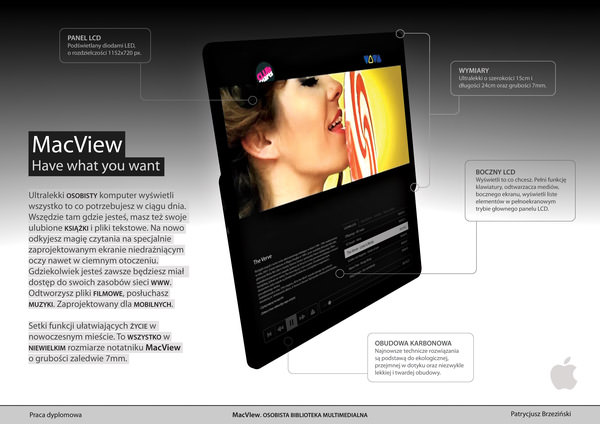
Back View.
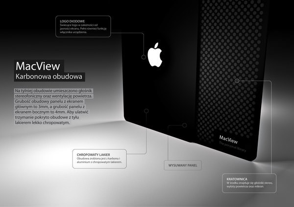
Charging Station.

MacBook Page By Devindh Baburam
“The MacBook Page is based on the size of a standard sheet of A4 paper. It maximizes screen ‘real estate by presenting the user with an edge-to-edge interactive desktop. It also incorporates a hidden solar panel to supplement the power supply.”
MacBook Page.

Doodle Book By Pyeong Yeol Yoo, Hun Park
“Doodle book is a Lifebook able to do creative work. Portable enough to be carried out, it can be easily used as memo pad in any place. Included the concept of layer in its input system, it can attach or overlap an existing document, image, sketch or video comment with pen.
Doodle book is able to make creative work between idea and realization.”
Doodle Book.

Handling.

Synchronization.

Ecopad By Yonggu Do, Jun-se Kim, Eun-ha Seo
“Electricity is made automatically by using your ecoPad. Currently commercialized tablet PCs and smartphones have a very limited battery life – often not more than a day before having to be recharged.
However, on average, people press their touchscreens over 10,000 times a day. The ecoPad does not require special charging from an adaptor.
Instead, it generates electricity when a user presses the touchscreen, due to the nano piezoelectricity film that is located below the display.”
ecoPad.

Layer View.

Front View.

File-top By Fan Zhang
“This tablet is for the people who want a more portable and lighter computer. The inspiration comes from traditional Chinese liber. The foldable File-top composes of several translucent touchscreens and can be used as a touchpad or widescreen PC.
In the future the environmental papery material might take place of current memory devices. You are able to put all the documents into this “file” and it will store the information for you.”
File-top.

Product View.

Usage Situation.

Fractal By Pedro Calle
“Fractal is everything you need, it can be split into pieces each of which can work individually as laptop, pad, music player and you can tweak them with apps and widgets.
It can also work together as a console with different touchscreens with programs, menus, tools, palettes, brushes and audio samplers, all separated physically.
Find all the fun on customizing your Fractals, share them with your friends and enjoy making the digital realm a more analogous experience.”
Fractal.

Featured View.

Hermes By Yeongwom Jeon, Sangmin Park, Seokho Yu
“Previous tablet PC has two disadvantages. The typing work is not as good as the original keyboard and others can easily see what you are doing on the computer.
Now, you do not need to worry about emerging of personal information with Hermes. You can send messages and call with Hermes as well.”
Hermes.

Product View.

HTC Evolve Tablet By Timur Pinar
A HTC branded high-end tablet with smart Android OS running on it. Doubtlessly the design is sleek and the user interface seems to be very promising.
There’s also an extra tab on the left side of the tablet which gives more dedicated spaces for apps. I must say this is probably one of the best concepts which I wish it to be materialized.
HTC Evolve Tablet.

Features.

Extra Tab.

HTC TUBE By NAK Studio
Another sleek concept for HTC brand, but the idea revolves around the “Cartridge powered multimedia device”. The concept is not much explained, but this might be the tablet which will function as a big monitor when the phone is plugged in.
An interesting idea, and I must say the device is well designed.
HTC TUBE.

Product View.

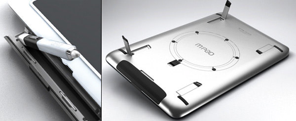
MPad By Volker Hübner
MPad is for professional designers. It combines the advantage of intuitive multi-touch operation with the precision of a pressure-sensitive pen, probably sounds like a very, very advanced Wacom tablet.
For its features part, essential keyboard commands are arranged next to the 15.6″ OLED display, 9 fixed buttons, 2 programmable buttons rockers with e-ink display, with up to 24 shortcuts for each software application.
Monstrous tablet, but of course I hope there’s a model for left-handers like me.
MPad.

Back View.
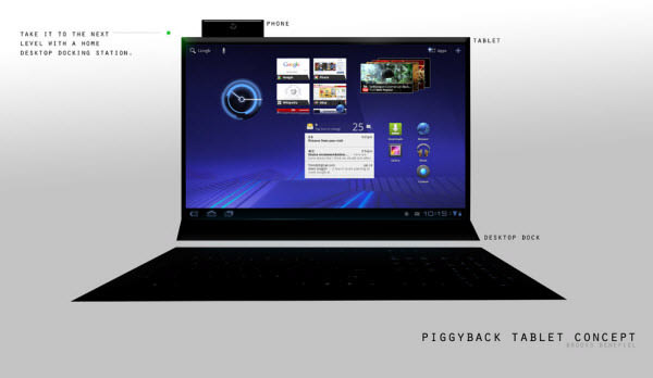
Piggyback By Brooks Benefiel
Piggyback tablet is the similar concept with HTC Tube which suggests that, you have a smartphone, and what you really need now is just a bigger screen.
With the tablet, you will be able to plug in the smartphone to get a bigger screen for more complicated tasks like typing out long report or, if the processing power allows, doing graphic editing job. Yes, all you need is a bigger screen.
Piggyback.

Desktop Dock.
Sony Ericsson Vivaz™ XL by Frank Tobias
“Well, here I made a XL-version of Vivaz. It features an 8 megapixel camera at the back, of course with HD video recording and the interior capacity is about 75GB. I hope you like it ;)”
Sony Ericsson Vivaz™ XL.

Sony Ericsson X10™ Maxi by Frank Tobias
“So here I expanded the Sony Ericsson X10 to a tablet called X10 Maxi. ;) It features like the X10, an 8 megapixel camera, the system is OS Android 2.0 and the interior capacity features 100GB.”
Sony Ericsson X10™ Maxi.
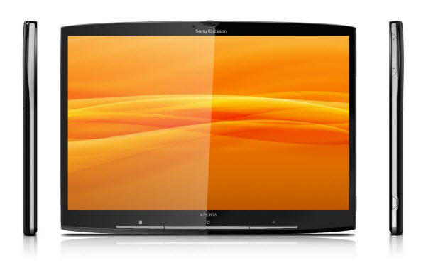
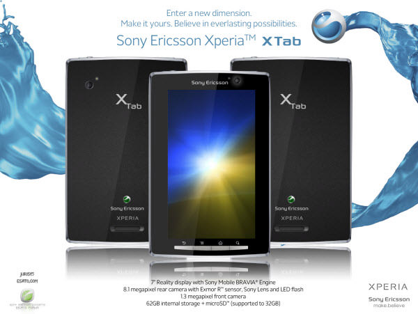
Sony Ericsson Xperia™ XTab By Juris15
Seriously this guy needs to be hired by Sony Ericsson, and I’m sure you will know why by looking at 2 distinguishing designs below. Sleek and sexy.
Sony Ericsson Xperia™ XTab.
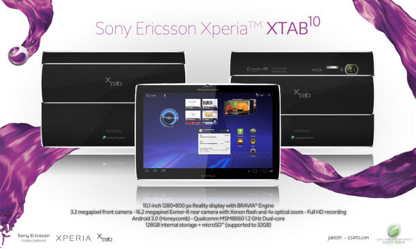
Sony Ericsson Xperia™ XTab10 By Juris15
Another great design from the XTab series, also one of the series that I sincerely hope it was true.
Sony Ericsson Xperia™ XTab10.
The Part By Jun Se Kim, Yong-gu Do, Eun-ha Seo
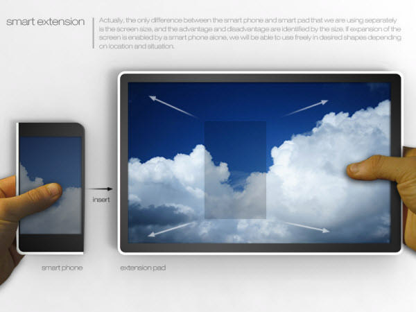
“Do we really have to buy a smartphone and a pad? Do we really need both? Actually, the only difference between the smartphone and smartpad that we are using separately is the screen size, and the advantage and disadvantage are identified by the size.
Carrying two kinds of devices, smartphone and smartpad, is not only inefficient for users, but it is an uncomfortable waste that the smart era created.
In that aspect, the ‘part’ is not a separate device, but an efficient and convenient smart device with a new concept that a smartpad can be combined with a smartphone.”
The Part.

Component Breakdown.

Smart Extension.
Unknown Tablet by Frank Tobias
“Here I made another tablet. Unfortunately I don’t know which brand and user interface I should take for it…
Well, the tablet itself sports a 3.5 mm audio jack on the left side, 2 USB ports on the right side, and a camera with 10 megapixels, HD video recording and a triple LED flash…”
Unknown Tablet.

Unnamed Tablet by Frank Tobias
“So here’s another tablet concept. It’s running Windows 7, supports a 5 megapixel camera with LED flash at the back, 4GB ram, 300GB interior memory, an Intel i5 processor and HD video recording :)”
Unnamed Tablet.

Volumni By Dulyawat Wongnawa
“Volumni is a new concept of PC which integrates various types of PCs into one single device with only a size of an envelope once it’s folded (23 x 10 cm). It consists of 4 units of ultra-slim touchscreens linked together by a 360 degrees pivot hinge.
It serves as both a portable device and a workstation depending on user preference. Users can define their usage of the device by just folding and turning it.”
Volumni.

Product View.

Featured Modes.

Reflection
Looking back, it was an interesting time to see how criticism for the iPad eventually falls before its sales number. It’s just like what we’re complaining about, iPad lacks of USB port, VGA adapter, Flash… but it still champions the market 1.6 year after its launch, and apparently there are still no company created a true competitor that can bring down the iPad.
What is the reason behind the tremendous success of iPad, is it because of the design that covers the lack of functionality?
Also, do you think any device above, if materialized, can bring down the iPad? Let us know what you think, and don’t forget to tell us which concept tablet above you fall in love with!
Image sourced from iLounge, Patrycjusz Brzezinski, Design Boom, Timur Pinar, NAK Studio, Yanko Design, DVICE, Frank Tobias, and juris15.