20 Creative Combinations of Header and Footer in Web Design
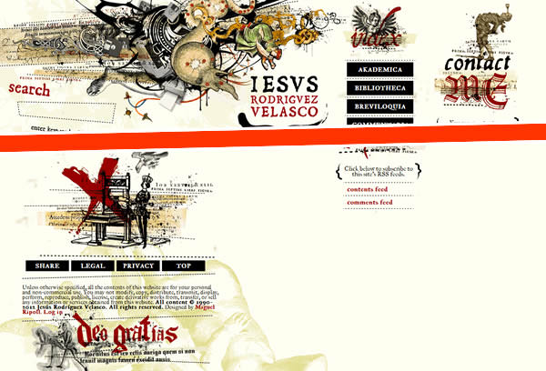
By now we have seen dozens, if not hundreds, of showcases of creative headers and footers. With the tools available today, creating a fancy header isn’t that difficult. But it takes a bit of extra work and creativity to make a fancy header that combines well with the footer, offering seamless transition and visual perception.
For example, a header can depict the top of a tree, with leaves and branches – something that we have seen many times in header fancy designs. But it’s always more interesting to go the extra mile and incorporate a footer that builds on that particular visual element. In the case with the tree top, it would be the tree trunk at the bottom.
This is not only more cohesive and visually pleasing to look at, but it also guides the eye as the user scrolls down the page.
Today, we’re taking a look at such combinations: creative headers and footers that work well together and are integrated in some way, by design, transition, or otherwise. Here are 20 examples of sites with such header and footer combinations.
Recommended Reading: 50 Beautiful & Enticing Designers Websites
#1

#2

#3

#4

#5

#6

#7

#8

#9

#10

#11

#12

#13

#14

#15

#16

#17

#18

#19

#20

More Beautiful Websites:
Here are more showcases of beautiful websites we’ve published in the past: