The Basics of Emotional Design
Have you ever thought what makes things ‘good’ or ‘bad’? Why do people like one thing and hate others? Aarron Walter has found the answer to this question and you can find it in his book “Designing for Emotions“.
I have read this book and would like to share a few secrets with you on how to use knowledge about emotions in website creation and in the promotion of your products and services. To understand the issue better you can watch Don Norman’s video "3 Ways Good Designs Make You Happy" , one more experienced specialist in this field.
We face a huge number of generic and repetitive website designs but monotony is definitely not the best tool to attract customers.
Often all the attempts of website creators to stand out from the crowd break down. Instead of attracting customers, developers and designers push them away. So does it take to create a website that will attract clients like a magnet?
30 Tips for a Nicer Looking Website
When launching new projects, it's common to overlook updating older blogs and websites. This article offers 30 practical... Read more
Key Elements of Emotional Design
There are tons of books and guides all over the Web on how to create a right website design: add beautiful images, combine typography and colors, write interesting texts, and follow the latest web trends. But none of them will tell you how to create a website that may impress visitors so deeply that they will keep coming back.
The answer is quite simple (like all genius things are), you should evoke positive emotions, emotions like:
- pleasure
- joy
- surprise (do something unexpected and pleasant)
- attention (a suggestion for help, even if you’re not obliged to)
- expectation (tell something interesting before the launch)
- exclusivity (suggest something exclusive to people from your niche, for example, housewives)
- anticipation combined with a strong personality
All these factors are the basis of emotional design. However, appropriate tactics should be chosen for each specific brand and target audience. Let’s take a look at a few good examples of websites that put knowledge about emotional design into practice.
Human Nature
Parents love their children, even when they cry all the time and challenge your sense of smell with their poo, but why do parents endure this? Our brain perceives the proportion of child’s face (big eyes and a tiny nose) as something special, innocent and fragile.
The baby’s look evokes a sense of trust and love. Looking at a defenseless child’s face, you forget about how demanding they are and submit wholeheartedly. The same logic is applied to the use of cartoons. Here are some examples:
MailChimp

Netbluez

OurBabyBox

I’m pretty sure that you know plenty of websites that use this principle to create an emotional connection with their audience.
Smile :)
Design of the Volkswagen Beetle car is recognized as the most successful in the history of vehicle construction. Its headlights look like eyes the rounded hood makes it look like it is smiling at you. This is human-like in design, which has helped many Beetle owners feel a personal connection to it.

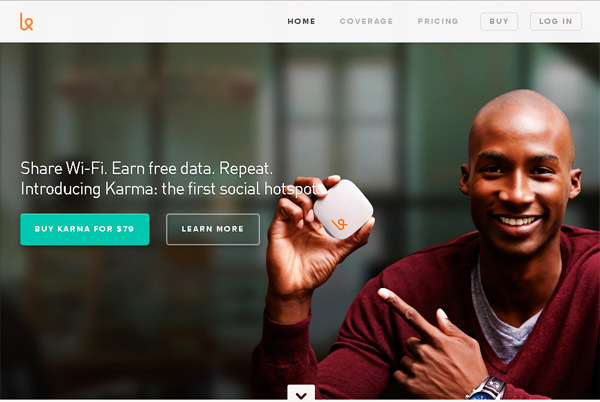
If a person that you like smiles at you, you smile back. And it works on the websites too. Take a look at the launched page of these websites:
Your Karma

GOEasy Cloud

You want to smile too, don’t you? You think that this particular product or service makes these people feel happy and in response, you want to buy it too. It’s a smart marketing step.
Humor
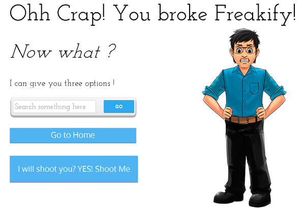
As I have mentioned before, to hook a visitor you should do something unexpected and evoke only positive feelings. It’s like when you fail to enter the right website address on Freakify’s 404 page.

If you push “I will shoot you? YES! Shoot me” you may be pretty surprised with the results.

Another funny 404 page is that of Apartment Home Living website.

If you move your cursor over the toilet, you will get:

The website that makes you laugh will be remembered. It can even become viral, because you might want to share the joke with friends.
Attention!!
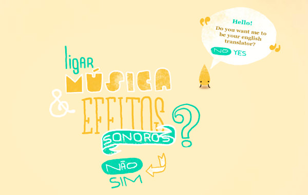
If you do something to show that you care about your every visitors, he or she will appreciate and remember it. For example, take a look at this website, Xixi.
The mascot on Xixi asks “Do you want me to be your English translator?”. Click yes then enter your name in a field, and when you hover your cursor over a word, the mascot translates it for you. How’s that for personalized attention?

Details
You should pay attention to detail like how Photojojo (This site has retired.) does. There is a shopping cart on every page of Photojojo website. It’s gray and unhappy.

But if you add an item to the cart, it becomes happy and green. It’s an amazing example of emotional design.

Moreover, there is one more cool detail on the page. There is a lever with the instruction: Do not pull near the photo of the product. Of course, curious visitors will pull it anyway. Give it a go and see what it has in store for you.

Another shop that uses elements of emotional design is Threadless. Here is one more example of a “happy shopping cart” on T-shirt online shop.

If you remove the items from a cart, it becomes "sad and lonely". Aww….

Oops, Trouble
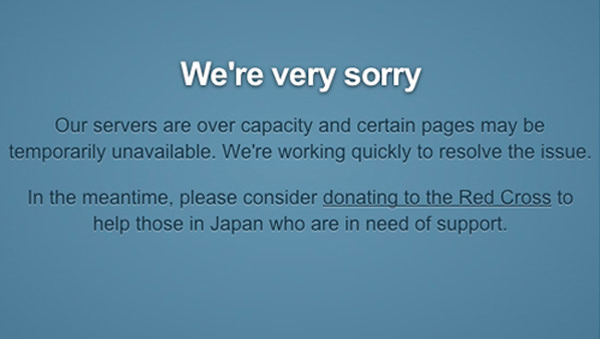
You can turn trouble with your service into advantages like how Tumblr does it. A big blogging platform like that has no time for breaks, but occasionally things don’t go as planned. These two down pages show how they tackle the situation effectively.
Tumblr – We’ll be back shortly
A funny and unusual “Tumblr is down” page will appease and soothe your anger.

Here’s one that reminds you that there are more serious problems in your life than your Tumblr page not working.

Wrap Up
I have collected this stuff to show you how different brands express their personality by putting emotions into design. How would you approach design using emotions? Feel free to share your thoughts and ideas in the comment section below.