Ultimate Guide to Flat Website Design
The combination of bright colors and exotic typography has paved the way for unique flat interfaces. Minimalism is a big part of this design idea, and you can see how popular these trends have become in recent months.
Flat website design is a brilliant concept because it focuses solely on the content. But many designers are unfamiliar with the latest trends and don’t know where to get started.
In this guide I want to present the ultimate collection of articles, tutorials, free graphics, and website layouts based on flat design. Anybody who is still getting into this concept will certainly learn something new. These trends have been around for a long time but we have just recently witnessed a major rise in flat website design.
And this comes with plenty of good reason! Flat design mixed with page content is easier to read and easier to interact with.
Shortcuts to:
- Popularity of Flat Design
- Designer’s guide to Flat Design
- Design resources
- Flat websites (Showcase)
- Flat UI (Showcase)
You should not expect to be using flat design in every project. Like all design trends, flat website layouts should be used exclusively when the details fit together. Otherwise it can feel jarring to force a minimalist approach into a more complicated website.
But when carefully placed together I have found that flat user interfaces are brilliant, simple, and so effortlessly enticing they will captivate your visitors for years to come.
Showcase of Beautiful Flat UI Design
Behold web and user interface designers, a new trend (or style), is taking the world of UI and... Read more
Popularity of Flat Websites
As mentioned in this article on Forbes, flat website design is a growing maturity within the industry. It removes a lot of the more complicated textures, patterns, shadows, bubbles, gradients, and other shiny effects to focus on simplicity.
Flat buttons still look clickable and the input fields still look editable. Flat website layouts in general still look interactive but without the more exquisitely refined graphics.
Flat design has been around for a while but recently picked up steam from the Microsoft mobile platform, and now Microsoft Windows 8. Metro design has started a major trend which pushed the ball forward into flat layouts.
Both web and mobile interfaces have seen a major uptick in trendy new user interfaces. And with responsive websites blurring the difference between desktop and mobile devices, flat UI has bridged the gap for simplicity with a bit of cultural class.

The biggest problems you will face when designing a flat website are the interactive elements. Visitors need to know which areas of the page are plain static content, while other areas are clickable and draggable and whatnot.
Flat design can still use light shadows and edge effects to imply this interactivity. But subtlety is the name of the game and you can witness examples among many other flat website layouts.
Helpful Designer Guides
There are quite a few online articles which I have presented a bit lower, but I want to share a couple specific resources to help with flat design concepts. I like to think of these more as guidelines than actual rules.
In a Medium blog post referencing flat design & UI problems, the author Missy Titus goes on to explain that flat UI should help to solve your problems or just make them easier to look at.
By stripping away textures and stitching and box shadows you should not be removing the important content from the page. Design trends are just a certain look.
Of course, flat design is not for every website. There are so many various website trends and they are all popular for a reason – people like variety. Carefully-crafted flat 2-D interfaces stand out because they look really simple to use. And it keeps visitors focused more on your content than anything else.
Another great article on the principles of flat design will help you understand the more concrete interface features.
Most notably you want to focus on content hierarchy within the page. Elements do not usually intersect each other and the page should flow very naturally. This includes switching between colors and box content.
It is easier to think of the page being built around typography, and these various boxes of text will inform the user how to interact with the page.
Some buttons may use flat background colors, while other buttons may use shapes and pictograms. Webpage text and color schemes are two vitally important design concepts to your flat website.

The Metro look originally popularized by Microsoft has a great system of picking out colors. These are important because colors make your website stand out. Colors make buttons and links and headings appear not so black-and-white. But sometimes it can be difficult choosing a scheme that works well.
You need to look through examples of other designs and see how professionals have been doing this in the past. Check out the outstanding FlatDesign inspiration gallery for a collection of similar website interfaces.
Flattened Design Colors
DesignModo has published a very large collection of resources based around flat user interface design. While on the subject of colors I want to point out another article discussing flat design and color trends.
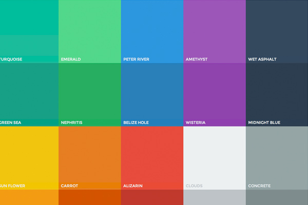
The schemes themselves are made up by starting with one color displayed at full hue, then removing hue lower and mixing in black/grey. This method will create multiple shades for your new color palette.
The most saturated and bright colors stand out amongst any light or dark background. On DesignModo they published another interesting post on retro color schemes which can relate perfectly into a flat website layout. But really the process requires some practice and intuition when building a new project.
The online resource Flat UI Colors is a great place to start when attempting to focus your creative efforts on flat color schemes.
Related Articles
Instead of copying and regurgitating offbeat content into this article, I want to share other inspiring blog posts which are related to flat user interfaces. I have read countless articles on this subject and the viewpoints are exquisite.
Take a few minutes to skim just 2 or 3 articles from this list and you may be surprised what you can learn.
- The Flattening of Design
- Flat Web Design: Trend Or Revolution?
- A Look at Flat Design and Why it’s Significant
Free Resources
With some of the design theory nailed down we should move into discussing other flat design resources. Both graphics and code samples are available all around the web if you know where to look. Open source codes are some of the best ways for new developers to immerse themselves into a new design trend.
But graphics also play a critical role in understanding flat user interfaces. Both website design and mobile app design have grown into tremendous areas of study. Consider these free resources as learning tools for practicing your flat design ideas.
Free Resources: Graphics
Both designers and developers have a need for graphics. Symbols, icons, logos, and other common graphical traits can be found in almost every website layout.
Thus freebie graphics using flat techniques are becoming even more popular around the Internet. This is a small collection of my personal favorite UI kits and icons created in the realm of flat design.
Pixeden Flat Icons Set
I simply love Pixeden for their amazing collection of freebies and premium graphics. Just recently I found a number of Dribbble shots advertising a free Flat Design Icons set.
The icons have been released in 4 volumes, each containing a different set of icons. The vol1 & vol2 sets were accidentally labeled the same but you can tell this is a tremendous collection of flat icons – all free to use in any number of web projects!
Pixeden: Vol #1 – Vol #2 – Vol #3 – Vol #4
Dribbble Mirror: Vol #1 – Vol #2 – Vol #3 – Vol #4

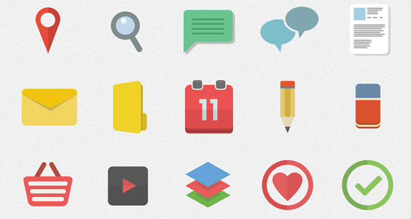
Colorful Flat Iconset
Freebiesbug has a ton of great PSD files for designers. One exceptional example is their set of flat colorful icons for user interfaces. You can download this free set from their website or directly from the Dribbble page.
The set includes 12 icon designs which are based on popular Internet services. And this collection may not be useful for every project, but it is nice to know there are plenty of flat freebies out there for graphic designers to play with.

Flat Web Browser Icons
There are more than a few reasons you might need to include browser icons in your website. Design agencies and SaaS companies will frequently need to list their features and supported clients.
And these flat browser icons are the perfect companion for any new layout. You can also download this iconset from the original Dribbble shot published by Stefano Tirloni.

Flatilicious Icons
Flatilicious are some brand new icons released just last month on Dribbble by designer Lukas Jurik. This wonderful collection includes 48 free flat icon designs in a PSD file. You are free to use these on any web or mobile projects.
What I specifically enjoy about this set is the variety of icons to choose from. Truly a creative masterpiece for designers just getting into flat UI.
IconShock Flat Icons
This fantastic set of flat icons released by iconShock includes over 3600 different examples. The design features a slight glossy effect on many of the icons and it stands out among other similar iconsets.
And this is great because the icons have been resized into 3 various settings for big, medium, and small website elements. What a collection for these freely available flat icons!

Flat Event Planning UI PSD
The darker color scheme from this events input freebie really stands out using flat design features. The interface itself is built for a website to handle user input for scheduling an event, or possibly signing up for attendance. Of course you can use this freebie just for practice.
But I also think the various PSD styles along with the color scheme itself provide a nice framework for learning. All credit for this freebie goes to Dylan Opet.

Flat Dropdown Menu PSD
When you are designing a website layout it can be tough gathering ideas for inspiration. The various page objects from image sliders, navigation links, thumbnails, and certainly dropdown menus can be difficult to brainstorm without examples.
This freebie PSD contains an excellent flat website dropdown menu. The icons are easy to scale and you can duplicate many of the same box shadows using CSS3 effects. Check out the original Dribbble shot to download a copy and see another preview.

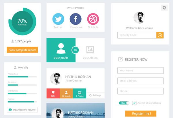
Freebie Flat Website UI Kit
If you are looking for a collection of web-based user interface elements then look no further! This brilliant flat UI PSD freebie released by Andreea Nicolaescu is an excellent starting point when coding your own website.
Use this PSD kit not just for graphics, but also to help with color selection and matching up a full color scheme. The PSD is built around a white background which is most common among minimalist designers. You can view a full-screen preview on the original Dribbble shot.

Flat UI Kit PSD #1
Along with the brilliant flat icons I also want to share a collection of user interface kits. This first PSD file was created by Riki Tanone and released for free on Dribbble.
It is a small file, but it contains a number of offbeat elements such as a video player and email inbox. The colors are brilliant and they almost remind me of various pastel shades.

Flat UI Kit PSD #2
Now this second UI kit was also released by Riki Tanone and focuses more on blog elements. It is just about the same size as the other PSD and contains blogging items like a subscribe box, calendar, compose textarea, tags input box, and some other neat stuff.
The color scheme is more solidified yet the flat buttons/elements look almost identical. If you want to get started quickly I recommend downloading both of these kits and practicing in your own time.

Flat UI Kit PSD #3
This alternative flat UI kit was designed by Devin Schulz and also released for free on Dribbble. I really like this PSD file because it focuses mostly on common website elements.
Input fields, horizontal & vertical navigation, sliders, buttons, and lots of other page objects. The color scheme follows grey/green on almost every element and it looks simply fantastic.
All of these free UI kits encapsulate the flat design culture perfectly. And I am certain there are many many more examples to be found online. Actually just searching through Dribbble presents a long list of results for flat UI kits. I encourage all designers to check out similar examples and see what you can build off these flat webpage elements.

Flatlyfe UI Kit PSD
The designer Dylan Opet who also created the Event Planning UI freebie above, also released a newer flat UI Kit. The elements are based on common website objects like sliders, buttons, switches, tags, and input fields.
I definitely recommend downloading a copy and using these designs on some practice websites. Even the process of coding CSS3 styles based off this PSD would be a huge learning experience.

WDD Flat UI Kit PSD
Just recently there was a big post on Webdesigner Depot releasing a new flat UI kit. This set is designed more towards the metro trends with a similar color palette, interface elements, sliders, bars, and other offbeat page objects.
I would think this UI kit may also be used for mobile app design as well. It is a free download after you enter your e-mail address for their newsletter signup.
Free Resources: Codes
Frontend web developers are always interested in the latest trends. Web design and development tend to overlap in many key areas, and this happens frequently when you are coding a website interface. Check out some of these free code samples which you can use in your flat design projects.
Flat UI
The Flat UI kit is probably the best resource for web developers getting into this trend. DesignModo has released both a free version and a pro version which includes both PSD files and HTML/CSS coded elements.
But the free version is honestly astounding and it provides all of the major items you would need like input fields, switch buttons, headers, icons, and so much more. Their free version is also hosted on Github for developers who may want to fork the project and extend functionality.

iCheck
The jQuery iCheck plugin is a tool for enhancing your input buttons. Notably checkboxes and radio inputs are two elements which can be difficult to style using CSS.
iCheck is completely free and open source, which is perfect for new developers. You can build outstanding interfaces which blend perfectly into your website layout with just a few customizations.

Boxy Buttons
Web developers are probably familiar with cloud-based IDEs such as jsFiddle and JSBin. Well CodePen is another example which actually catalogs and presents the latest pens in one location. Developers will practice their skills and release awesome freebie codes to the world.
This example presents a common set of flat interface buttons designed in 3 varying sizes. You can obviously update the color scheme to match your own website. But I am really impressed with the hover/active states on each button.
Although the design is "flat" you can still notice a shadow beneath the button as you click. It is a really nice effect and it’s awesome to find stuff like this out there for free use.

Simple Button Styles
These simple button styles are also found within CodePen. This is more of a bare-bones example which actually does not support an active state.
The button hover uses CSS3 transitions for updating the background color in an elegant animation effect. Take this example with a grain of salt and see if you can expand on the codes to suit your own needs.

Signup Form
CSSFlow snippets may be one of the best online galleries for free HTML/CSS codes. This particular example is a signup form using a flat button and a couple input fields. You can actually try out the live demo example and see how this works in your own browser.
The submit button has a natural hover and active state, plus the input fields also glow on focus. It is not much to start with but you can find other flat design examples from the CSSFlow snippets page.

50 Beautiful Flat design Websites
What ultimate design guide would be complete without some beautiful examples? Flat design concepts are fun to discuss and debate, however talking will not always get you to the finish line.
Browsing through some examples of other layouts can actually help you put together interfaces in your mind which you may not have thought about on your own.
I have collected 50 luxurious flat website layouts which I hope will prove inspirational to designers all around the world.
Inky
Squidee

WerkPress

Campaign Monitor

RGBto

MapBox

Fitbit

United Pixelworkers

President for a Day

Treehouse

Rock Werchter 2013

Erik Ford

Minimal Monkey

Our Little Projects

Server Talk

Sumall

Pixel Plant

Gidmotion

Moddit

Cool Design Jobs

SoftwareMill

Invoisse

Appstronauts

Snowbird

Involvio

Women and Tech

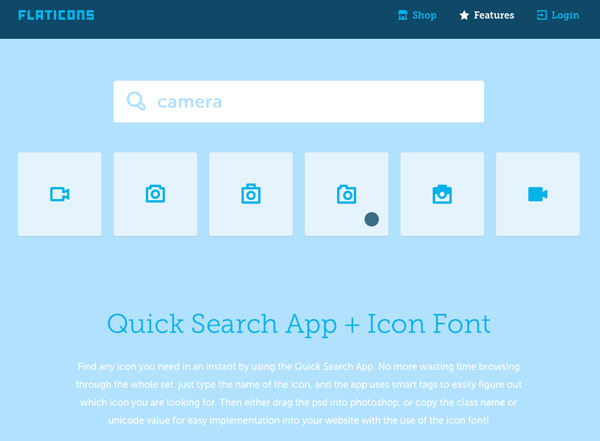
Flaticons
Palace

Pears

Dropbox DBX

Dynamit

Tiny Big Studio

Wistia

Symbolset

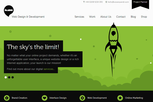
P And R
The Gadget Flow

The Gently Mad Podcast

Hanno

Beard Design

OnSite

Mud Agency

Visual Supply Co

La Carotte

Future Insights

Segment.io

Startup Giraffe

Ancient Wisdom Productions

Entypo

Awkward

Pixel Lab
