Flow: A Full-featured Task-management App
For those who have never heard about Flow, it is a powerful task management suite that offers an online web app, iOS mobile app, and a native macOS application. It is a simple way to organize tasks and also delegate tasks across any sized team of people. The guys over at MetaLab have recently updated Flow to run on a much smoother interface.
In this guide, I want to go over some of the significant changes you can find within the new Flow release. Some of the old components have been re-worked, and other interface features are entirely new.
After a bit of practice, the UI almost becomes like second nature. It’s an excellent product for individuals or teams who need an easy tool for project collaboration.
10 Best Project Management Software for Remote Teams
Remote working is on the rise globally, making managing projects remotely more important than before. Here are the... Read more
Guided signup tour
Right from the Flow homepage, you can quickly sign up for a free trial account with your name and e-mail address. The application itself is hosted on a subdomain that separates the web app from the site itself.
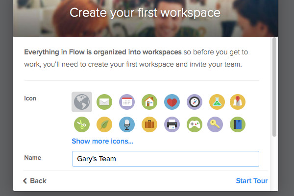
I was very impressed with the initial tour you get right when logging into your account for the first time. Right after clicking "sign up," you are redirected to the application tour.
This is full of animations and modal boxes that feel very smooth. It also introduces essential pieces of the interface, which may seem confusing without context.
Immediately you should choose a name for your profile and your default Workspace. This is where all your tasks are held and where you can keep up with teammates.
If you have the time to go through the Flow tour, I would highly recommend it! But I also think this guide will help out newcomers to get started using Flow as a productivity tool.
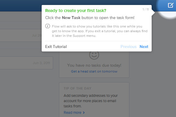
Tasks and Workspaces
Each big project or team should be grouped into Workspaces. These spaces have their inbox, lists, calendars, and team members. You may customize workspaces using cute icons to distinguish between them quickly.
Many people who only need to manage a single team or group of tasks will be fine using one single workspace.
But the ability to run multiple workspaces together makes Flow exceptional for multi-tasking. It is possible to split up tasks from your company, your freelancing projects, and your personal life all under this single application.
Now tasks may be organized into the inbox or split into lists by any organization style you choose. Listings may be grouped if you have groups of tasks that are related or need to get done together(ex: frontend & backend development).
Creating a new task within a list or the inbox uses the same interface where you can set up a due date, assign the task onto a team member, or even tag it with specific keywords.

The Workspace Dashboard
Each workspace opens up to the dashboard panel. This will lay out all the recent activities regarding new tasks, new lists, completed tasks, assigned tasks, task comments, and other similar actions. You can get a full view of the whole project in a helpful timeline fashion, much like a familiar news feed.
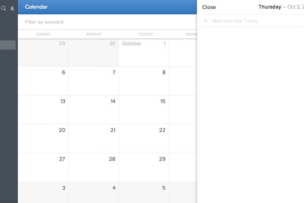
Each workspace also has its calendar for laying out tasks with due dates. This may help to visualize time frames on a project and how far along you are towards completion.
On a desktop or laptop, the calendar page is built with infinite scrolling in mind so that you can traverse a collection of months at one time. You may also create new tasks right from the calendar view by double-clicking on any day.
Flagged tasks are distinct items that appear high-priority or in need of attention. You can flag any item by clicking on the mini flag icon you’ll see in the task view. This feature may not be handy, but the functionality is there for each workspace.
All the other links beneath the Dashboard are relatively straightforward to help organize tasks based on who they are assigned to & the estimated due date.
Adding new members
If you have other people who need access to your workspace, then you can invite them with only an e-mail address.
While viewing your workspace, click the small gear icon located at the very bottom of the left navigation pane. Click and select "Workspace Preferences" from the popup menu.
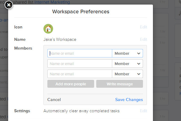
This brings up a new window with a section labeled Members. If you click the link to “Add people” a small set of input fields will appear. Notice that you can select one of three ranks for new members.
- Administrators have the power to remove members and delete the workspace altogether. Generally, you wouldn’t need more than 2 or 3 administrators on a project.
- Members are the role you’ll normally use, and it is the pre-selected role by default. This group can view all activity in the workspace except for hidden lists with pre-defined access granted to certain people.
- Guests are perfect for freelancers or contractors who are coming onto a project for a brief period of time. These people only have access to the areas where they are explicitly given the right to view or edit.
During the first tour, you are provided an option to add members to your primary workspace. After the first time, you probably won’t need to go back, adding too many extra people. But it is apart of the overall functionality, and it’s a good idea to get accustomed to how this all works.
Lists and Groups
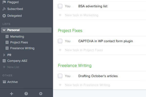
Using a list or group is a primary solution to organizing big projects with multiple sub-sections of work.
A group doesn’t contain anything but more lists, and while a list may stand on its own, you may fit it easier to group them. Note that a list also isn’t something that has to be used forever.
You might create a group for a small side-project of the company which has a few internal lists of things to do. Once they are all done, you can archive the lists, so all the tasks are marked as complete and moved out of the upcoming section.
Think of each list as different sticky notes for keeping related tasks together based on project requirements or the team members involved.
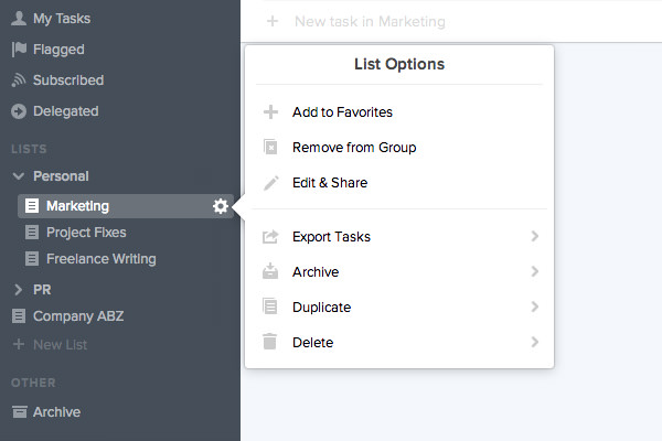
If you hover a list, you’ll notice the small gear icon appears over to the side. Click this icon for a drop-down menu full of links to edit the list details. Clicking on "Edit & Share" will bring up a new window where you can choose who is explicitly allowed to view these tasks. It may be just you, or it may be only a few people.
By default, new lists are public to every team member in the workspace, so you’ll need to customize this option if you want to hide specific tasks.
Also notice when you are in a list or any other task view, there is a search bar found at the very top of the page. You can start typing some keywords or phrases, and Flow will automatically filter out tasks for you.
This is one primary reason to use tags because it helps provide better search results.
Task comments for discussion
In the old version of Flow, descriptions were applied onto each new task. These descriptions have been removed in lieu of more direct user comments. These are much easier for handling discussions where team members can drop extra information or ask questions about the task.
By clicking on a task from any view, it will display a new pane on the right side. This has details about the task, along with a small comment form. Once you select the field, several extra features appear.
Click the little info icon in the top-right corner of the text field to get tips about writing in markdown.
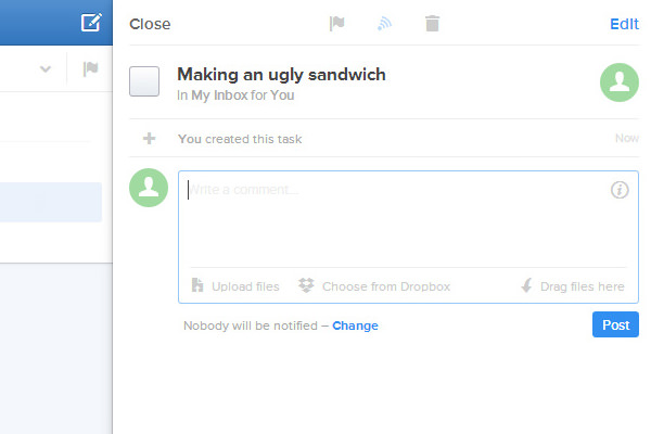
Another huge feature is the ability to share any file with other members of the team by attaching it to a comment. You can link files by dragging and dropping them into the window or browsing your HDD.
Also, if you connect into your Dropbox account, then you can pull data directly into Flow through the API. This file-sharing functionality is incredible, and it almost behaves like a repository for items necessary to the workspace.
Overall changes
Basically, this new version of Flow is impressive. The dashboard includes not just simple task management but updates of any actions handled in the workspace. You can see which team members have left, joined, assigned tasks, even dropped a few comments, or uploaded some files.
It truly brings together all the features you would expect for a team-based project management solution.
Another significant improvement is the expanded internationalization for a wide variety of additional languages. Also, the mobile web view has been optimized for smartphone browsers along with retina screens.
Flow works great on any modern device, and even with so many features, it never feels too bogged down.
I also really like the notifications window and search bar found near the top workspace icon. You can check out the latest activity and search for anything within the workspace, be it people or tasks or whatever.
This new version of Flow can change your scheduled work habits. It may take some practice to get used to the interface, but it is certainly worth the effort.
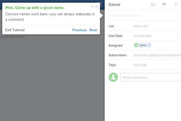
If you ever get lost in the interface, try clicking on the small question mark icon found in the bottom left navbar. This icon displays a menu with links to online guides for learning the application, notable keyboard shortcuts, and even a method to re-start the intro tutorial walkthrough.
There are also more helpful mini-tutorials that pop up from time to time as you start using Flow more frequently. If you have questions that you cannot seem to answer, then don’t be afraid to contact support or visit the Support Center page directly.
Reviewing the iOS App
Flow also has a free iOS application that runs on the iPhone, iPad, and iPod Touch devices. This is perfect for checking up with projects on-the-go or completing tasks when you are away from the computer.
The older version of Flow has a similar application but not as polished and organized.
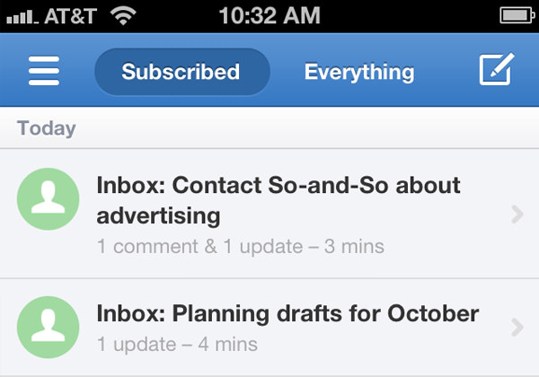
When you first sign in, you’ll get a quick tour of the features. The UI focuses around a 5-tab navigation bar for the workspace dashboard, upcoming tasks, your assigned tasks, lists, and a menu with the other accessible features.
Using the sliding navigation toggle in the top-left corner, you may switch between different workspaces quickly from any view.
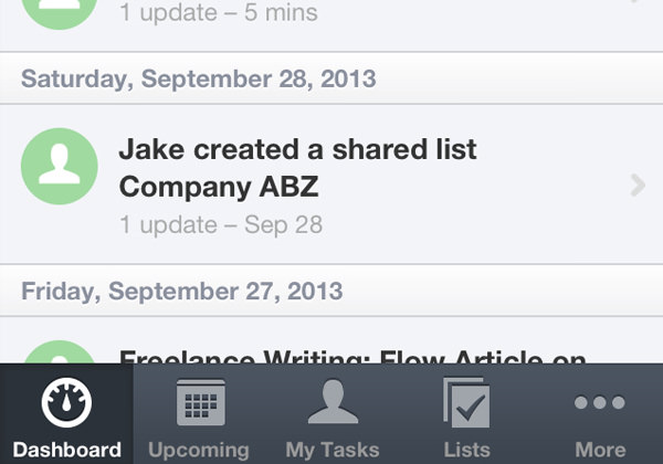
Sometimes you may feel overwhelmed with so many tasks to finish, but Flow lays out your work in a clean and straightforward manner. The upcoming tasks list, along with your own assigned tasks, will help you narrow down focus onto what needs to get done.
Considering it’s free, I would recommend grabbing a copy of the mobile app if you have an iOS device.
Even working by yourself, this can be a great product if you need to organize multiple lists of project work. If you use a Mac computer, then you may want to grab a copy of the Flow App for macOS, which is also free to download.
Closing
With all the various task management solutions out there, it can be tough switching over to something new. Anyone who has used Flow in the past likely remembers it for the extraordinary features and killer UI.
This update brings in some brand new functionality that stays true to the core of Flow’s design – easy project management for individuals or teams.
While I do feel this application can work a lot better for managing groups of people or projects, it can also work marvelously as a singular to-do project management application. Other features like the calendar and project lists are realistically essential once you get into everyday workflow.
Be sure to check out the Flow website if you have some extra time, and if you have other questions or comments about the article, feel free to share with us in the post discussion area.