Login / Registration Form: Ideas and Beautiful Examples
Note: This post was first published on the 4th April, 2011.
All throughout the modern web, we are seeing a growing amount of places for user input. These include shopping carts, interactive web games, and, most certainly, website registration forms. It seems that not only should designers be focusing on page design, but form aesthetics also play an equally vital role.
Consider how many forms you may have filled out over the course of your Internet history. There are countless examples from forums, message boards, blogs, and so many more. In this article, we’ll look at some great tricks to designing your in-page forms.
It is wise to consider some of the items here from an objective perspective. Although many login and registration forms work well with one type of site, there is no final judgment call on what’s the “best” solution. Use your design intuition to apply bits and pieces from forms you aspire towards.
Consider Multiple Inputs
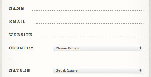
To start things off, consider a small contact form from Foundation Six Web Design. Yes, this isn’t a login form, so it may steer a bit off-topic. However, their page design is impressive and shows you what a little creativity can achieve.
Each of the input fields offers room for you to type personal contact info – name, e-mail, etc. The styles go far beyond ordinary, offering user input in a type of handwritten calligraphy. This type of formatting will keep your users in a state of wonder and achieve a goal of much higher design standards.

You’ll want to implement styles like these similar to all of your login pages. I certainly wouldn’t recommend sticking with the same style of input text and option/select menus. When jogging your brain for creativity, consider how each element should be laid out: plenty of space between layers, large easily-readable text, and even sidebar links to their direct e-mail line.
jQuery Login Boxes
This has been used on countless websites in the past and will surely be seen within new-age designs. Long gone are the days when standard practices would bring users onto a new page for each step of the login process. Normally this would mean a page to input your data and also a new page for processing login information.
Pixel2Life offers some fantastic insight into a new field of data input. From their homepage, you can click the login link and bring up a dynamic jQuery-powered login box. This form contains an Ajax call to an external PHP script that checks the credentials of your login info and, once processed, either grants or denies access.

Going further, astute may notice a registration link directly below the login box. This offers a much smoother user experience for those looking to sign up for the website but unable to locate the registration link.
If a user doesn’t have an account but would like to make one, this brings them onto the registration page without any buggy page glitches. The log-in box would still be a viable option for accessing your own account; however, allowing the option gives way for greater returns and higher volumes of new registrants.
Simple One-Page Registrations
Another shifting paradigm we see is lacking in such detail for new account registrations. This isn’t necessarily a bad statistic assuming users are growing impatient with filling out data. The numbers actually suggest websites with shorter registration pages garner heavier lists of new users daily.
Sikbox offers a lightweight option for visitors to create their own search box for a website. The only requirement is your own custom domain which to provide search results for. The input fields are large, the text is very simple to read, and there are no advertisements to distract users from building their search form!

Now, this isn’t the best form to build off when creating your own registration page for a forum or blog archive. These will, by standard definition, at least require some type of e-mail address/username combination along with a password. Some new-age web applications will generate dynamic passwords for users just to make the registration process quicker.
Of course, the trade-off here is lacking control on the user’s end to generate their own password, which many people are accustomed to.
Build off Flashy Effects
One of the greatest signup experiences I’ve ever had was creating my first Tumblr account. The home page of their site offers both login and signup forms placed directly beneath each other with new CSS3 highlight/fade effects.

This systematic approach is similar to Pixel2Life’s jQuery login area. However, the difference with Tumblr is the network cannot offer any content to those without a blog (aside from browsing others’ accounts). The real benefit from Tumblr is creating your own blog and following others – thus, your main objective on the front page is either to create an account or log in.
There are some bugs with this system. Most notably, IE6/IE7 does not support these new CSS properties. Also used on the home page is a system for adding label elements into form input values – basically overruling the “default” characters used for email/password boxes.

These labels fade away on focus in modern browsers such as Chrome/Firefox. But no such luck with the deprecated browsers, which, as you can imagine, is quite annoying trying to re-read your own input!
20+ Examples of Beautiful Form Design
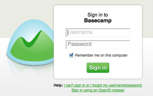
Below is a quick roundup gallery of some fantastic login form designs. These have been picked from around the web and include numerous forms of web applications.
If you have suggestions for other sites, feel free to share them in the comments section below!

Snoggle News

Robo.to


Grooveshark


Green Globe Ideas


TestFlight


Gowalla


MobileMe

Laterthis

Launchlist

Theidealist
