Logo Evolution of 25 Famous Brands
A company’s logo is a recognition tool for the public to link their services or products to the company. In other words, it is part of a company’s branding. Without such branding, the public will not be able to differentiate between companies, and therefore unable to expect a certain standard or quality from the company which they interact with.
A logo, if designed effectively, can bring to people’s mind the unique selling proposition of an organization, which inevitably promotes the company on a sub-conscious level.
What better way to evaluate the effectiveness of logos than to examine how they have evolved in successful and age-old companies? We have scouted for some of the most well-known companies in the world and researched on how their logos have changed over the years, decades and even the century. We hope that these will give you some ideas on how companies like these have designed their logo in such a way that people could easily identify with their brand names.
Shell
The Shell gas station brand logo started out in 1900 as a literal inked clamshell drawing but has gradually become a smooth red and yellow stylized shell. The colors and shape are so distinct, Shell doesn’t even write its name on the logo anymore.
Current logo
Previous logos


Microsoft
In 1992 the Windows 3.1 logo was a literal window with four panes and a black frame that broke into tails on one side like a meteor. It remained the same until Windows XP was released in 2001. The Windows XP logo was minimalized down to just the four colored windowpanes floating with no frame – distinctly Windows but much simpler.
Current logo

Previous logos


Volkswagen
The original VW logo from 1939 featured bumped teeth around the circle to make it look like a gear, with long arms rotating around the circle. The arms and gear bumps were eliminated by the time WWII ended and in 2000, VW colored the logo blue and silver.
Current logo

Previous logos




Nike
A single curved line that goes thicker at one end, officially known as "the Nike Swoosh." Nike used to include its name with the Swoosh but the distinct shape works on its own – minimalism at its finest.
Current logo

Previous logos


Mozilla Firefox
Originally a phoenix with wings outspread to match the program’s original name: Phoenix. For legal reasons, the name was changed to Firefox and the logo redrawn as a fiery fox and globe so unique, no words are necessary.
Current logo

Previous logos


Pepsi
Pepsi’s original logo was red script on white. Pepsi introduced a red, white and blue round bottle cap to their design in 1950. They swapped the fancy script for clean black lettering in 1962. The bottlecap stylized into a circle with colored stripes by 1972 and as of 2011, the striped circle stands alone as Pepsi’s logo.
Current logo

Previous logos


Walmart
In 1962, Walmart began its business with a simple logo that consisted of its brand name in a font that is available to its printer. Over the years, the logo remained almost the same except for the use of different fonts and colors. It was until 2008, which was the last time they altered the logo, that Walmart used both caps and small caps to spell out its brand name, included its company tagline as well as placed a yellow star-like symbol on the side of its name.
Current logo

Previous logos


Renault
Renault’s logo began as a medallion with the founders’ initials in 1900. The next two logo designs that follow indicated the products they were selling, namely automobiles (1906) and tanks (1919). Four years later, the logo took a turn for their design and replaced it with a grill that found commonly at the front of a vehicle. It was not until in 1925 that Renault adopted the diamond shape logo which we recognize today. In 1946, their signature yellow color is added into the logo. After further modifications over the next half of the century, the latest Renault logo was created in 2007
Current logo

Previous logos




Siemens
Siemens used to have a symbol as its logo since 1899. The symbol was the combined effect of placing the letter ‘S’ and ‘H’ together, which were the initials of its founders – Siemens and Halske. It was canned in 1973 after the company was renamed simply as Siemens AG. The latest update in 1991 resulted in cyan-colored ‘SIEMENS’ typeface.
Current logo

Previous logos


Xerox
The history of Xerox’s logo began in 1937 when the company was known as Haloid Company. The name was replaced in 1961, following a highly acclaimed copier they developed, the Haloid Xerox 914. Since then, the ‘Xerox’ typeface became the only feature of the logo until 2008. This time, they put in a red ball-like symbol with the white letter ‘X’ painted on it, something that might allow people to recognize the company better.
Current logo

Previous logos


Apple
The first Apple logo was created in 1976, where it features the famous scene of how Sir Issac Newton discovered gravity – sitting beneath an apple tree. In the same year, the logo was switched to one of a shape of an apple with rainbow stripes. It was then further simplified into a silhouetted apple image consisting of only black. Since the year 2000, the apple logo has been recognized as a monochrome apple.
Current logo

Previous logos


 1998
1998BMW
Everybody knows a BMW automobile when they see one, but most of them have no idea what the logo means. The trademark blue-white BMW logo is meant to symbolize the movement of an aircraft propeller, of white blades cutting through the blue skies. It was first created in 1923, but the logo has pretty much retained its original features other than a few minor modifications to its fonts and colors.
Current logo

Previous logos


Canon
Canon’s first logo was indeed very different from what follows over the years. It was a depiction of the Buddhist’s Goddess of Mercy sitting on a lotus flower, with her thousands of arms and surrounded by flames. The next logo in line only retained its ‘Kwanon’ brand name, using unique typefaces. By 1935, Canon’s logo was changed to that of ‘Canon’. That logo was progressively refined till 1956, when it becomes the logo we see today.
Current logo

Previous logos


Coca Cola
There is a long history of logo for Coca-Cola, beginning from 1886. Contrary to popular beliefs, Coca-Cola’s first logo was not the script logo we see today, but appeared instead as a dull-looking black font spelling out its name. It was only after that year that Coca-Cola began to use its famous Spencerian script which we are can recognize at first instance. Over the next century, there were many variations of its logos. All the logos retain its script except the one in 1985.
Current logo

Previous logos


Fiat
Technically speaking, Fiat’s first logo was an unappealing brown leather parch where the company details were written on. It was only two years later in 1901 that Fiat came up with a proper logo which spelt out its brand name on a blue emblem. There were many changes to the logos, but its characteristic letter ‘A’ is present in everyone except for the one in 1968.
Current logo
Previous logos





IBM
The merging of two companies’ logos (International Time Recording Company and Computing Scale Company) resulted in the first official IBM logo in 1911. It was not until in 1947 that IBM created its well-known typeface logo. After a little modification in 1956, and another final change in 1972, IBM finally settled down with its current blue horizontally-striped logo.
Current logo

Previous logos


Lego
As with some companies’ first logo, the logo of Lego began with a straightforward wording with no particular design. It was simply blank fonts italicize. The logo gradually moves towards one with a red background, and the end result was white fonts against a bright red backdrop.
Current logo

Previous logos



LG
Other than its company tagline ‘Life’s Good’, LG is also an abbreviation of its two previous companies prior merger, ‘Lucky’ and ‘Goldstar’. By 1995, ‘Lucky Goldstar’ changed its name to ‘LG Electronics’, with its current trademark logo.
Current logo

Previous logos


Mastercard
MasterCard used to be recognized as an interbank federation in 1966, hence its first logo. Subsequently, it adopted its prominent two overlapping red and orange circles and the name ‘Master’. In the 1990s, the colors of the circles were made brighter and hence more visible. There were no updates to the logo by far since 1996.
Current logo

Previous logos


Mazda
Mazda’s first logo in 1934 was a simple yet stylish typeface of its brand name. Two years later, Mazda altered its logo to that of a triple ‘M’, made to shape like a wing to signify its ability to reach new peaks. The logos that follow next were all enclosed by a circle/oval, with the latest one in 1997 bearing some resemblance to the winged logo in 1936.
Current logo

Previous logos


Mercedes Benz
The three-pointed star symbol was only incorporated into Mercedes-Benz’s logo in 1909, after two previous logos. In 1933, a circle was included that enclosed the star. Then, the logo pretty much remained the same as the one we identify today.
Current logo
Previous logos





MGM
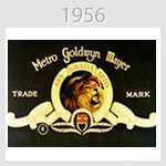
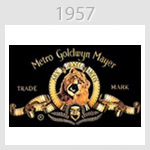
MGM has a creative way of captivating its audience with its logo through its use of an actual lion roaring. Over the years, as filming technology improves, we see a gradual change in the quality of its logo, which is shown to the audience before any MGM movie begins. If you notice, the lion used in each logo is different, but the background and everything else stays the same in all these years.
Current logo

Previous logos


Mitsubishi
The first logo of Mitsubishi was derived from a combination of two age-old Japanese family crests in 1875. The logo was strengthened with the thickening each of the three individual diamonds in 1964. The latest logo update has Mitsubishi spelling out its brand name and including its tagline.
Current logo

Previous logos


Palm
Palm was founded not too long ago in 1992, when it used to known as Palm Computing. The logo was a simple dotted ‘P’ on five horizontal lines. That logo soon changed in 2000, when the company was split into two. The logo was what most of us are familiar with, a circular shiny blue button with ‘palm’ printed on it. Further conflicts in the companies produced two modifications to the logo, until it is now a circular orange ‘palm’ logo.
Current logo

Previous logos


Peugeot
The Peugeot logo has remained pretty consistent for about one-half of a century. Beginning in 1850, the Peugeot lion was present in all of its different logos to date. Although in 1960 and 1965 the logo only features the head of the lion instead of the whole body, the lion was there. The most significant change was the addition of the blue background to the logo in 1998,
Current logo

Previous logos


