7 Tips To Better Mobile-Optimized Websites
More and more people get online through their smartphone and tablet these days. So, it is important that we as designers and developers address how our websites are displayed on these devices. In this post we will see several components that you need to include to make your website optimized and accessible on mobile devices.
1. Meta Viewport Tag
The meta viewport is an HTML tag for specifying viewport width and controlling page scale. Using this tag, we can set the page zoom when it is first loaded, the maximum zoom allowed for the page, and also disable zoom capability.
Below is an example of how we commonly add meta viewport tag inside the <head>.
<meta name="viewport" content="width=device-width; initial-scale=1.0; maximum-scale=1.0;">
You can also add it inside your stylesheet this way:
@-viewport {
	width: device-width;
}
The meta viewport tag is an indispensible tag (together with Media Queries) if you are building a responsive website. However, you can technically set viewport meta tag for non-responsive web design all the same.
2. Media Queries
Media Queries let you shift the styles of your website at specified break points. Not everything from your website can properly fit on a narrow viewport size of a mobile device.
By using Media Queries, you can add specific style rules for specific viewport width. We can also apply styles based on the screen orientation and the screen pixel density.
You can embed Media Queries either directly in the stylesheet link:
<link rel="stylesheet" media="screen and (orientation: portrait) and (min-width: 960px), projection" href="style.css" />
Or code it inside the stylesheet, which is the most common way used by developers.
@media screen and (max-width: 960px) {
	/** Style Rules here **/
}
3. Modernizr
Modenizr is a JavaScript for browser/device feature detection. Browsers vary and they may or may not support certain features. When building a website for mobile you probably will use new and cutting edge features of CSS3 and HTML5, which unfortunately are not supported in earlier browsers (not everyone uses the latest of browsers).
Modernizr allows you to give fallback of functions and presentation for less capable browsers by adding extra HTML classes in the body tag and a set of method.
Check Out: Getting Started with Modernizr
4. TouchSwipe
TouchSwipe is a jQuery plugin to enable touch interaction for websites (phone or tablet). It supports a set of common gestures like Swipe, Pinch, Zoom and Scroll.
With more devices dropping physical keyboards and enabling the screen for touch, you should consider applying this plugin on your website for a better and richer user experience.
Read Also: A Look Into: Building Websites For Tablet Users
5. iOS Icons
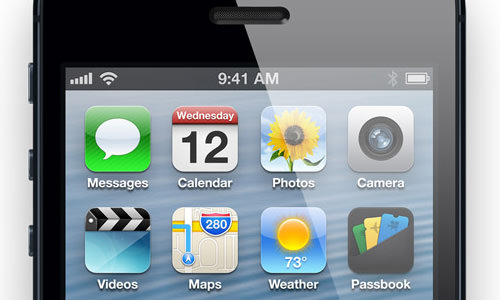
The first thing you see after unlocking your iPhone (or iPad) is the app icon. Apart from app icons iOS will also display icons for websites that have been added on the Home Screen.

To do this for your website, simply add the following link element within the <head> tag.
<link rel="apple-touch-icon" href="touch-icon-iphone.png" />
<link rel="apple-touch-icon" sizes="72x72" href="touch-icon-ipad.png" />
<link rel="apple-touch-icon" sizes="114x114" href="touch-icon-iphone-retina.png" />
Alernatively, you may remove those link elements, but ensure that the icons are saved in the root directory, and prefixed with apple-touch-icon-* on its name.
Check out: Easily Generate Android Or IOS App Icons With MakeAppIcon
6. Splash Screen
Splash Screen is the first image that is displayed when users start an application. The screen tells the users that the app is loading. It is common to use the Splash Screen as an opportunity to show off brand identity.
To add it to your website, simply insert the following lines at the <head>.
<link rel="apple-touch-startup-image" href="splash-screen.png" />
When users open your website through the Home Screen, the image assigned in this link element will be displayed briefly before users see the whole website.
Although using Splash Screen to display brand is actually against the guideline, but as long as the the Splash Image is very well designed and loads briefly, it can gives better user experience and adds a cool factor to your website.
7. Windows 8 Pin Icon
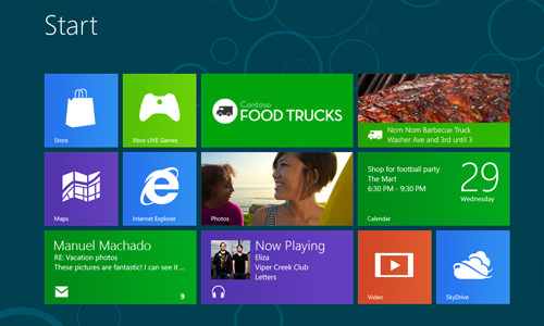
Windows 8 and RT also have the same feature of adding icons when a website is pinned at the Home Screen. In Windows 8, this is called Pin Icon.

Unlike in iOS, which uses link element, Windows 8 uses meta tag to add icons. Here is an example.
<meta name="msapplication-TileColor" content="#000"/>
<meta name="msapplication-TileImage" content="icon.png"/>
The first meta is defining the Tile Color, and the second is referring the icon image. There is a site called Build My Pinned Site that allows you to generate this meta tag easily.
Final Thought
The mobile device revolution have changed the way we, web developers, build websites. And, at least, these elements that we have discussed above should be included in your Web document to make your website turn out well for viewing on mobile platforms, like iOS and Windows 8.