How Web 2.0 Logos Are Drawn With Photoshop
Ever wonder how these guys draw their Web 2.0 Logos? Sometimes it’s nice to learn from others, build up the basic skills and start your own creativity from there. In this Photoshop tutorial, I’m going to reveal you some of the nice Web 2.0 logos, how you can draw their logo exactly the same (well, not really 100%, though) with Photoshop.
1. Download and Install style file
First of all, you will need to download a style I’ve created and load it into Photoshop.
- Download Photoshop style here. (Right-click -> Save as)
- For Photoshop users, put this style file into
Program Files\Adobe\Adobe Photoshop\Presets\Styles
2. Load style
Call up your Style Dialog box in Photoshop
- w
- Windows > Styles
- Notice a small arrow button on the top right corner. Click on it and select Load Styles from the drop down
- Find web20 from the list and click Load. If you don’t find web20, try closing Photoshop, re-open it repeat Step 1.
- Click on the arrow button again and select Large List from drop down
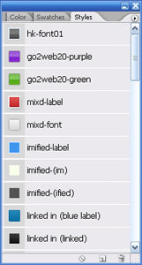
Your result should look something similar to the image below.
3. The six Web 2.0 Logos

Here are six Web 2.0 Logos; MyBlogLog, Imified, mixd, skype, Linked In, and Go2Web20. The style you’ve just installed is going to reveal how to draw them. I’ll go through “mixd” and “Go2Web20” logos, the rest is just reusing the same technique.
4. How to draw
The reason I use Style here is that once they are saved into a .asl file (the file you downloaded), they are convenient to apply. Let’s go about drawing some of these logos.
Drawing mixd Logo
Initial observation, mixd logo consist of
- “mixd” text
- rounded rectangular
- small dot
- smaller dot
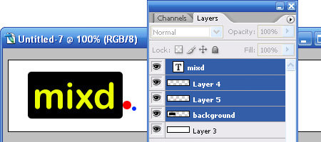
We will roughly draw them out in Photoshop, each element in a different layer, as illustrated in the image below.
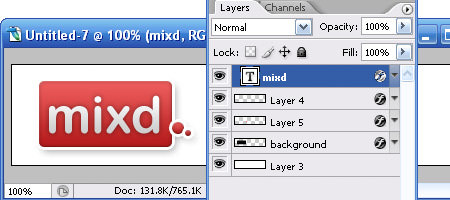
Now, here’s the trick. Look for “mixd-label” in the Style Dialog. Drag them directly to the background layer, small dot layer, and smaller dot layer, respectively. If you drag them correctly, you will notice that the layer will now inherit the colors and blending of the style. Find “mixd-font” in Style Dialog, drag it to the text layer, and your mixd logo is complete, 90% like the original, I’ll say.
Drawing Go2Web20 Logo
Have 4 new layers created, each for “GO“, “2“, “WEB” and “2.0“
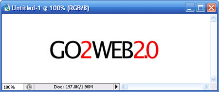
Drag “go2web20-purple” from Style Dialog into “GO” & “WEB”, drag “go2web20-green” into “2” & “2.0” and you will get this final output.
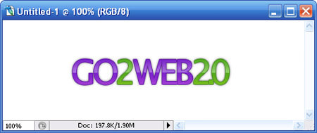
As for the rest (MyBlogLog, imified, skype and Linked In), it’s all about dragging their respective style in and match with the correct font.
5. Conclusion
If you look into the Blending Options of each style, you will be noticed that most Web 2.0 logos are a matter of playing with gradients and strokes with the combination of the right fonts. This may not the “exact” way how these guys had done their logo, but it’s at least a way to achieve it. I’m not encouraging you to fake their style and redraw your logo, but try to understand it, and hopefully, you can come out with a nice sleek Web 2.0 logo. I love putting my designs in Style (.asl), I can reuse them whenever I want.