Designer’s Guide to Working With Style Guides & Style Tiles
Creating a branded identity is no easy task. It requires hard effort, but it’s also one of the most rewarding creative tasks. Web projects often mix branding with interface design. This can be confusing because there’s so much to do in both areas. Style guides and style tiles are great resources for web designers, and while they do sound similar, they accomplish two different tasks.
In this post, I’d like to delve into both and cover the benefits you can get from these creative assets. Not everyone will need (or like) creating style guides or style tiles. But every designer should at least understand what these are and how they work.
Style Guides For The Web
I’ve read varying opinions on style guides. Some say these are digital mockups while others say that code-based style guides are the most useful.
Recommended Reading: How to Optimize CSS with Code Style Guides
Either way, the goal of a style guide is the same for the web as any other project. It defines consistent patterns, UI modules, and creative preferences used in the design process. You can get very specific and stipulate pixel-perfect measurements for certain elements, or you can stay loose and offer guidelines with visual examples.
There is no single right way to do a style guide. The only wrong way is to create a resource that simply can’t be understood by others.
The goal is to create an asset that will stand the test of time. It should be open for edits if new resources are created. It should also be accessible for anyone who joins the team to dive right into the guide with ease.
A style guide should be as detailed as needed for the project. It usually includes reusable assets, such as typography, buttons, color swatches, textures, and common page elements.
We recently covered living style guide tools that can help you build living style guides from scratch. These living guides are more for front-end developers, but they can be just as useful to designers. You can read more on this subject in this Smashing Magazine post.
My absolute favorite resource is StyleGuides.io. It covers the basics of style guides for the web, including live examples and case studies.

MailChimp’s pattern library is one of the best examples you can find at StyleGuides.io. It’s an online live style guide that defines MailChimp’s grid, typography, and page elements.

When you design a style guide for a web company, it’s common to put everything online, but you can also create internal guides, and keep them on a local intranet or host them privately behind a user login page. The way you access a style guide really doesn’t matter. They all serve the same purpose of conveying specific colors, patterns, and visuals that match the theme of a web project.
To learn more on the subject, check out these other posts on style guides:
- Front-end Style Guides (24ways.org)
- Create a website style guide (creativebloq.com)
Branching Into Style Tiles
Style tiles are a different beast altogether. These tiles are creative assets used in the early design phase when trying to nail down a specific aesthetic.
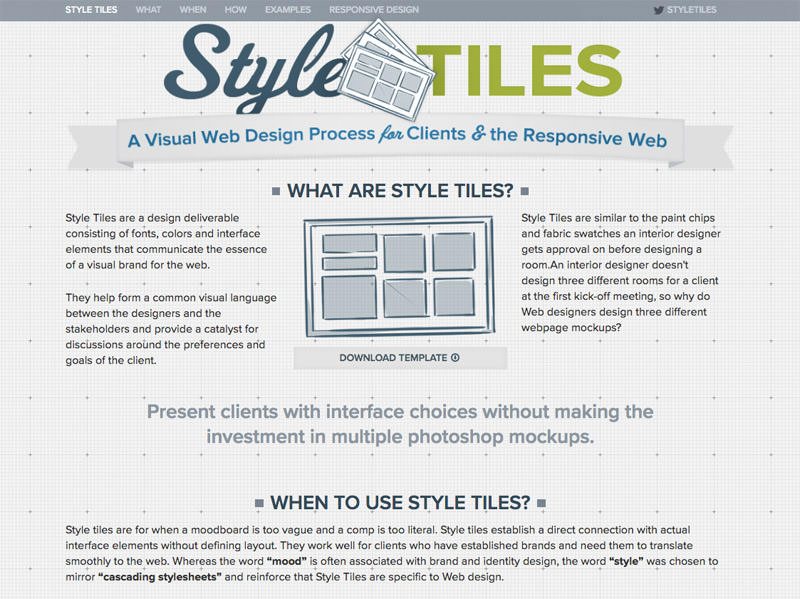
The Style Tiles website was created by Samantha Warren, and it has everything you would possibly need to know. There is no specific template for designing a style tile. But Samantha’s examples use headings and paragraph types, links, patterns, and possible color choices along with a branded logo.

When working with style tiles, your goal ultimately is to present 2-3 different style tiles to the client or creative director. These tiles are more detailed than a mood board, yet much less detailed than a full mockup.
Tiles should be just detailed enough to give a sense of the identity and mood of the website. Samantha encourages using adjectives to describe each tile in detail.
Clients can look through the different tiles, and select their favorite pieces. This saves you time when designing because the client has already seen assets they like, so there’s less chance of hefty revisions.
Here’s a great quote from the Style Tiles website:
Style Tiles are similar to the paint chips and fabric swatches an interior designer gets approval on before designing a room. An interior designer doesn’t design three different rooms for a client at the first kick-off meeting, so why do Web designers design three different webpage mockups?
Comparing style tiles to an interior designer’s toolkit is quite an apt analogy. You don’t want to pour effort into a pixel-perfect mockup only to have the client realize they hate most of the colors and fonts.
Instead, use style tiles to find a common theme or visual language to be used across the entire site. This can include branding/identity but also might include UI features, such as dropdown menus or CTA buttons.
You should use these as deliverable assets early in the process. Once you complete a full mockup, there’s really no need to reference the style tile anymore. Nevertheless, at the beginning, style tiles can be crucial to the creative process by saving the designer time and iving the client many options to choose from.
If you want to delve more into style tiles check out these related posts.
- Style Tiles and How They Work
- Style Tiles: An Alternative to Full Design Comps
- Creating Style Tiles: An Easy Approach To A Design Direction
Style Guides vs. Style Tiles
The difference between style guides and style tiles is vague but definite. A style guide is much more detailed and should be used as a continual reference guide for the creative team. A style tile can be used as a moodboard to plot ideas visually for yourself or the client. They are often used to explore ideas, and once the project is finished, they don’t serve much of a purpose.
Style tiles are often much rougher around the edges, and they’re used solely in the early creative process. A style guide is meant to be used throughout the entire design process and even afterwards for future reference for other designers who might work on the site.
Both have their benefits and drawbacks. Style tiles are quick and fun, but ephemeral in nature. Style guides are thorough and behave like visual documentation, but they also require a lot of work.
So which one should you use? It ultimately depends on the project.
Smaller projects such as for small business websites work better with style tiles. Building an entire style guide for a small business site would require far too much work and billable hours. This probably isn’t worth the cost for most clients.
However a large project like redesigning the NY Times would benefit from both style tiles and style guides.
Finding a language and mood for a new project is always a valuable process. This is what makes style tiles perfect for almost every scenario.
You can also get by without creating either of these assets. Some designers go right from wireframes to detailed mockups. And some clients don’t even want a style guide because it won’t get used.
Work on a per-project basis and decide what’s best for each one.
Live Examples
Let’s wrap this up by covering examples of both style guides and style tiles. I found these designs while browsing Dribbble, and I think they exemplify the quality you’d want in your own style guides or style tiles.
Style Guides
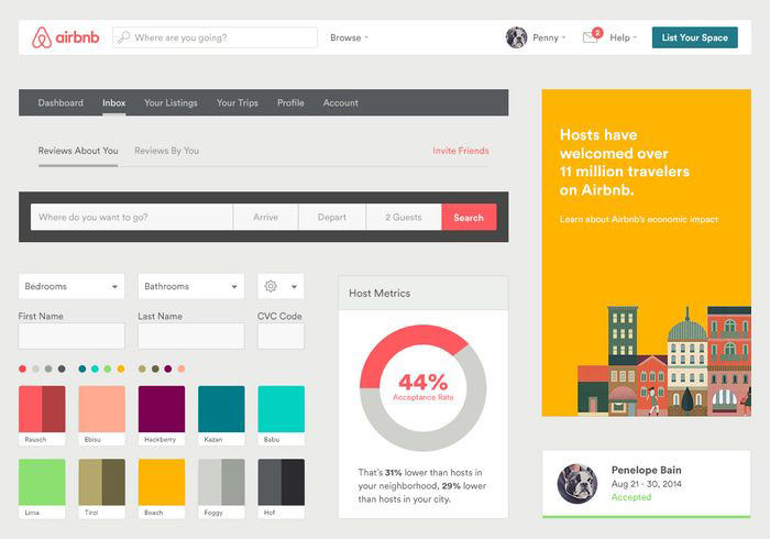
This incredible Airbnb style guide was created by Derek Bradley. It’s very simple, but it clearly illustrates the main patterns, colors, and page elements to be found in the design.

Here’s a much larger digital style guide created by designer Naoshad Alam. This example is much more organized with sections for colors, typography, forms, interface elements and other UI features.
More detailed style guides would put all these design elements on the web, and include code snippets for each one.

Designer Cupi Wong made this guide for AfterShip. Typography, buttons, color choices, and common page elements are carefully crafted, and organized together into sections.
This could also be ported to the web and built out much larger as online reference documentation.

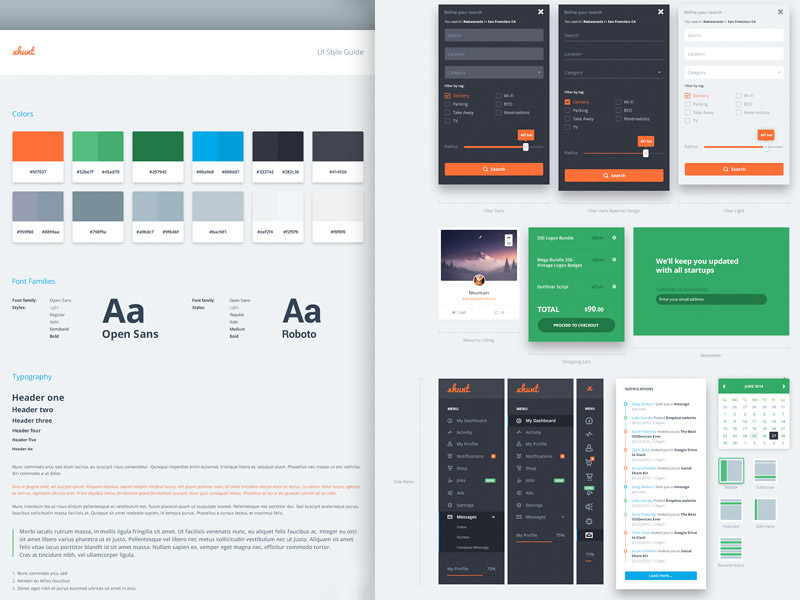
UI designer Greg Dlubacz shared his own UI style guide for a web project. This thing is seriously huge. The fullscreen preview spans 21,000 pixels high!
Absolutely one of the best digital style guides I’ve ever seen. This could also be ported to an online documentation page for team members to reference.

Style Tiles
UI/UX designer Abdus Salam created this style tile for an organic food store website. It’s very basic with flat design elements, some minor UI features, and a color palette.

Designer Adrian Cantelmi really went detailed with his divestment style tile. It has colors and typography but also includes vector illustrations.
These vectors help to define the brand, the mood, and the overall color scheme of the website.

The World Cup Advisors redesign got its own style tile with very basic features. A few icons, some color choices, along with a couple of button designs. Simplicity is the name of the game.
If you can get a feel for what the site might look like at a glance then you’re doing it right.

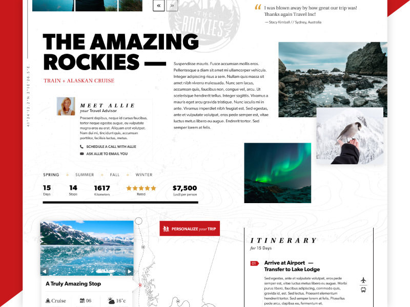
Here’s a fun example of a rejected style tile used for a travel project. The designer Brennan Gleason only provides a small sample of the tile, but you can still get a feel for the ambience of the website.

Final Words
If you search around the web you’ll find lots more examples, tips, and resources for building style guides and style tiles. But I hope this article can be a primer on both and get you fluent in understanding & creating these design assets.