40 Beautiful and Colorful Blog Design
Bright colors can scare off a lot of web designers, especially when you use a few of them together. It takes more care and precision to create a design that uses eye-popping color well without being overwhelming or looking amateurish.
And if you’re combining contrasting colors, extra care needs to be taken to prevent your design from being jarring.
The blog designs featured below make excellent use of bright colors. Most use multiple colors together, though a few take a more monochromatic approach. Some are set against dark backgrounds; others are set against white.
So, in case you don’t want to jump into an original design like these, there are a number of blog templates at the end that uses similar bright color schemes.
50 Clean, Simple and Minimalist Website Designs
Minimalism has gained popularity in the past few years and has been among the top web design trends... Read more
WebDesigner Wall
WebDesignerWall’s site uses a wide range of colors and a hand-drawn design. It’s artistic and fun, a perfect look for the site’s content.

Web Design Hobart
Web Design Hobart uses a bright watercolor design for its background with lime green accents, while the rest of the site’s design elements are a bit more subdued.

Brija.com
Bruja uses a more limited pallette, though the bright red and yellow are still very eye-catching.

Design Disease
Design Disease’s site uses a cyan blue and lime green, with additional shades of each color used throughout the rest of the site, and a few other bright accents.

Cult-foo
Using bright colors against a muted background color (like gray) makes the colors pop even more, as shown by Cult-foo’s website.

Danilo Fiocco
The bright colors and cartoon character lend a very informal feel to Danilo Fiocco’s site.

Eric Dies
The lime green really stands out against the gray background on Eric Dies’s site.

Designministeriet
Cyan and lime green with hot pink accents makes Designministeriet’s site feel very modern and young.

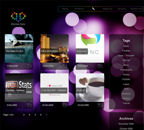
Dezine Zync
A bright background stands out more when mixed with transparent elements, as shown on Dezine Zync’s website.
Dreamling.ca
Mixing slightly muted bright colors with a white background gives Dreamling.ca’s a very feminine look.

Depthinfinity
Depthinfinity’s site combines a bright, multi-colored background with lime green and other bright accents to create a very fun and artistic site.

Ezobase
Ezobase uses a CMYK (Cyan-Magenta-Yellow-Black) color scheme, which looks very fresh on a website.

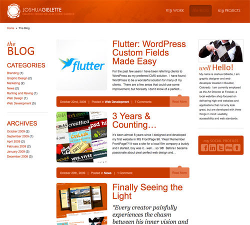
Joshua Giblette
Shades of a single color when set against a neutral background can have a huge visual impact, as displayed on Joshua Giblette’s website.
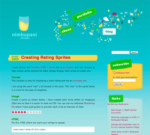
Nimbupani Designs
Mixing multiple bright colors can be tricky, but is executed well on the Nimbupani Designs site.
Krftd
A bright, graffiti-esque background is mixed with cyan accents within the text to really make Krftd’s site pop.

Super Girl
Super Girl is another great example of bright colors used with a white background to create a feminine look.

TruSpeaks
Combining a header with bright colors with a bright but monochromatic background makes the content on the TruSpeaks site stand out and creates a very modern and hip feeling.

Almost-Famous.TV
Combining a single bright color with a white background makes Almost-Famous.TV’s site look very pulled together while allowing the layout to look like it’s trying to break free from its grid-based design.

Entropia Blog
Mixing very bright colors both in the text and background image makes the Entropia Blog look fun and fresh.

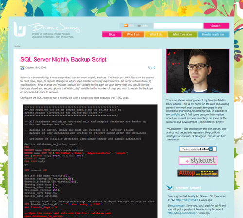
Brian Jeremy Kupetz
A graffiti-esque painted background mixed with accents that take their color cues from the background itself make for a very pulled-together yet lively look.
Ilovecolors
Ilovecolors mixes bright colors with grunge-influenced elements to create a very unique design.

Moradito
The bright, pixelated background of Moradito really stands out when it’s combined with transparency and a few colored accents.

Hello My Name is Heather
A lime green background and brightly-colored header combined with bright accents and images within posts make for a very cheerful design on the Hello My Name is Heather site.

Duirwaigh Studios – Message from the Muse
Duirwaigh Studio’s Message from the Muse blog mixes bright colors with a vintage-inspired design to create a background that really pops.

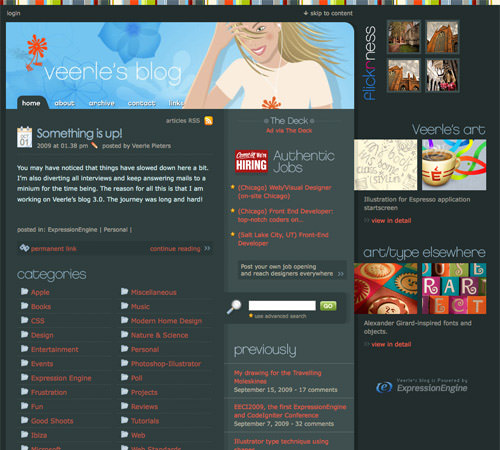
Veerle’s Blog
The steel-gray background of Veerle’s Blog mixed with bright orange accents and a bright header looks very original.
Inspiredology
A rainbow-colored header image combined with cyan and magenta accents makes the Inspiredology site look welcoming and original.

Celebrific
Celebrific’s bright pink and light blue color scheme really pops and makes the site’s content really stand out.
