10+ Animated & Interactive Infographics That Brings Content to Life
Everyone loves infographics, sure, but static infographics are a bit old hat now. With so many infographics out there, it’s easy to overlook a lot of infographics with good content just because they just don’t stand out from the rest of the pack. And, if you’re a designer, you’ve probably racked your brains trying to figure out how to attract viewers and create infographics that do stand out from the rest.
Well, one of the ways you can do that is with animated infographics.
Animated and interactive infographics, especially those designed using HTML5, are quite possibly the future of infographics. Animated infographics engage with viewers better and can help add interest to topics that might otherwise come across as mundane.
Here’s a list of 10+ animated and interactive infographics that you can enjoy and find some inspiration from. Do click on the links to get to the full version of the infographics, complete with the animation.
20+ Best Infographic Tools
Infographics tools help you turn boring data into vivid charts and graphs within minutes, and with minimal effort. Read more
Hungry Tech Giants
This interactive infographic is a sortable timeline of acquisitions from five of the world’s biggest tech companies over the past 15 years.

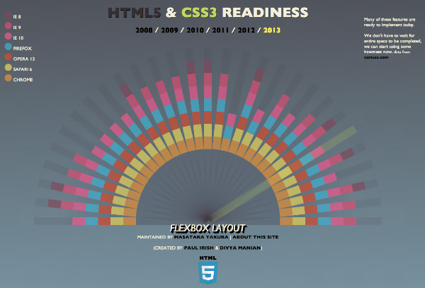
HTML5 & CSS3 Readiness
This interactive infographic is a breakdown of HTML5 and CSS3 support in all the major web browsers up to 2013.

The Evolution Of The Web
This infographic uses SVG elements, the timeline of browsers and technologies, as well as the growth of the Internet itself.

Inception
This infographic uses animations to great effect to help explain what happened in the movie ‘Inception’. The minimalist design definitely helps it achieve this goal.

Flights Interactive
This infographic is an aviation buff’s dream. Not only is it an interactive world map that tracks all the planes and flight routes in real-time, it’s also a presentation on the history of commercial flight.

Bond: Licence To Drive
This wonderfully animated, designed and drawn infographic charts the evolution of Bond cars, from the Sunbeam Alpine in ‘Dr. No’ up to the Land Rover Defender in ‘Skyfall’.

World’s Biggest Data Breaches
This interactive infographic is a visualization of all the biggest data breaches since 2004.

Thirteen Reasons Why Your Brain Craves Infographics
This charmingly animated infographic takes a quick look at why we love infographics so much.

How Search Works
This interactive infographic details how Google search works, from the initial crawling and indexing stages to how they fight spam to ensure the quality of your search results.

Dribbble: What’s It Used For?
This interactive HTML5 infographic explains Dribbble, from what it’s used for to some common terms used on the service.

How A Flat Panel Display Works
This animated infographic, made in HTML5, dissects a flat screen display to show exactly how one works.

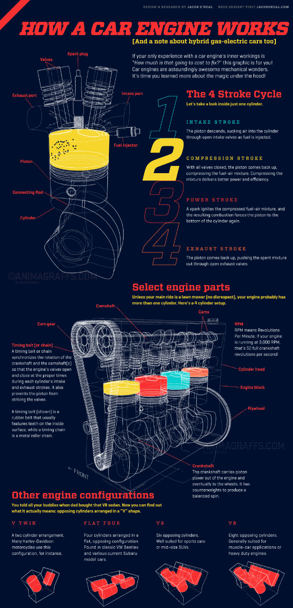
How A Car Engine Works
This HTML5 animated infographic shows you how a car engine works in brilliant detail.
