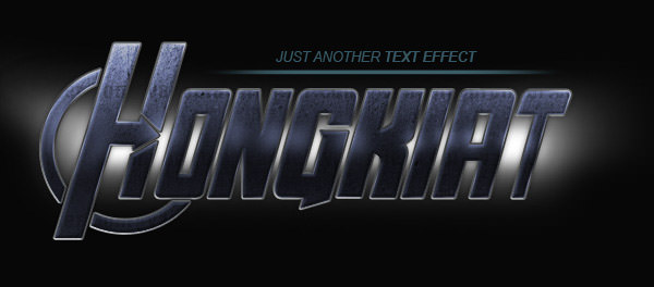
How to Create Avengers Text Effect in Illustrator & Photoshop
In today’s tutorial, we are going to re-create the text effect used in the comic (also an upcoming movie) – The Avengers, to make ourselves feel like we are heroes too, at least Illustrator/Photoshop heroes :)
We will make the text manually in Adobe Illustrator, then import its path to Adobe Photoshop and apply some effects and texture. Instead of ‘Avengers’, we will use ‘Hongkiat’ as the text, or you can use any text you please.
Let’s get started.
Getting Started
To follow this tutorial, you will need the following resources:
- Concrete Texture from vandelaydesign
- Free Alternative: Free Concrete Textures from Texture King
- The Avengers font from Owen Dawson
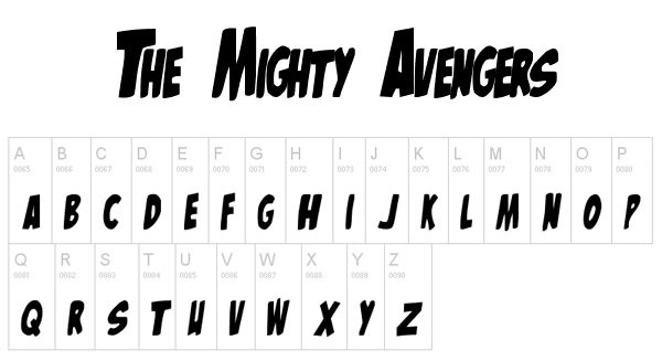
- The Mighty Avengers font from Owen Dawson
Avenger Text Effect
Step 1: Getting the font
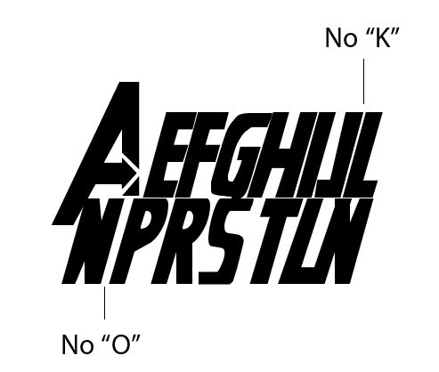
Let’s start with working on its characters. Our first option is using a free font type. After searching Google using the keyword ‘free fonts Avengers’, I found two fonts with an Avengers theme: The Avengers and The Mighty Avengers. Both are made by Owen Dawson. Unfortunately, neither has the complete alphabet for our project.
The first font has no K and O. We need these two characters in ‘Hongkiat’. Also, we cannot use its A character because it is not suitable if used between letters, such as in ‘Hongkiat’.
The second font seems to be based on The Avengers original comic. It has round edges instead of sharp ones. This font style is different from its movie poster.
So, our best option is to draw the characters manually. We are not going to use these fonts, but they will be useful for reference while creating the characters.
Step 2: Reference
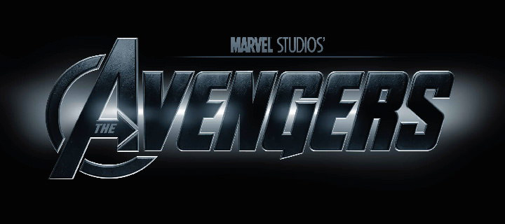
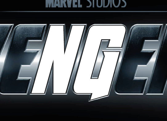
You should start by Googling ‘The Avengers’. This is what I use for our reference. Save the image file, create a new file in Adobe Illustrator, then paste the file. Click Object > Lock > Selection to lock the image and prevent it from being edited accidentally.
Step 3: Making Characters
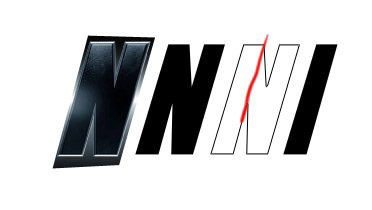
In the current ‘AVENGERS’ text, we can find N and G, which are used in ‘HONGKIAT’. Make a new layer, then use the pen tool to trace characters N and G.
Step 4
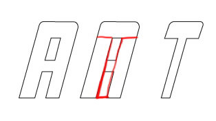
For the other characters (H, O, K, I, A, and T), we will base them on other available characters. For I, we use the available N character and remove half of it.
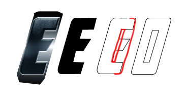
For O, we modify E by closing it and adding a hole in its center.
For K, we can simply modify R by cutting its upper part.
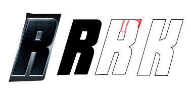
We also use R as the base character for A.
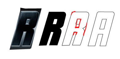
For T, we use the A character that we created earlier.
Step 5
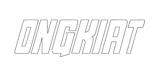
Place all these characters into position. Currently, we have ‘ONGKIAT’.
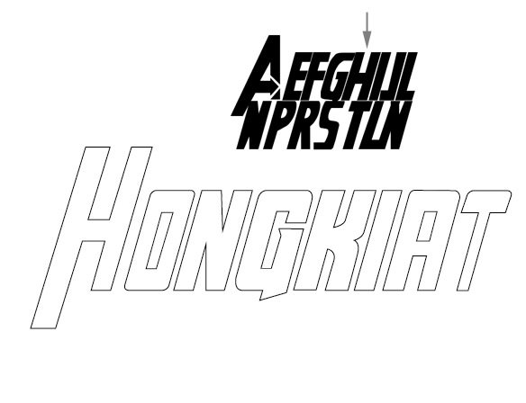
Step 6: Draw First Character ‘H’
Just as in the reference image, the first character is very tall compared to the others. For the H, we can use the preview font The Avengers as a reference.
Step 7
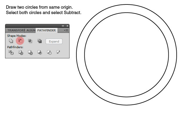
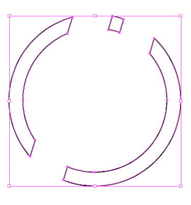
Draw two circles from the same origin. Select both circles, open the Pathfinder panel, and select Subtract to create a ring shape.
Step 8
Place the ring shape on top of the H and O characters. Note: To help us see better, I will remove unused paths from sight.

Step 9
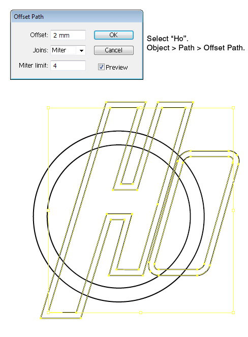
Select the ‘Ho’ characters, click Object > Path > Offset Path.
Step 10
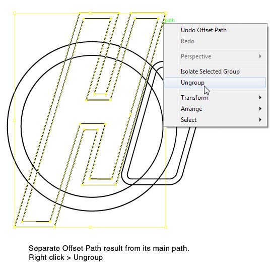
Right-click H and select Ungroup to separate the Offset Path from its main path. Repeat this process for O.
Step 11
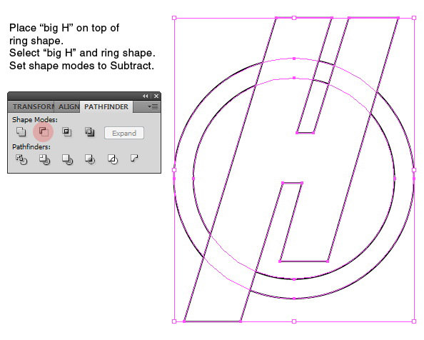
Place the big H on top of the ring shape by clicking Object > Arrange > Bring to Front. Select the big H and the ring shape, then select Subtract on the Pathfinder panel.
This is the result.

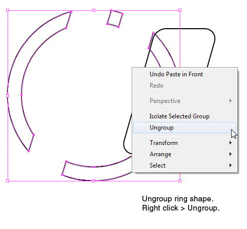
Step 12
Right-click the ring shape and select Ungroup.
Step 13
Place the big O on top of the ring shape by clicking Object > Arrange > Bring to Front. Select the big O and the ring shape underneath it. From the Pathfinder panel, select Subtract.

Below is the result.

Step 14
Delete the remaining parts of the ring that are unused.
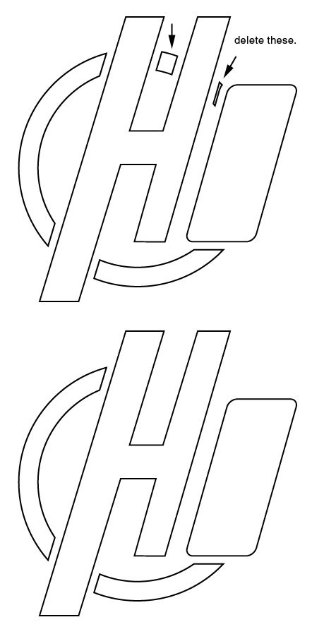
Step 15
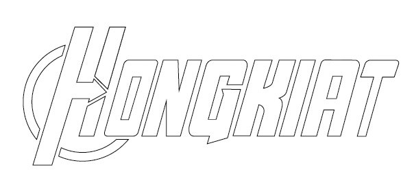
This is the complete preview of our current path.

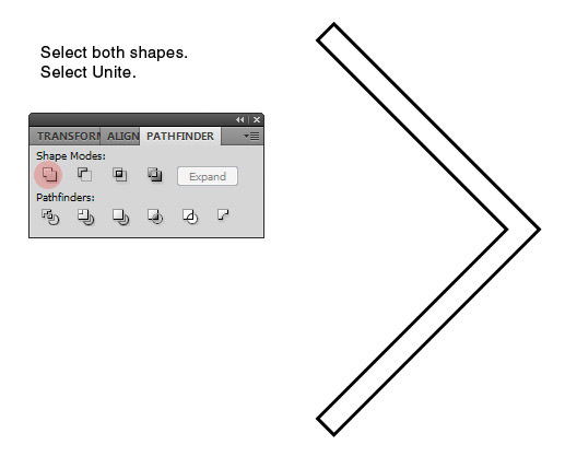
Step 16
Draw two rectangles, then rotate them 45° and –45°. Position both shapes until we get an arrow shape.

Step 17
Select both shapes and select Unite from the Pathfinder panel.
Step 18
Place the arrow on top of the H character. See the picture below for its placement. Select both shapes and select Subtract.
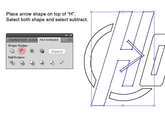
Now, we have an arrow hidden inside the H character. This text is now ready to be used.
Step 19: Start Working in Photoshop
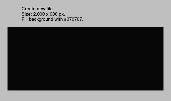
Open Photoshop. Make a new file with size: 2000 px × 900 px. Fill the background with color: #070707.
Step 20: Importing Character Path
Return to Illustrator. Select all character paths and then press Ctrl + C to copy them to the clipboard.

Step 21
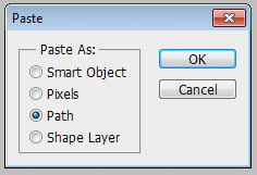
In Photoshop, press Ctrl + V. Paste the text as a path.
Text from Illustrator is placed as a new path. You can find it in the Paths panel.

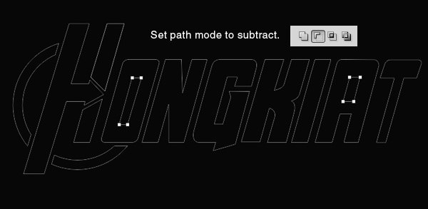
Step 22
Select the paths inside O and A. In the options bar, set their mode to Subtract. This mode will make both paths create holes inside their main path.
Step 23: Convert Path to Shape
Click the black and white circle in the Layers panel. Select Solid Color, and set its color to #070c12. Now, we have a new shape based on the imported paths.

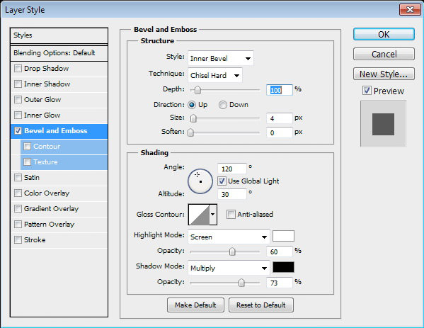
Double-click the layer to open the Layer Style dialog box. Add Bevel and Emboss. Select Technique: Chisel Hard to get hard edges.
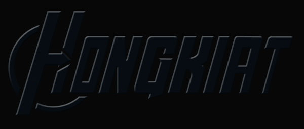
This is our current result.
Step 24
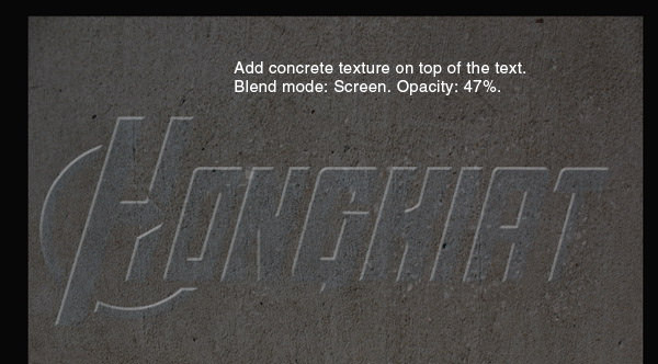
Add the concrete texture and place it on top of the text. Set its blend mode to Screen and reduce its Opacity to 47%.
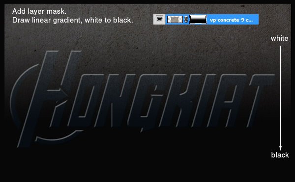
Step 25
Add a layer mask. Draw a linear gradient from white to black.
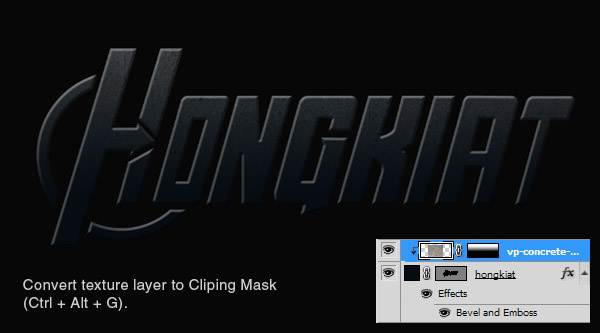
Step 26
Press Ctrl + Alt + G to convert the texture into a Clipping Mask. The texture now goes inside the text.
Step 27
The texture is currently faded in the lower part of the text. Let’s reveal some of it there by painting that area with white using a brush with 30% Opacity. Below, you can see the layer mask after painting those areas.
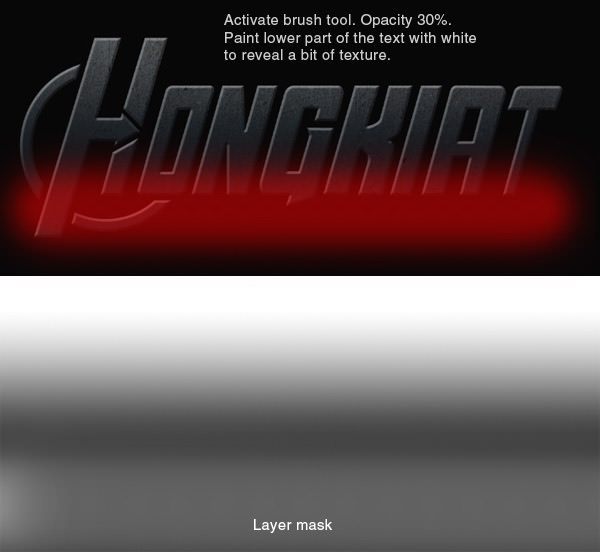
This is the result. You can see that there’s now a subtle texture on the lower part of the text.
Step 28: Add Embossed Stroke Effect on Text
Duplicate the text layer and place it behind the original text layer. Add Layer Style: Stroke.

Below, you can see that the result is just a flat color stroke line.
Step 29
Let’s add Bevel and Emboss and set its Style to Stroke Emboss. This way, the effect is also applied to the Stroke we just added.

Now, the stroke has an Emboss appearance.

Step 30
Add Outer Glow to add a subtle shadow behind each character. Currently, we will not be able to see its effect because the background is still too dark.
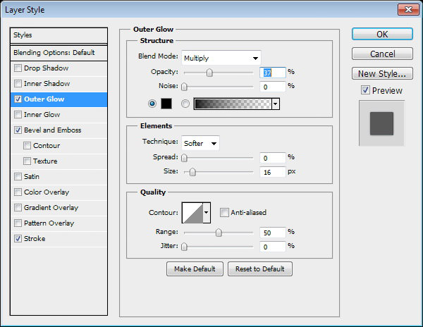
Step 31
Create a new layer above the text with the stroke effect. Press Ctrl and click on the text layer thumbnail. Click Select > Modify > Expand. Set Expand by 3 pixels. Notice that we expanded the selection by 3 pixels so it matches the stroke size.
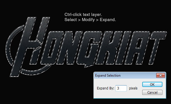
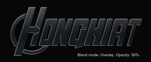
Fill the selection with a linear gradient from white to black to white.

Set its blend mode to Overlay. Reduce Opacity to 30%.
Step 32: Add Lights on Background
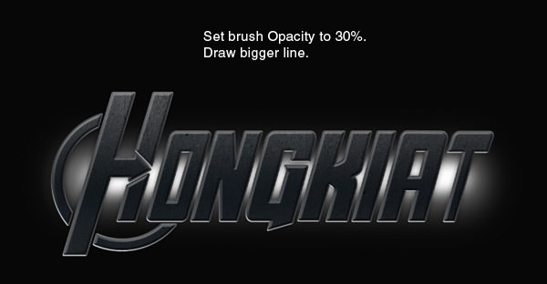
Create a new layer under the text. Activate the Brush tool and set its Opacity to 100%. Draw a white line behind the text.

Step 33
Reduce the brush’s Opacity and draw a bigger line covering the first line.
Step 34
Paint random light casts on the line’s edges.

Step 35
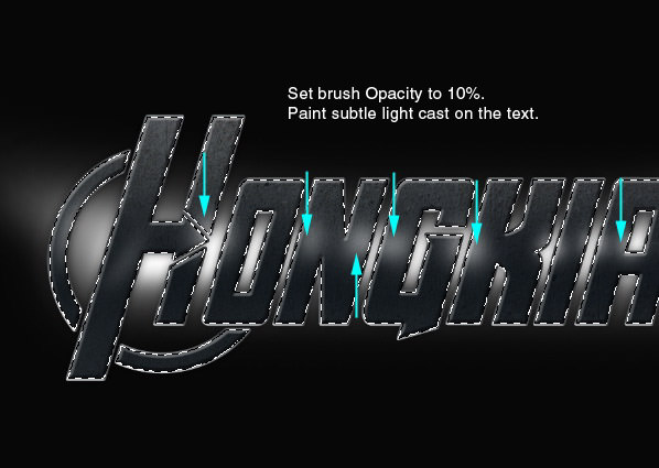
Press Ctrl and click on the text layer thumbnail to create a new selection based on the text shape. Make a new layer and place it on top of the main text.
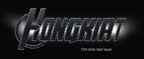
Activate the Brush tool, set its Opacity to 10%. Paint some white in the middle of the text as if the light cast is from behind.
Below, you can see the result before and after adding the light cast.

Step 36
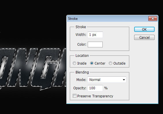
Make a new layer again. Place it on top of the text. Right-click the selection and choose Stroke.
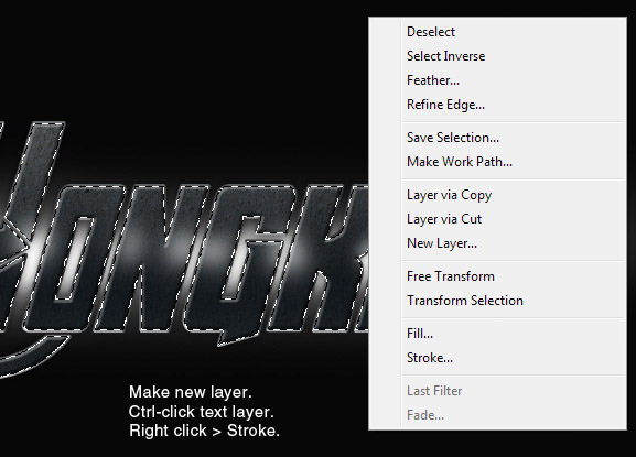
Select white color, Width: 1 px.
Step 37
Press Ctrl + D to remove the selection. Apply Gaussian Blur to soften the stroke line.
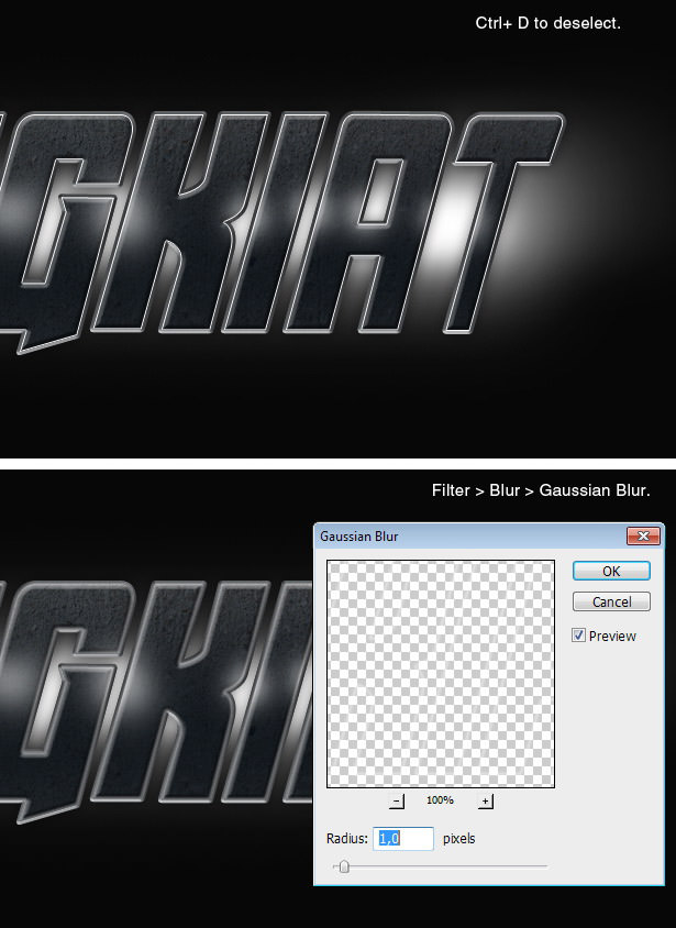
Step 38
Erase some of the stroke lines. These lines become highlights on the text shape.

Step 39
Draw another stroke line again on a new layer. Erase some of it to act as a sharper highlight.

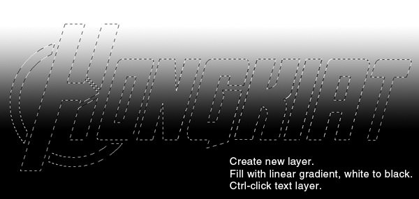
Step 40
Make a new layer and fill it with a linear gradient, white to black. Press Ctrl and click on the text layer thumbnail.
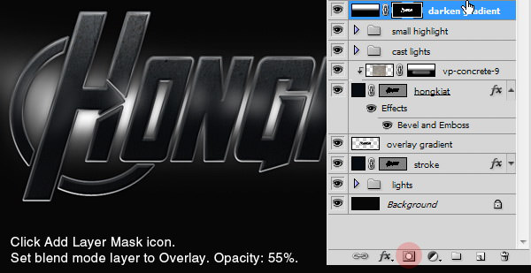
Step 41
Add a layer mask by clicking the Add Layer Mask icon in the Layers panel. Set the blend mode to Overlay and reduce its Opacity to 55%.
Step 42: Adding Color
Again, press Ctrl and click on the text layer thumbnail.

Add an Adjustment layer Hue/Saturation. Use the settings below and make sure to activate the Colorize option.
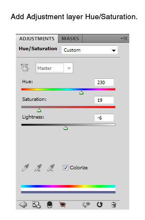
Here’s the result on the text.

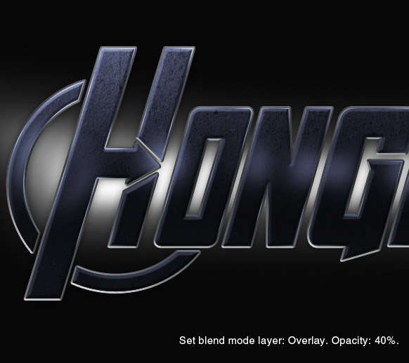
Step 43: Increase Text Contrast
Make a new layer. Press Ctrl and click on the text layer thumbnail, then fill the selection with a radial gradient from black to white.

Set the blend mode to Overlay, then reduce its Opacity to 40%.
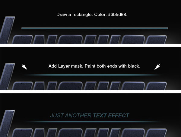
Step 44: Adding Subtitle
Draw a thin rectangle on top of the text with color: #3b568f. Add a Layer Mask, then paint both ends with black. Add the subtitle above the rectangle.
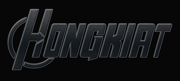
Final Result
We’re done! Below is the result of our tutorial. Click on the image to see it in full size. I hope you enjoyed this tutorial and learned some new techniques. If you have any questions, feel free to ask.