Beautiful Annual Report Designs
The usual company annual report is a word-filled extravaganza of jargon, terms, figures and text. If beautiful report designs were the norm, maybe more people would actually read them. We are used to seeing pages after pages of annual reports printed in black and white on unassuming pages. Totally predictable; absolutely boring.
Come on people! There are a lot of ways to turn a super-mundane report into one people actually want to flip through. And you can do this with the right dose of creativity.
Here we’re going to share with you 20 annual report designs which will make your imagination run wild. These annual reports use bold colors, creative typography and vivid sheets and diagrams to showcase the data.
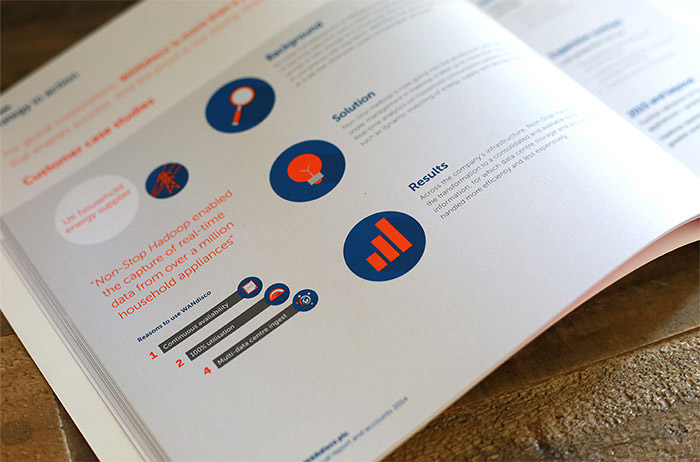
1. Wandisco Annual Report 2014

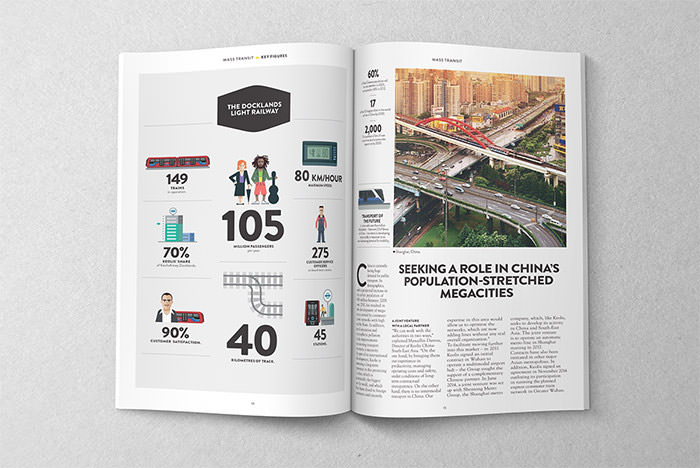
2. KEOLIS Group 2011 Annual Report

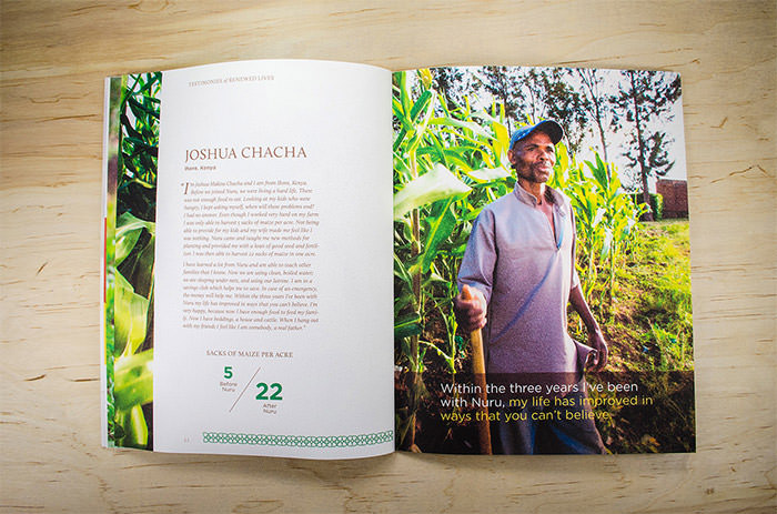
3. Nuru International Annual Report




5. 2-in-1 Annual Report & Presenter


6. Prometey Bank Annual Report 2012

7. Museum Boijmans annual report




10. “Rosneft” Annual Report 2011


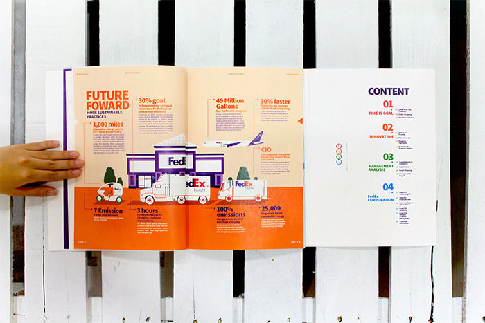


13. Barbara Jordan Institute Annual Report 2015

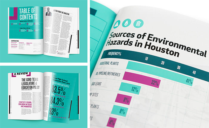
14. Annual Report
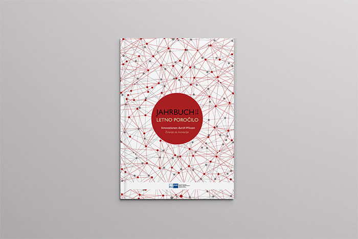

15. The Tipping Point: Annual Report

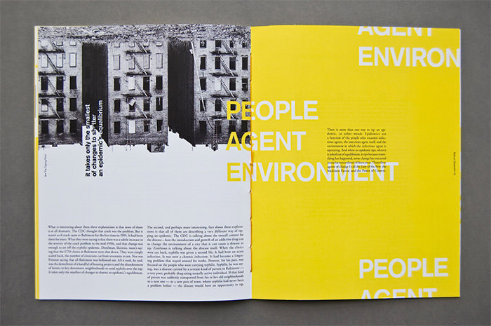
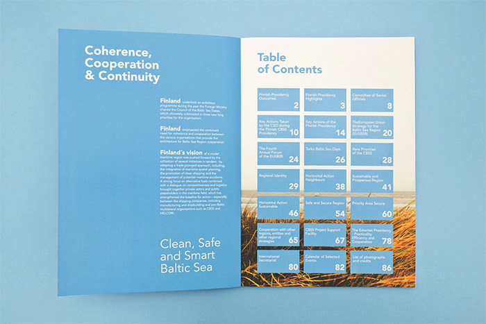
16. Council of the Baltic Sea States Annual Report

17. Vrijwilligersacademie Amsterdam Annual Report


18. Annual Report


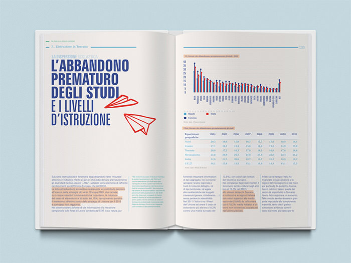

20. Alarga 2013


More: 30+ Creative Branding And Identity Designs For Your Inspiration