The Art of Lettering: Inspiring Typography in Print Advertising
Making a lasting impression through banners on the Internet can be challenging, and we believe that printed ads face a similar predicament. If your ads aren’t eye-catching and impactful, they’re likely to be overlooked and quickly forgotten. However, typography in printed ads can be an effective way to capture people’s interest and attention.
Typography can be a successful marketing tool. With software like Photoshop at the disposal of designers, the possibilities for creativity are virtually limitless. However, this can be a double-edged sword. If typography is not executed properly or precisely, it can backfire, making it a challenging task.
In this post, we’re going to introduce some strategies for creating compelling typography-based print ads. We’ll also provide examples for your reference. We hope these tips and examples will inspire you and help you create effective and memorable ads. :)
Minimal Text, or a Wall of It
Unlike advertisements for television, print ads offer a unique advantage. People do not have to sit looking at the ad page; they can simply skip past it to the article they want to read. However, the ultimate goals of any advertisement are to capture the viewer’s attention, make them stop, view the ad, and remember the message. To achieve this, your text needs to grab people’s attention instantly.
There are three effective text formats in advertisements:
-
Say little and convey a lot: Clever ads often use this approach. They display one word and then have another word written in the negative space created by the letters. This technique is visually engaging and can convey a powerful message with minimal text.
-
Say a lot of interesting things, or boring things, displayed in an interesting way: A wall of text won’t keep anyone’s interest unless it starts with a compelling “hook” or the typography is appealing enough to make the viewer want to read to the end. The key here is to present the information in a way that is visually appealing and engaging.
-
Don’t say anything in actual text: Instead, shape letters or words out of objects in a picture. This creative approach can be very effective in capturing attention and conveying a message without using traditional text.
Different kinds of ads call for different amounts of text, but it’s surprising how versatile these three formats can be. Here are a few examples of print typography campaigns:
Examples:
Coppertone Sunblock: Kobe


Coca-Cola Light: Lemon Peel

Ikea

Pepsi: Joy

Penguin Books: Travel with words, Paris

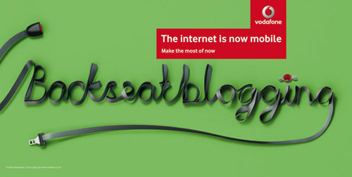
Vodafone
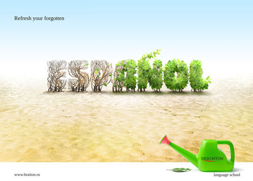
Brighton Language School: Espanol
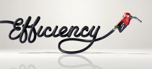
Toyota: Efficiency
Smarties Campaign


U.S. Preventive Medicine


Complot Creativity School – Typography Course: H

Bert & Bud’s Vintage Coffins: Mellow

Lots of Eye Candy
Print advertisements do not have the luxury of motion and sound that television ads enjoy. Therefore, they must utilize their space effectively to capture the viewer’s attention. A striking image serves as an excellent tool for this purpose. However, being an advertisement, it also needs to incorporate all the necessary text into the composition.
This requirement often leads to creative solutions, such as forming images out of type or crafting words out of images. The use of flashy special effects also proves to be effective in grabbing attention. In essence, print ads offer a feast for the eyes, making the most out of their static medium to deliver their message.
Examples:
United Nations Population Fund: Population day

Orange SMS
Text messaging while driving prevents you from seeing what really matters.

Hahn Nitzsche Recording Studios: Kaffee

PS2: Girlfriend

Classic & New Recording Studios

Punny Messages
Visual puns are an excellent tool for conveying a significant message with just a few words. They are particularly suitable for print advertisements, where the objective is to communicate everything through a single static image. Typically, visual puns incorporate a part of a well-known phrase or proverb and complete the pun using various materials and special effects.
Let’s delve into the anatomy of a visual pun:
Consider words like “bad credit,” “taxes,” and “bills.” Then, imagine the shape of prison bars. The next step is to merge these two elements by constructing the bars using the words. To enhance the message, you can add a subtitle such as “Don’t be a prisoner to your finances.”
And there you have it – a visual pun!
Examples:
Mitchell Eye Centre: Trash

Mitchell Eye Centre: Diamond

Feltrinelli Publisher: Berlusconi’s bubble

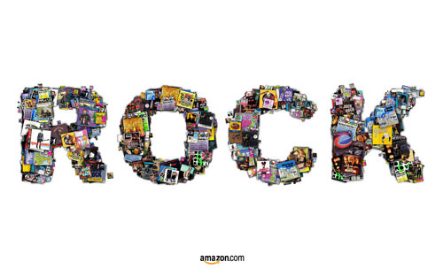
Amazon: Rock
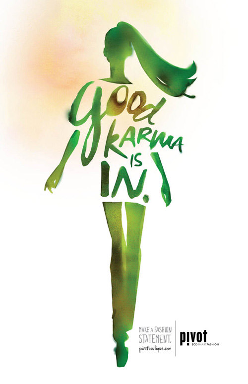
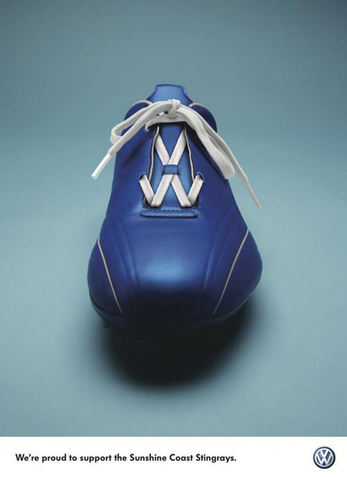
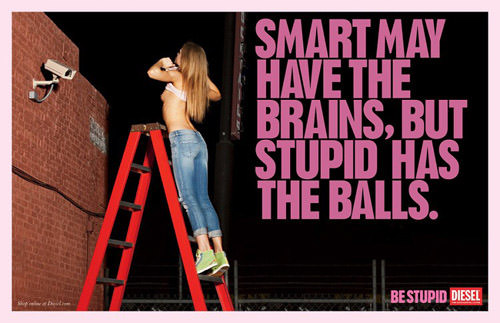
Being a Little Offbeat
The sheer volume of advertisements already in existence makes originality a challenging pursuit. One potential solution to this problem is to create progressively more unconventional and dramatic content. If an idea for an advertisement appears too strange, it’s worth considering that its peculiarity might actually make it memorable to the audience. After all, the ultimate goal of every advertisement is to make a lasting impression.
Examples:
Pivot Boutique: Karma
Volkswagen: Laces
Nike ACG 20th birthday: Strut

Corrado Mattresses

Pak-n-stor: Basement

Diesel Jeans: Be stupid
No matter what type of print ad you need to create, you should consider typography as an essential element of the ad rather than just text.