Showcase of Eco-friendly Website Designs
What is the best source of the inspiration? The nature! By living in this beautiful mother Earth, we could get so much inspiration from the sky, the trees, the grasses, and even the ground, your brain is the limit! Witnessing their very beauty, it’s a no-brainer for web designers to implement these elements of nature into what’s so-called eco-friendly web design.
In this collection you will find 30 chosen examples of nature-inspired websites. Most of the websites use nature-related colors like green, brown and blue as well as the natural textures like leaves, floral and woods. Hope the showcase will inspire you to do an eco-friendly website, be ready to fill your eyes with the beauty of nature then!
More beautiful web design showcases:
- Web design: Hand-drawn
- Web design: Minimalism
- Web design: Typography-based
- Web design: Retro and vintage
- Web design: Space-inspired
- Web design: Black and white
- Web design: Single-page
Origen Creatives
Green and brown, the two colors which are mostly associated with the nature are used in this website design, and they are combined nicely to create an eco-friendly website! Simple logo with leaf design makes the website look even more charming!

Sunrise Design
Really beautiful and refreshing watercolor illustration. Simple, yet impressive.

Lipton Green Tea
Lipton Green Tea website uses a lot of green colors to bring out the nature feel. Beautiful plant graphics and stylized floral help greatly to create the nature feel.

Sera Tomate
Outstanding and catchy picture of shiny tomatoes, definitely an attention grabber!

Cookiesound
The entire layout is dominated by brown color, cardboard and paper textures as well as subtle plant graphics which create nature feel throughout the site.

Sproutlet
Refreshing example of eco-friendly website with engaging green colors and plant illustrations.

RxBalance
Another website with brown color scheme and high quality plant graphics, it looks just awesome!

iMyGarden
Unique layout with green and brown color combination and subtle wood texture associated with nature.

Purple Tree Farm
Old wood texture and leaves with strong color are really great combination. I felt nature!

Summer Activities
Green and cartoonic landscape illustration makes the website look really eco-friendly, cute and charming!

Hyderabad
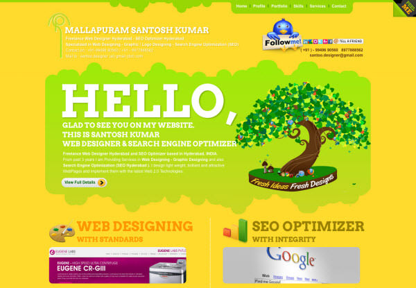
Shiny colors definitely make the site stand out from other nature-inspired site.

Allure Graphic Design
Florals are great when it comes to decorate the site, which make the site look like it’s in the wonderful nature!

Priid
Simple and beautiful nature landscape illustration makes visitors feel comfortable with the site.

Bear Grylls Live
Breathtaking typography and jungle texture, just wow!

Stop The Vom
Amusing nature-inspired illustration makes this site more interesting than others!

Toasted Digital
Toasted Digital website uses awesome and somehow cute illustration of countryside to impress visitors.

Aussie BBQ Legends
Your BBQ promotion won’t look delicious without a design like this. Wild and fun!

Fran Boot
Outstanding example of dark website with nature elements, and the water reflection at the bottom is just creative!

Go Glamping
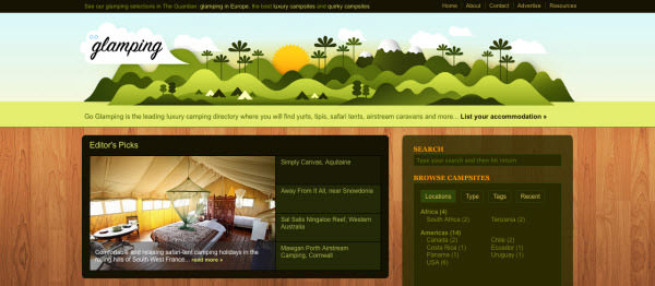
Great example of the uses of simple and engaging nature-inspired vector graphics in the site.

Tori’s Eye
Origami for decorating a site? Creative!

Eco Lecom
Eco Lecom website uses beautiful and elegant watercolor paintings of plants and birds as decoration, creating a relaxing feel for the site.

Kooba
Lots of green stuff and textures in the site to help create an impressive eco-friendly website design.

Meomi Cloud House
Meomi Cloud House stands out by putting the cute nature-inspired illustration with fake 3D effect into the site.

Komodo Media
Pretty website with subtle wood textures and reasonable amount of plants.

Ecoki
Ecoki website uses mainly brown color to bring the nature feel into the site. Subtle recycled paper texture creates an image of eco-friendly organization.

Ecoki iPhone App
Beautiful example with landscape implemented as a background of the website. Tea leaves bring even more nature feel!

Eco Vitta Residencial
Eco Vitta website looks very clean and refreshing. Bright sky background with few clouds create positive mood, and the wood texture used on the navigation menu definitely makes the site look more eco-friendly!

Ryan Scherf
Landscape, floral graphics and some cool textures combined wisely into an inspiring web design.

Eco Environments
Eco-Environments website stands out with nature-inspired graphics which also promote renewable energy.

CURE
A convincing website with brown colors dominated the entire website! Subtle grunge textures add even more charm into the site.
