36 Quirky and Interesting Packaging Designs
It was 1035 when a Persian traveler walked into a market in Cairo and noted that vegetables, spices and hardware were wrapped in paper for the customers. This is the earliest record of packaging. Since then, packaging has evolved into a great industry that serves so many purposes for modern society, making package design one of the most essential elements to sell products.
First impressions make all the difference, especially in a fast-paced age when everyone is just too busy to take a step back to wait and see. But what kind of design will impress the consumers? In this particular post we want to show you some possible answers by showcasing 36 extraordinary packaging designs by extraordinary designers.
With that said, you might be able to pick up a lot of interesting visual elements to use in your designs as well.
20 Creative Packaging Design
When you're at shopping at the supermarket, chances are you'll probably buy things that you might not necessarily... Read more
Antismoke Pack
An impressive packaging design that shows the smokers what the cigarettes can offer them – faster path to death.
(Image Source: Reynolds and Reyner)

Anti-Theft Lunch Bags
“Anti-Theft Lunch Bags are zipper bags that have green splotches printed on both sides, making your freshly prepared lunch look spoiled. Don’t let a sticky-fingered co-worker or schoolyard bully get away with your lunch ever again!”
(Image Source: thinkofthe)

Butter Spoon
Ever wanted to have some butter yet you have to find a spoon somewhere? Well this packaging design actually solves that problem.
(Image Source: Yanko Design)

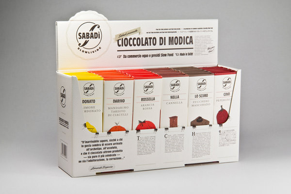
Sabadi
Did you notice their small hands? Small but creative designs could make great differences.
(Image Source: Happycentro)

Yarmarka Platinum
A product that shines with its design implies quality and creativity.
(Image Source: KIAN)

Trata OnIce Packaging
A creative design by Beetroot that makes the products recognizable from any view angle, and it gives a delicatessen feeling as well.
(Image Source: Beetroot)

Wanted Snacks
Besides the packaging that ensures the quality, the amusing illustration of the snacks just makes me want to have one of each!
(Image Source: Peter Gregson Blog)

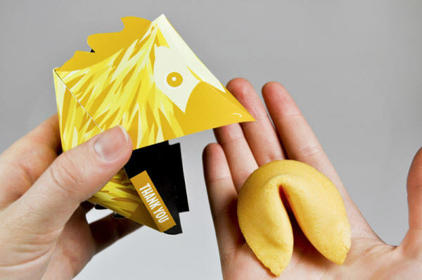
Beijing Buffet Fortunes
Interesting fortune cookies with a cute design? Now that’s a must-buy.
(Image Source: Caroline Brickell)

Dino
Dino gum! There’s no doubt I’ll just buy the gum for its dino-styled package!
(Image Source: BQB)

Gubble Bum
Amusing design that can’t be done without proper illustration.
(Image Source: JJAAKK Design)

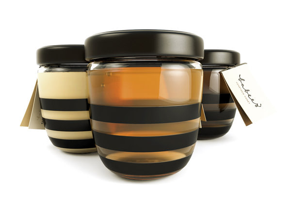
Babees Honey
What could be sweeter than a slim bottle design that actually looks like a cute bee?
(Image Source: AH & OH)

Ice Cream Cup Bobblers
How dare I eat you! Killer product for children and girls, for sure.
(Image Source: junfei176)

NYC Spaghetti
A very famous and impressive design that is showcased through several famous blogs, and this masterpiece is actually just Alex Creamer’s university project! On the bottom side of the box is a model of the Chrysler building that pushes the spaghetti up to create a skyscraper shape showcased below.
(Image Source: Alex Creamer)

Mr Lee
The design, especially the expression really adds to the attractiveness of the product.
(Image Source: Design Bridge)

I’m Not A Battery
“Rechargeable power for your dining table.”
(Image Source: Mehmet Gozetlik)

STR Bottle
With the implementation of ground-breaking UV ink technology, dBOD is able to make its bottle come to life when it’s exposed to UV black light, which makes the hidden ink suddenly flare up on the bottle’s surface, revealing a glorious design.
(Image Source: dBOD)

Colier
I wonder how many champagne lovers will reject this royal design. It’s just too sexy.
(Image Source: Reynolds and Reyner)

AMPRO Bottle
The bottle which also serves as the glass, talk about user-friendliness! Yet the design can be so elegant without eating into function.
(Image Source: AMPRO)

Norsk Ol
Charming design based on the fictional character, “Nisse”, which are small mythical creatures that are “thought to bring good luck but are also mischievous as well”. Legend says that they dwell in barns and around farms.
(Image Source: Ryanna Christianson)

Cider
Now this one is really clever. By simply altering the design the can shows different messages that brings a smile to customers. That’s called creativity.
(Image Source: Amore)

FIRMA PACKMAN
Really amazing design that strikes the eyes of the consumers, also probably one of the designs that deserve the consumer’s money.
(Image Source: FIRMA)

Milk
Sometimes the direct message just works, and it works really well.
(Image Source: VisualAdvice)

Soy Mamelle
Not only is it fresh, it can even be squeezed!
(Image Source: KIAN)

Fridgeezoo
You won’t be able to get young or female customers without cute designs, and these Fridgeezoo packages shows you how it’s done.
(Image Source: Appare Store)

Fruit Juice Packaging
Undoubtedly a masterpiece by Naoto Fukasawa, not only does the package design tell you what’s inside the package, it actually gives yout he feeling that it’s fresh and delicious!
(Image Source: Toxel)

Juice Box
Another delicious juice packaging that uses the fruit skin as part of its design, and it does looks really juicy! Well done slwshin!
(Image Source: slwshin)

Frusion
Not feeling the mood to have a fruit? Then this package is goign to make your fruit look more adorable. A happy design makes the product more appealing for sure.
(Image Source: designslave)

Hanger Tea
I’m not sure, but I think no other tea packaging can be more charming than this! Also a great execution of colors does improve the design a lot.
(Image Source: Yanko Design)

DemocraTea
How’s the taste of Obama? Maybe this DemocraTea will give you some signs. I don’t prefer others, just in case you ask.
(Image Source: Donkey Products)

Kleenex
Award-winning design from Hiroko Sanders, and the design just shows why it’s the judge’s favorite!
(Image Source: Hiroko Sanders)

Herokid™ Magic Box
Classic example to show you how making a simple modification can make a product look far better than its usual form.
(Image Source: Andreu Zaragoza)

Rellana Wool
The design of the Ogilvy Deutschland has the same packaging style as other similar designs, but the design of the package changes everything from plain to impressive. This probably shows you how important the creative design is.
(Image Source: WPP)

Noté
With the over-saturated earphone market, this kind of design is guaranteed to attract the consumer’s eyes.
(Image Source: Corinne Pant)

EarBudeez: Rojo
Another impressive one with a hardcore design, I like.
(Image Source: JDA, Inc.)

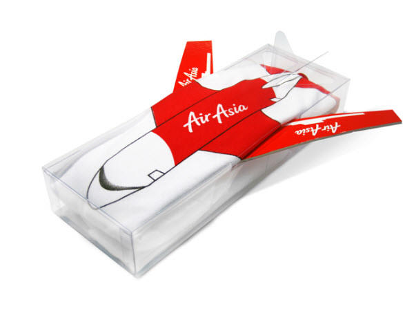
Sod Air Asia
What makes this Prompt Design’s work really striking is its surprising red wing packaging that actually functions as a cloth hanger.
(Image Source: The Dieline)

Spikes
The best packaging design could be the design that shows off the msot amazing feature that the product offers.
(Image Source: The Dieline Awards)

Reflection
So you probably know by now that an impressive design attracts customers, yet these impressive designs are mostly slight modifications from what have already existed for years. That’s how it works – you don’t have to make impressive stuff by reinventing the wheel, but instead focus fully on the elements that will shine before the customer’s eyes and trigger their feeling.
But your thoughts could be different! What do you think of the designs above? Are they impressive to you? Which ones are your favourite? We look forward to your kind comments as they are what keeps us going, thanks!