10 Interesting Apple Watch Concept Design From The Past
One of the much-hyped devices of the decade was the Apple Watch, which was released back in 2014. At that time , Apple had a team of 100 designers working on the device which was to carry biometric features and health monitors on top of a revolutionary (see: curved glass) design.
So, while the world was waiting for the release of Apple Watch, some pretty amazing Apple Watch concept designs thought up by independent designers were already on the web. Some of these concept designs emphasize on the shape and form, while others focus on function and the UI that was bound to change the way we interact with technology.
Best Apple Watch Docks (20)
Discover the best Apple docks for charging and syncing your devices. Keep your workspace organized and efficient with... Read more
Zach King
Although the Apple Watch in this concept may be flat, with no room for a lot of gears and screws inside, on the outside, it opens up a world of possibilities: with a holographic interface.
With the Apple Watch projecting your apps into the air, you can swipe your fingers in the air instead of a metalic surface or glass, and escape the rigid confines of a tablet or smartphone screen. Keep your health stats constantly monitored, video call a friend on the go and even passcode-lock your door with it!


Antorio Derosa
From a holographic surface, we make a return to interacting on a flat screen and this curved corner Apple Watch design keeps the idea minimalistic and stylish.
Merging the conventional idea of a watch but giving life to the screen this design gives users an interactive screen and three buttons for power and volume control, just like a regular smartphone.


Tolga Tuncer
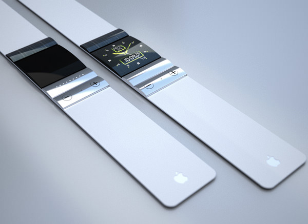
The talk about curved glass being an integral characteristic of the Apple Watch seems possible with this rendition. At 3.3 cm wide, this watch concept looks like it is a part of the Macbook family, particularly since it also has a touchpad. The screen however is not touch-enabled, and the way the watch bends may not fit onto every wearer’s wrist.
On the bright side, the watch is solar-powered, which will give you motivation to get out more


Stephen Olmstead
Don’t let the old-school design fool you. Each part of this Apple Watch concept serves a purpose that would fit the way we interact with out gadgets in spite of its classic and timeless look. In this shot below you are looking at an e-ink screen that is ‘clickable’, with a camera lens above and a microphone, flanked by two speaker outlets below.
You can choose between Siri or the two side buttons to interact with the apps run on this smart watch.


Pavel Simeonov
This particular version does not try hard to reinvent itself because why break something that isn’t broken, right? Just imagine an iPhone at a size that you can strap onto your wrist. By far, this concept should have one of the largest screen sizes among the other concepts in the list, making it the perfect device to watch videos on, Facetime with friends or check Maps on.
However, there is always a problem with large screens – how is this watch going to fit on a wrist?


Edgar Rios
Like the previous concept, this one also utilizes a large screen size to fully display its contents, from the face of a traditional wall clock to weather conditions, music interfaces to new incoming notifications
The designs are available only in black and white but there isn’t a lot of information on the strap material, the screen or if there are any external buttons.

Diccarese Design
This Apple Watch concept design by an Italian team has been making the rounds in tech sites recently and you can clearly see why. Designed to suit the latest iOS interface, the build of the device answers a lot of ergonomic and usability needs potential buyers (will) pose.
The elegant and beautiful final solution of curving the device naturally around the wrist breaks one of the biggest hurdle of turning the design of a smart watch revolutionary yet practical.


Yrving Torrealba
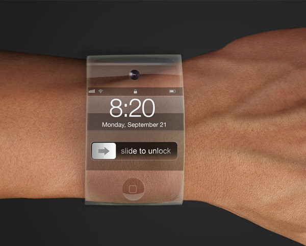
The idea of a see-through smart device is far from new, and even ‘farther’ from feasible. But if concept designs have any primary purpose, it is to inspire designers to create concepts that are not only different, but jaw-dropping, and mind-boggling. Remember the iPad?

Esben Oxholm
If the Apple Watch is not going to fall back on straps, then the idea of fitting different-sized watches will be rather insurmountable. At least this version has sections which you can remove or add, to reduce or extend the length of the watch.
The only physical button here is the infamous Home button although there isn’t more info about what the button (or the watch for that matter) is capable of.


jivaldi
This concept seems to have everything: a large enough touch-enabled screen akin to that of a smartphone’s, the actual face of a watch, external side buttons and a Home button. The design also looks flexible (and rubbery) enough to fit snugly onto a wrist. But will it become real?


