Interaction Design: How to Create Simple User Profiles
Let’s think together. Suppose you want to make a product or website for someone. What’s the first thing you think about? Do you think about what they like, or do you think about the people who will use what you make?
Experts now say the best way is to think about the people who will use your design. This idea is called user-focused design. It means you should mainly think about the people who will use your design, not just the person asking you to make it.
If the users are happy, the person who asked you to make the design will also be happy. This means they will be ready to pay and give good feedback. To do this, you need to know the users well.
Making designs for users can be tough. You need technical skills, creative thinking, kindness, and a good understanding of how people think. To help with this, designers make user profiles, also known as personas.
Why Experience Design is The Next Big Thing
A scary article about the death of web design swept through the internet this summer making the web... Read more
Why Personas Are Important
When you make a product, many people will use it. So, the big question is: how do you make something for everyone? Instead of seeing your users as a large group, it’s better to think of a smaller number of users. This helps you understand and design for them better.
A Persona is like a made-up version of a regular user. Remember, you don’t need to have just one persona. But, having too many can be confusing.

Personas are not just imaginary users. They should be based on real user studies. It’s a good idea to make personas early in the design process. This way, you can involve your client too. They might know more about their users than you do.
Personas also help avoid wrong ideas or judgements. When you think of personas as real people, you design for them. This is better than designing for a vague group of unknown people.
A Simple Example: Persona Cafe Story
Personas help us think about specific users instead of a general group. Let’s look at a real example to see how personas can be used in designing a user experience.
Imagine you have a client who asks you to create a website for a well-known coffee shop on a university campus named “Persona Cafe”.
Persona Cafe offers hot and cold drinks, sandwiches, and sweets. It’s where students and teachers hang out during breaks or after class. The cafe owners want a website that their visitors will love. What’s the first step you’d take?

Getting Started
Personas are often shown as one-page visuals that you can print and keep nearby when designing. You can find and download helpful persona templates online or use tools like this User Persona Maker.

Remember, personas are different from user groups, market categories, typical ideas, or roles.
If you’re thinking of a usual university student or a typical professor when considering the users of Persona Cafe, change that thought quickly.
The main thing to understand is how they connect with your product, the aim they have, or the issue they’re trying to fix using your product. For instance, a security officer at the campus might have the same reasons to visit the Persona Cafe as a hardworking student – they both might share the same interests and aims.
About Andrew, Virginia, Jeanne
First, let’s discuss some basic details about our personas like age, job, and so on. Remember, these details aren’t the main focus for the design. They help us see them as real people. What’s truly important are the stories we’ll attach to our personas later.
Names, Ages, and Places
To avoid biases or stereotypes, we’ll use a fake name tool and a free photo website to create our personas.

I set the tool to make American names since our fictional campus is in the U.S. I chose ages between 19 to 46 and an even split for gender. This reflects a usual mix for a university cafe (students and staff).
The tool gave us these three names:
- 26-year-old Andrew from Oakland, CA
- 22-year-old Virginia from Stanley, NY
- 45-year-old Jeanne from Chester, SC
Based on their ages, we think Andrew is a graduate student, Virginia is an undergraduate, and Jeanne is a professor.
Pictures
I used the Pixabay photo site for our personas’ pictures. For Andrew and Virginia, I searched for “university student”. I chose the first male picture for Andrew and the first female picture for Virginia. For Jeanne, I looked up “teacher” and selected the first middle-aged woman picture.
So, we have random names, ages, places, and photos for our personas. This way, we’re sure we’re not using any of our own preconceived ideas.

The Stories
With the basic details of our example users ready, let’s set them aside for a bit.
Let’s think about how a usual user of a university cafe feels about the place. What do they need? What bothers them? What are their aims or problems? The best way to know is to ask real users. You can talk to your client or even ask friends or family what they think when they visit a coffee shop.
Using Real Feedback
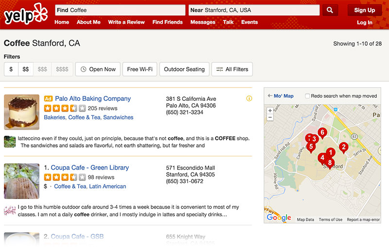
The internet also offers insights since many people share their experiences online. For this example, I checked the Yelp review site. I selected Stanford, California as the location, representing a usual U.S. university setting. Then, I looked at Coffee & Tea Shop reviews to get a sense of what regular users of a university cafe feel.

You can see the reviews I found on this link. Or, you can search other locations if you prefer. Here are some quotes from the reviews to give an idea of what the future customers of our Persona Cafe might think.
Reasons They Visit
“I prefer this place over the one on university since it’s more affordable.”
“The Venezuelan lattes here give a strong boost of caffeine, great for studying at the green library.”
“It’s great having this spot right between the Education buildings and two libraries…”
“My boyfriend and I had our first date here. It holds a special memory for me.”
“I love its location and the food portions they serve.”
Things That Bother Them
“During lunch, they misplaced my order. I waited 45 minutes for a takeout.”
“I think I had the worst iced double espresso here.”
“The dusty atmosphere and the noise seemed to have affected the care in making the lattes…”
“My friend is allergic to certain nuts. The crepe didn’t mention any nuts in its ingredients.”
Their Aims
“I visit this outdoor cafe often because it’s close to most of my classes.”
“I like their strong coffee. It’s the right size for a quick energy boost.”
“They offer online orders, which is convenient. Plus, their prices are fair.”
“Being vegan, I order the same items always. Love their hummus plate, vegetarian panini, and hummus veggie wrap. Their drinks are great too.”
Linking Personas to Their Stories
After understanding the common needs, aims, and problems of general customers, let’s get back to our personas. Remember, they don’t show a certain group but rather a specific way they feel about the product.
Andrew, 26 – Graduate Student
About Andrew:
Andrew is a dedicated PhD student seeking a quiet spot for focused study and reading. Given his extensive time on campus and love for coffee, Persona Cafe is a great fit for him. He values quick, efficient service, the ability to order from his phone, and prefers minimal interruptions from staff.
What He Wants:
- Top-quality, robust coffee
- A calm setting for study
- A convenient spot near the campus
What Bothers Him:
- Long waits for his coffee order
- Frequent disruptions from staff when he’s engrossed in his work
- Concerns about the coffee’s strength affecting his focus
His Aims:
- He wants to know about the kind of coffee served at Persona Cafe to judge its quality
- Quick access to the menu and any daily specials
- The ability to order using his smartphone
Virginia, 22 – Undergraduate Student
About Virginia:
Virginia is budget-conscious and doesn’t often eat out. However, she loves spending time with friends and looks for places where they can meet up. Their gatherings aren’t really about studying; it’s more about relaxation and enjoyment. While she can’t spend much on food, she enjoys a diverse menu and gets bored with repetitive meals.
What She Wants:
- Affordable prices and generous portions so she can order just once
- A wide variety of food and drink options, including some unique choices
- A regular spot to hang out with friends
What Bothers Her:
- Spending her money on bland, unappetizing food
- Unfriendly staff that might dampen their fun
- Prices that could be too high for her and her friends
Her Aims:
- Quick access to the menu prices
- Loyalty rewards like discounts or coupons
- Detailed descriptions of food and drinks to help her choose the best options
Jeanne, 45 – Professor
About Jeanne:
Jeanne’s cafe visits are less frequent than Andrew’s or Virginia’s. She is health-conscious, preferring to stick to her diet and limit eating out. Rather than spending breaks at a cafe, she prefers to take walks. When she does visit a cafe, it’s usually due to an invitation from colleagues. A neat environment is crucial for her. She doesn’t drink coffee and is particular about having only healthy meals.
What She Wants:
- A welcoming setting that’s good for professional discussions
- Diet-friendly food and drink options
- An opportunity to interact with her students at the cafe
What Bothers Her:
- Concerns about an untidy setting, which can be a distraction
- Unhealthy food and drink options disrupting her diet
- Long waiting times during busy hours
Her Aims:
- She wants a cafe near her university, making it easier for both professional discussions and student meetings
- Detailed ingredient lists for menu items, so she can make informed choices
- An avenue to provide feedback on service and quality after her visit, since it’s a rare treat for her
Wrapping Up
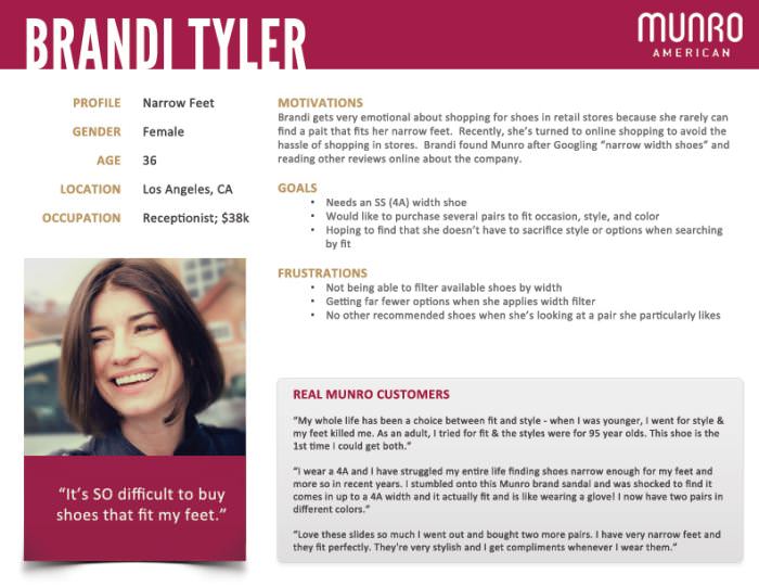
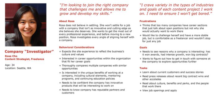
And there we have it! We’ve now completed profiles for our three personas, who showcase the desires, aims, feelings, and challenges of Persona Cafe’s potential visitors. If you’re a fan of visual aids, you can search for or craft a stylish persona template and populate it with the details. Here are three excellent examples for you to consider.
It’s crucial to understand that personas are rooted in interaction design. Before diving into the visuals, adept designers should first grasp how future users will engage with their creation.


