20 Deliciously Creative Candy Branding Examples
Everyone gets a little craving for something sweet once in a while. So how does one decide which sugary treat to get? Well, more often than not, it usually comes down to the packaging. Believe it or not, the way a candy is packaged and branded can have a huge impact on its potential customers.
Moreover, the competition among candy retailers is in full force, so quirky and creative package design is definitely the best way to increase sales. Here you’ll be able to find 20 creative candy branding examples that I’ve put together. From adorable red fishes in an envelope to finger candy that’ll confuse you, these unusual candy branding examples will have you wondering if you’re on a sugar high.
Recommended Reading: 20 Creative Branding And Identity Designs For Your Inspiration
Candy Craft Branding by Dylan Wright. Simple and effective with its use of the products, this candy craft logo just pops out at you!

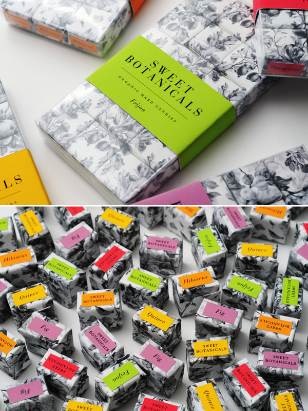
Sweet Botanicals by Miguel Yatco. Not all candy packaging has to be colorful and loud, these ones are not only sweet but sophisticated too.

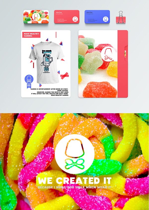
Jelly.holic by Đức Hữu. Sometimes you just have to let the product do the talking and the jelly beans are definitely speaking for themselves.

Lifeboats Branding by Vicki Turner. Set sail for some yummy candy in your tummy.

Sweet Botanicals by Meghan Calabro. A pleasing and colorful wrapper can make all the difference in enjoying your treat.

Brooks Brothers x Swedish Fish by Miguel Yatco. It may seem like an odd combination but you’ll definitely want these cute fishes to swim in your direction.

Uppers and Downers Promo Gift by Marx Design. You won’t find these just any regular pharmacy. Whatever your mood may be, there’s a candy available to aid in your dilemma.

Sugarpova by RED ANTLER. Your lips can say a lot about you and Maria Sharapova’s premium candy line uses different lips to convey various personalities.

ПАЛЬЧИКИ ОБЛИЖЕШЬ / FINGER-LICKIN by Constantin Bolimond and Tamara Vareyko. This is a humorous take on the brand’s identity of being finger-licking.

Allsorts by BOND Creative Agency and Marko Salonen. A good indicator of the candied delights that await you inside the box.

Karamelleriet by Bessermachen DesignStudio. The patience and craft behind these handmade caramels are complemented by the simple but effective packaging.

M&M’s Packaging by Christina Bull. No more having to sort the m&m’s out according to color with this nifty little case.

Chop pop by alex la chance. It may be a design for lollipops for men but no sucky packaging here.

Happy Pills by Marion Donneweg. You don’t need a prescription for these happy pills. Just make a trip to the candy store.

Arctic Candy by Neue. The design on this little tin is berry, oops, I mean very, nicely done.

Candy King by BVD. All hail candy! The true problem solver of everything!

SWEET TOOTH CHOCOLATE by Chrystian Guillermo. Using the product in the logo itself in a subtle way makes for a simple yet satisfying branding technique.

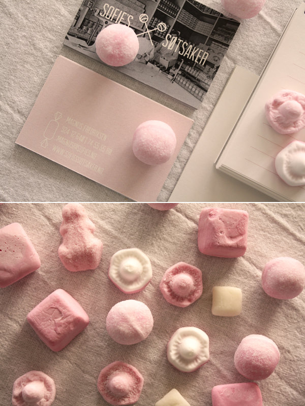
Sofie´s søtsaker by Karine Kimo Pedersen. A vintage feel doesn’t have to be a cliche for candy brands. This one makes classic a classy statement too.

The Sweet Taste of Brand Success by Workbrands Ltd, bObby peliza and Tom Ovens. What do artisan truffles and Workbrands have in common? They’re both pretty exquisite.

Yumbers by blanka kvetonova. Sometimes, all it takes is a little flower power for a retro candy to stand out.
