30 Creative Double-Spread Magazine Ads That Keep You Engaged
Magazine ads are considered a more traditional form of advertising and take up over 30% of conventional magazine space. However, if done correctly, marketers can use their ads to focus on a particular target audience by choosing the right magazine to feature them in. This also paves the way for higher reader involvement.
Thinking outside the box definitely helps in creating impactful and effective ads, and double-page spreads leave plenty of room for creativity and innovation. I have put together 30 creative examples of double-page magazine ads to show you what I mean. Let’s just say you probably wouldn’t mind a magazine filled with ads if they are as interesting as these!
20 Editorial Design Pieces for Your Inspiration
With so many websites having similar designs and structures nowadays, it's very important for any web designer to... Read more
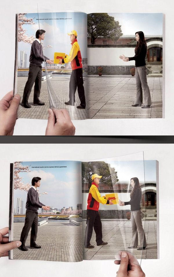
DHL: “Turning Page” Print Ad
Created by: Shanghai J&j Advertising Co., Ltd
DHL is known for its speedy delivery service. Here, their ad cleverly utilizes a transparent sheet of PVC paper to reflect just how fast their service is, regardless of how you turn the page.
Smuckers: Better Together
Created by: Art Director Elinor Buchler
Just like peanut butter and jelly, Bert and Ernie from Sesame Street also complement each other. Smuckers uses recognizable icons like them (among others) to showcase just how well they work together.

MacBook Pro: Ultra thin
Created by: SVA New York, USA
So this is what it feels like to have a Macbook Pro on your lap. Well, it’s not “paper”-thin, but considering the power a Macbook Pro packs at only 1-inch thick, it’s definitely thin enough by laptop standards.

Olimpia, La Fabril: Magazine
Created by: Maruri Grey Ecuador
When we see a bug flying around, our first reaction is usually to take a magazine and kill it. But seriously, why ruin a good magazine when you can use a floor cleaner that has insect repellent action in it,1111 too?

SulAmerica Health Insurance: Torn
Created by: MPM Advertising
Oops, did you that tear that dollar bill in two? Don’t worry, it’s just SulAmerica’s way of telling you that they won’t let you do the same with your company’s resources.

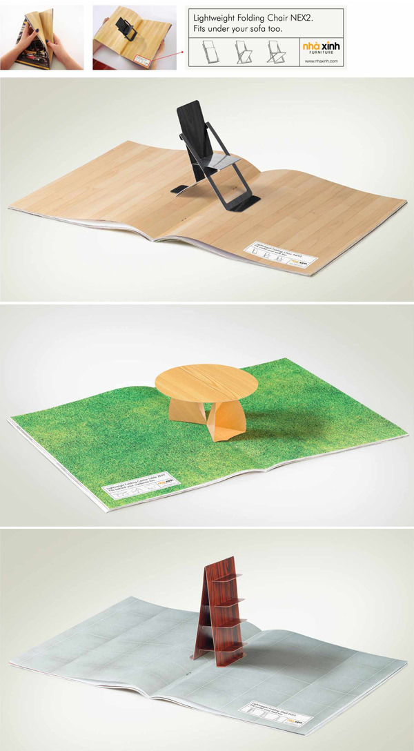
Furniture: “Folding Chair” Print Ad
Created by: Grey Group Vietnam
How’s this for how small a space you can store away your folding chairs? Pop-up ads put to good use.
Adidas Forever Sport Campaign
Created by: Unknown Agency
If only workouts are as easy as flipping the page back and forth. But hey, a girl can dream.

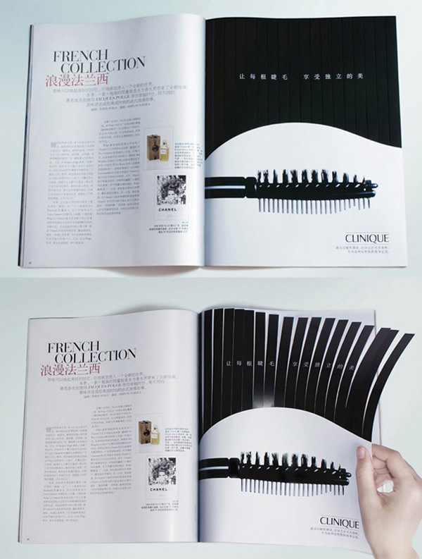
Clinique: “Lashes” Print Ad
Created by: WE Marketing Group
Now this is an ad that really gets you up close and personal with what the product can do. Flirty lashes, anyone?
Arcor Bubble Gum Ad
Created by: Leo Burnett
A fun ad that banks on your childhood need to blow the biggest bubble gum on the land (without breaking it)!

Shikun & Binui Solaria: Sun light
Created by: BBR Saatchi & Saatchi
Alright, I admit that this one isn’t a double-spread, but the illusion still needs two pages, pretty thin paper, strategic color placement, and a little ingenuity to work. “Solar-powered” ads FTW.

EDF: Clap Clap
Created by: Euro RSCG C&O
Put your hands, er, pages together to help celebrate the major wins of athletes from the EDF company in European championships, world championships, the Olympics and Paraolympics.

Hawaiian Tropic: Enjoy the sun
Created by: Grey
Not only is this an ad for a tanning product, but even the magazine also wants to get in on the act. A handy tanning tool to bring on the go.

WMF Kitchen Knives Ad
Created by: Leo Burnett Bangkok
The ad may be exaggerating but knives that can split food into two identical halves are definitely a chef’s dream tool.

Kotex: Dry leaf
Created by: Piyush Pandey
Readers open the pages to discover that there’s a dried leaf in between. How much more absorbent can these products get?

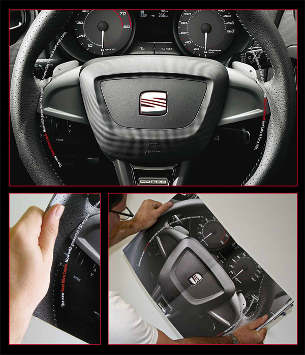
Seat Ibiza Cupra: Wheel
Created by: ACW Grey
Take the wheel. Yes, literally.
Depilatory Strips: “EPILDOU” Print Ad by
Created by: Lg2
Want clean and smooth legs free from hair? If only the deed is as easy as flipping a page. Well, lookie here.

BR Petrobras Oil: Victory
Created by: Master Rio de Janeiro
F1 fans would love to wave the checkered flag at the end of an exciting race. This is as close to a reenactment as you can get. Flip their pages!

Bic Soleil Clic: Hand
Created by: Dragster
The right razor can let you get into hard-to-reach spaces with ease. The differences are laid apparent perfectly with the use of white on bright orange.

Conto Barriers: Lift
Created by: McCann Erickson Prague
Your life can turn in a second, says the ad. And when you do turn the page, a simple icon alteration switches from being on a ski lift, to being on a wheelchair.

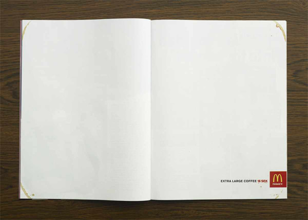
McDonald’s: Extra large coffee
Created by: DDB
A cheeky ad that uses a lot of white space and four strategically placed coffee stains to illustrate how large coffee at McDonald’s is.
TV6 / I’d do anything for money: Wax
Created by: Le Bureau
With the flip of a page, you, the reader, just ripped the eyebrows and beard off this guy’s face! Great opener for a show with the title, “‘I’d do anything for money”.

Revlon: “Roots” Print Ad
Created by: Martin/williams
Another product that lets you get to the hard-to-reach places easily, this one lets you get your roots done in a jiffy.

Subaru Forester: “King of the hills” Print Ad
Created by: Jwt
King of the hills doesn’t necessarily mean hills of lucious green and great forests. This four-wheel drive can master in sandy hills on the great desert. Way to drive the point home.

This is not easy
A powerful way to leave a powerful message and raise awareness about modern day slavery.

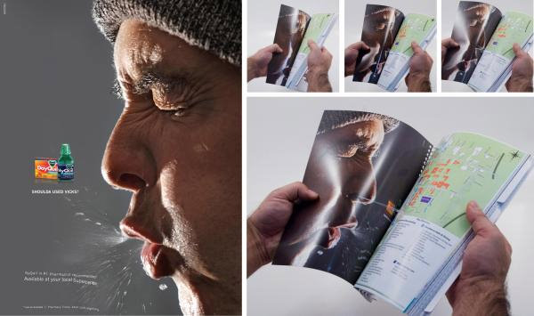
Vicks Nyquil: Boogers
Created by: Saatchi & Saatchi X
This ad may require a bit of strength as it’s glued to the other page and as it’s slowly revealed, you’ll understand why. Icky? Kind of. Makes a point? You bet.
Domino’s Pizza: Hole Reykjavik
Pizza so hot it burned through the back of your magazine. Now that’s good pizza delivery.

Sun Block
This sun block ad uses the sun to illustrate just how one can burn without proper protection. Without the right protection, be prepared to turn red (like the guy on the left). Stay protected, love your skin.

Audi: Grip, 2
Created by: BBH London
This is part of a series of Audi ads. In this one, you get a view of the type of grid you get when at the wheel of an Audi. You could be holding the wheel like you’re holding a stress ball, a snowball, a bird’s egg or a sponge, you’d still be in control.

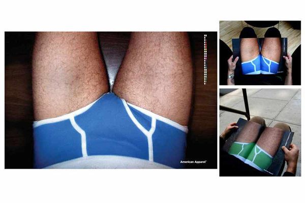
American Apparel: Double-page spread
So that’s what it looks like when you are in men’s underwear.
Terminix: Roach Chip
Created by: Publicis Dallas
Oh, this roach is definitely getting to me. And my food! Better grab some Terminix, just to be safe. Flip that darn page!
