20 Creative Travel App Designs for Your Inspiration
Traveling is probably in a lot of yearly to-do lists and most of us are probably in the midst of planning our next big trip of the season.
One thing we’d probably appreciate is a travel app that is both appealing and simple to use, giving you all the detailed and specific information of a travel destination alongside stunning photos that make you want to be there already. It would be even better if said app also lets you find hotels, plan accommodations and set itineraries all inside the app on a good-looking interface.
On the other side of the fence, creating such apps might be challenging though not impossible. Many designers have attempted to create the idea of a travel app. And some of them are really good. Here is a showcase of some of the more fascinating and appealing ones.
Read more: 10 UX lessons you can find in travel websites
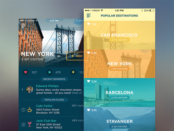
Traveller App by Ludmila Shevchenko. This travel app was designed to share tips and comments on particular travel destinations. I love the simple design but most of all the colorful filters over the images of destinations.

Book a Hotel by Agilie Team. This app allows users to choose a travel destination and book a hotel right on the app. Thin light fonts and dark grey background looks amazing along with beautiful sites of the local scenes.

Lets Go by Prateek Dave. Huge stunning travel images made this design truly attractive. The menus on the top and bottom colored with blue and yellow makes it convenient to find and use the navigation bar.


Take in the Scenery by Cai Cardenas. Despite the fact that this app was created just for fun, it looks super awesome. I love the big images, the white on blue, and round-ended status bar showing the rate of the place/hotel.

Camping App by Murat Gürsoy. A great example of card design in a mobile travel app. It features beautiful images with white typography. Also, I like orange reservation menu plu sthe nice use of icons.

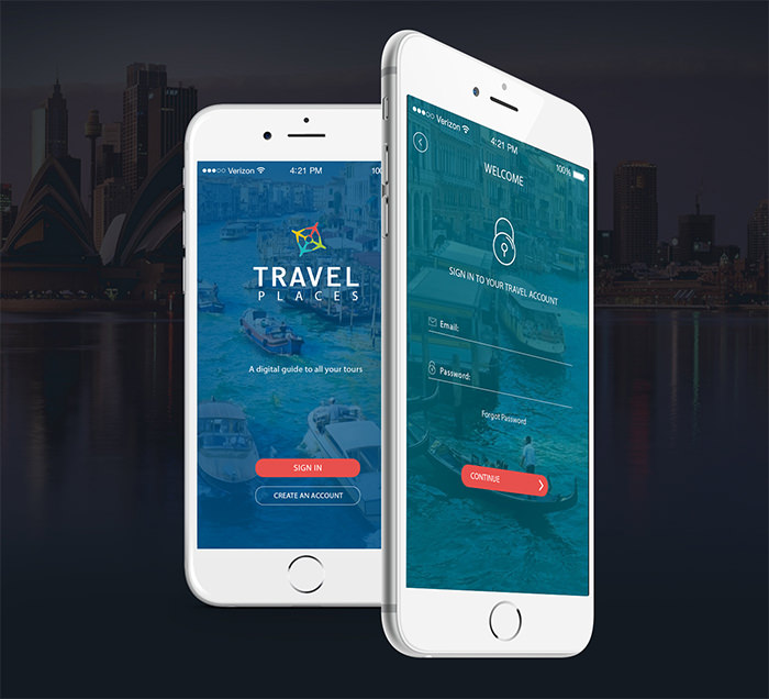
Travel Places by Humble Akhter. A full-fledged mobile app design for a travel app, the blue colored hover on the images make the red blight CTA buttons look really cool. The different categories are all placed in small and cute but functional circles.


Volo – Your Travel Journal by MinJee Hahm. This travel journal is made to share your travel journey with friends and followers. The design is simple, minimalistic, and light yet lets you share your writings, travel photos, allow likes on the photos, and keeps your log chronologically lined up.

Travel app [Card view] by Alexander Zaytsev. Multiple cards of destinations encourage users to swipe through them to find the next travel destination. It’s a clever thought. Pay attention to the colorful gradient on the image which looks like a light leak.

Timeline by Piotr Adam Kwiatkowski. This design features an amazing timelined journey with beautiful images taken on each leg of the journey. It shows places visited, images taken, and miles traveled. It seems to have infinitive scrolling, perfect for those who can never stay in one place.

Travel app Glimpse by Prakhar Neel Sharma. This design is so light and minimalistic and it gives a twist to the card design by making it not so squarish. The first screen left shows recent posts about travel destinations, and the second screen displays user reviews in numbers.

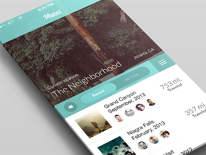
Travel Concept by Regy Perlera. Here is one more design with perfect blue color and font choices. Recent and All Time switch encourages to press the button. I also like the use of the hamburger menu button here.

Urban Walks by Anton & Irene and Danil Krivoruchko. The app showcases various travel tours available and travel is depicted on a beautiful hand-drawn maps and landmarks. I can only imagine how much time and effort were put into it.

Travel Place Info by Agilie Team. This animation shows how you can scroll and search through an interface for various tours. Scroll down, choose the location and it will unfold showing details.

Travel Guide Concept by Irina Salnykova. Here you can see the menu, list of tours, and an image of a chosen tour. I like the pink icons on the blue background on the sidebar menu too.

iBeacon by Jana de Klerk. This iBeacon app design is available for free download in PSD. I love the sunny images and modern minimalistic fonts.

TripAdvisor (Material Design) by Rico Monteiro. Here is a concept of TripAdvisor in Material Design which is a step up from the original design. The plus button is a nice touch.

Compass by Rahul Bhosale. This travel app displays a yellow compass in the bottom and an amazing-looking image slider where photos hide behind each other. On the right screen, there appears to be a destination profile.

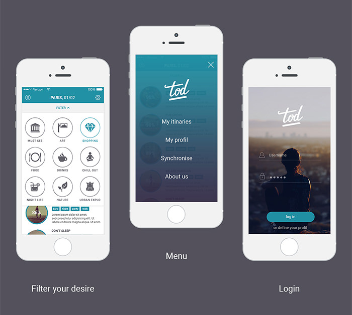
TOD by Léo Sestier. Here is a simple app design which allows you to choose a place you want to go to based on your interests. Glyph icons show the categories you can choose. The background images work great on the home screen of the app.

Roundtrip by EY-Intuitive. This simple app is designed to track every step of your trip. This initial view is a circle of the entire journey, hence the "roundtrip". You can use zoom to check the time details of each date.

Rentalcars by Tom Thorley. This app allows you to rent a car while travelling. It showcases beautiful images, various destinations and prices.
