How to Apply CSS Filter Effects to Web Images
Adjusting image Brightness and Contrast, or converting an image to Grayscale or Sepia are common features you’ll find in image editing applications like Photoshop. Now, it’s possible to add these same effects to web images using CSS.
This capability comes from the Filter Effects specification, which is still in the Working Draft stage. However, WebKit browsers have taken the lead in implementing this feature.
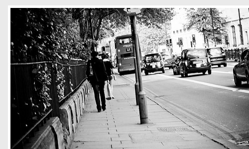
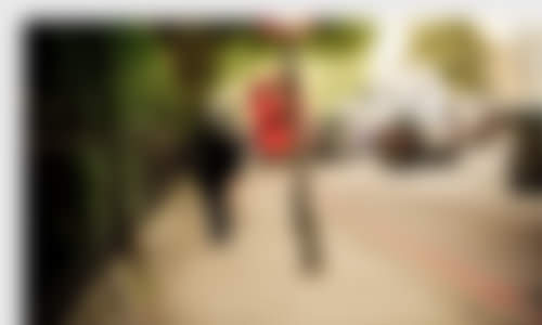
Let’s explore these effects using this image from Mehdi Kh as our example.
CSS Filter Effects
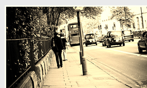
Applying these effects is straightforward. Here’s how to turn images into grayscale:
img {
    -webkit-filter: grayscale(100%);
}
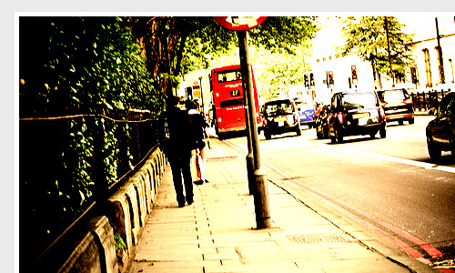
…and this is how to apply a sepia effect similar to Instagram.
img {
    -webkit-filter: sepia(100%);
}
Both the sepia and grayscale values are specified in percentages, where 100% represents maximum effect and 0% leaves the image unchanged. When no value is explicitly specified, 100% is used as the default.
You can also brighten images using the brightness function, like this:
img {
    -webkit-filter: brightness(50%);
}
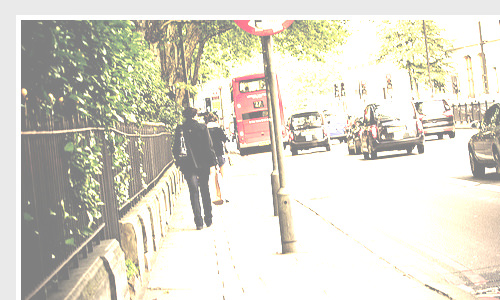
The brightness effect works similarly to the contrast and sepia effects, where 0% maintains the original image, and 100% fully brightens it. At maximum brightness, you might see only a white page instead of the image.
The brightness effect also accepts negative values, which will darken the image.
img {
    -webkit-filter: brightness(-50%);
}
To adjust the image contrast, use this method:
img {
    -webkit-filter: contrast(200%);
}
There’s a slight difference in how the contrast value works. As shown above, we set contrast() to 200% because 100% is the baseline where the image remains unchanged. Values below 100%, such as 50%, will reduce the image’s contrast.
We can also combine multiple effects in one declaration block. For example, here’s how to turn an image to grayscale and increase its contrast by 50% simultaneously:
img {
    -webkit-filter: grayscale(100%) contrast(150%);
}
By combining these filters with CSS3 transitions, we can create graceful hover effects.
img:hover {
    -webkit-filter: grayscale(0%);
}

img:hover {
    -webkit-filter: sepia(0%);
}

img:hover {
    -webkit-filter: brightness(0%);
}

img:hover {
    -webkit-filter: contrast(100%);
}
Finally, there’s one more effect worth exploring: the Gaussian Blur, which blurs the targeted element.
img:hover {
    -webkit-filter: blur(5px);
}
Similar to Photoshop, the blur value is specified in pixel radius. If no value is explicitly stated, 0 is used as the default, leaving the image unchanged.
Final Thoughts
The specification actually includes many more effects, such as hue-rotate, invert, and saturate, but these are less commonly used in real-world web applications. That’s why we’ve focused on just four main effects in this tutorial.
While we’ve demonstrated these effects on images, it’s worth noting that these properties can be applied to any element in the DOM.
You can view the live demo using the links below. Please note that the Filter feature is currently only supported in Chrome 19 and above.