Creating a Stitched Effect Using CSS
There are many visual effects we can achieve with CSS; the only limit is our creativity and imagination. This time, as the title suggests, we will create a stitched effect using only CSS.
Let’s get started.
Understanding Pseudo-Element :before and :after
Cascading Style Sheet (CSS) is primarily intended for applying styles to the HTML markup, however in some cases... Read more
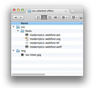
Preparing the Assets
First, we need a resource for the ‘F’ icon. In this tutorial, we will use this font: Modern Pictogram by John Caserta. We will also need an image for the background, and this time, we will use this linen texture from Premium Pixels.
Then, place these assets in appropriate folders, like so:
Structuring HTML Markup
Create a new HTML document and a CSS file. Then, link the CSS file and Normalize.css in the <head> section, like this:
<link rel="stylesheet" href="https://github.com/necolas/normalize.css/2.0.1/normalize.css">
<link rel="stylesheet" href="css/style.css">
To create this icon, we only need a single <div> element. Add the following <div> within the <body> section:
<div class="icon">F</div>
Styles
Now, let’s work on the styles. As usual, we’ll start by adding the @font-face rule and applying the linen background to the <body> element, like this:
@font-face {
  font-family: 'ModernPictogramsNormal';
  src: url('fonts/modernpics-webfont.eot');
  src: url('fonts/modernpics-webfont.eot?#iefix') format('embedded-opentype'),
       url('fonts/modernpics-webfont.woff') format('woff'),
       url('fonts/modernpics-webfont.ttf') format('truetype'),
       url('fonts/modernpics-webfont.svg#ModernPictogramsNormal') format('svg');
  font-weight: normal;
  font-style: normal;
}

body {
  background: url('../img/ios-linen.jpg');
}
Next, we add decorative styles to the .icon class. This includes specifying the height and width, adding rounded corners, a box shadow, and a color gradient for the background.
.icon {
  font-family: "ModernPictogramsNormal";
  font-size: 4em;
  color: #fff;
  text-align: center;
  line-height: 0.406em;
  text-shadow: 1px 1px 0px rgba(0, 0, 0, .5);
  width: 65px;
  height: 65px;
  padding: 7px;
  margin: 50px auto;
  position: relative;
  -webkit-border-radius: 6px;
  -moz-border-radius: 6px;
  border-radius: 6px;
  -webkit-box-shadow: 0px 0px 10px 1px rgba(0, 0, 0, .3), inset 0px 1px 0px 0px rgba(255, 255, 255, .15);
  -moz-box-shadow: 0px 0px 10px 1px rgba(0, 0, 0, .3), inset 0px 1px 0px 0px rgba(255, 255, 255, .15);
  box-shadow: 0px 0px 10px 1px rgba(0, 0, 0, .3), inset 0px 1px 0px 0px rgba(255, 255, 255, .15);
  background: #375a9a;
  background: -moz-linear-gradient(top, #375a9a 0%, #1b458e 100%);
  background: -webkit-gradient(linear, left top, left bottom, color-stop(0%, #375a9a), color-stop(100%, #1b458e));
  background: -webkit-linear-gradient(top, #375a9a 0%, #1b458e 100%);
  background: -o-linear-gradient(top, #375a9a 0%, #1b458e 100%);
  background: -ms-linear-gradient(top, #375a9a 0%, #1b458e 100%);
  background: linear-gradient(to bottom, #375a9a 0%, #1b458e 100%);
  filter: progid: DXImageTransform.Microsoft.gradient(startColorstr="#375a9a", endColorstr="#1b458e", GradientType=0);
}

.icon:before,
.icon:after {
  content: "";
  display: block;
  width: 63px;
  height: 63px;
  -webkit-border-radius: 3px;
  -moz-border-radius: 3px;
  border-radius: 3px;
  position: absolute;
}
Then, we add the :before and :after pseudo-elements with dashed borders. Each will have a different border color. The :before pseudo-element will have a dark blue border, like this:
.icon:before {
  border: 1px dashed #0d2b5e;
}
The :after pseudo-element’s border will be white with low opacity, defined using RGBA color mode. Furthermore, we need to position the :after element 1px from the top and 1px from the left so its border line is noticeable.
.icon:after {
  border: 1px dashed rgba(255, 255, 255, 0.1);
  top: 7px;
  left: 7px;
  margin-top: 1px;
  margin-left: 1px;
}
That’s all the code we need. Here is the result, and you can download the source code from the links below.