Web Design Trends to Avoid or Use Sparingly
People love to follow trends, which is essential for staying “cool” and competitive in web design. However, in the pursuit of trendiness, web designers can sometimes miss the mark on usability by overcomplicating or overlooking key details.
In this article, we’ll highlight some particularly irksome design trends and explain why they can be problematic. Understanding these pitfalls will help you avoid or moderate their use in your own projects.
Read Also: 10 Common Web Design Mistakes (Blunders)
Simplify Your Infinite Scroll and Footer Approach
Infinite scrolling can enhance the user experience by providing seamless content delivery, a trend popularized by Pinterest. However, issues arise when this feature prevents users from easily accessing footer content, constantly pushing it out of view.
Consider the challenge of combining infinite scroll with accessible footer content.

DVF.com employs infinite scrolling while placing its footer perpetually at the bottom. Trying to reach the footer can become a futile endeavor as the page endlessly extends.
This goes beyond mere annoyance; it’s a significant usability concern. Even Facebook encountered this challenge before devising a solution. It’s crucial to address such issues for a better user experience.

Reconsidering the Parallax Effect
Parallax design can captivate, offering a sense of depth and dynamism to websites. Once a rare gem, its widespread adoption has somewhat diluted its uniqueness. The allure of its rarity has diminished, leading even design blogs to move away from parallax-focused content.

It’s crucial to distinguish true parallax design, which involves layered depth, from mere single-page scrolling sites that lack this depth effect. Misunderstanding and overusing parallax for content-heavy sites compromises usability by cramming all content onto a single page, which can be overwhelming and counterproductive.
Read Also: 15 Examples of Scrolling Done Right In Website Designs
While parallax sites excel in showcasing products or services with minimal textual content, replacing traditional, multi-page websites leads to problems. Long scroll times and heavy page loads can alienate users, especially those with slower internet connections. However, executed well, parallax design still has the power to enchant.
Taming Floating Elements
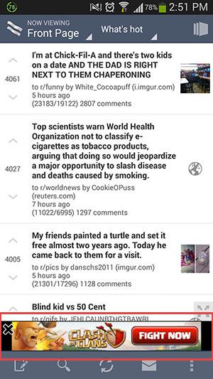
Floating elements – menu bars, social media icons, advertisements – have become ubiquitous across digital platforms. While intended to enhance accessibility and engagement, they can clutter the user experience, particularly on devices with limited screen real estate.
Drawbacks of floating elements include:
- Restricted content visibility on small screens.
- Potential to be distracting and obnoxious.
- Often detract from the overall design aesthetic.

Personal experiences highlight the frustration floating elements can cause, such as obscured content and intrusive navigation bars. This issue persists across platforms, including mobile, where floating elements can reappear and distract users even after being dismissed.
Read Also: Mobile Web Design: 10 Tips to Enhance Usability

Reevaluating Popups and Splash Pages
While splash pages feel outdated and popups are often deemed intrusive, their misuse – particularly for unsolicited advertisements or social media promotions – can significantly detract from the user experience. These elements are seen as disruptive when they fail to offer genuine value.

Historically, splash pages have largely fallen out of favor, yet some sites persist in using them, a practice that can be puzzling and frustrating for users. Popups, however, can be effective if they provide tangible benefits like ebooks, discounts, or valuable information in exchange for user engagement.

The takeaway is clear: minimize the use of popups and splash pages unless they offer a clear, immediate benefit to the user. If you must use them, ensure they respect the user’s time and contribute positively to their experience on your site.
Streamlining Distracting Backgrounds
The mantra of keeping designs simple holds true across all forms of art, emphasizing that content should remain the focal point, especially on informational websites. Complex or overly detailed backgrounds can overshadow content, pulling attention away from where it’s needed most.
Read Also: 5 Tips to Simplify Your Web Design
However, when backgrounds are strategically chosen and implemented, they can enhance the user’s experience by guiding attention and adding contextual depth without overwhelming the main content.

An exemplary use of large, immersive backgrounds can be seen in websites that employ them not just for aesthetics, but as functional elements that guide user interaction and focus on the content that matters.

Judging the balance between engaging and distracting is key. The effectiveness of a website’s background ultimately depends on how well it complements or enhances the content without causing distraction.
Final Thoughts
The creative decisions behind web design elements arise from necessity or passion, neither of which is inherently problematic. It’s the excessive or thoughtless application of these elements that can lead to user frustration. Remember, the core objective of design is to foster comfort and ease of use, making the digital experience as seamless and enjoyable as possible for everyone.