Boost Your Small Business with Visual Content
You’ve been working hard and churning out long-ish blog posts and articles along with a few images but to your dismay, you’re still not getting enough traffic or engagement on your blog. In this age of all sorts of big data, people are often bombarded with a lot of information they either don’t need or don’t know how to consume.
Three-sentence paragraphs, bullet points, sub-headings and bold font can only do so much to hold someone’s attention on your blog. It’s probably time to take your visual strategy to the next level.
But there’s an easy way to do it. If you want more people to read, share and engage with your content, visual content is a perfect answer to hold the attention of busy, distracted and hyper-engaged people.
Visual includes everything you can think of and have seen on a blog — infographics, graphs, piecharts, videos, memes, cartoons, maps etc. Using visuals, your message is conveyed much quicker and more effectively than writing a 1000-word article. Not only that, visuals get shared a lot more than text.
Still not convinced? Here are 6 reasons why you should consider going visual.
Top Tips & Resources to Creating Content People Want To Share
Content is everywhere. The Internet is full of it. The obvious question arises: How can you make your... Read more
1. Visuals are snackable
Big data is making people restless – we want to consume more and in less time. Visuals fit the bill perfectly. They are snackable, yet provide immense value.
The Two Leaves tea company’s website hardly looks like your typical e-commerce site. It’s got stunning photos of their products and a tea-picker as the background of the site’s pages. This sets them apart from their competition as a refreshing brand and also highlights their hand-picked tea. Natural!

2. Visuals are Memorable
Depending on how you utilize them, visuals have the potential to be as memorable as you want them to be. Who can forget the success kid meme used so cleverly by Virgin Media? Surely this made you chuckle, didn’t it? There’s nothing more “visible" than visuals.

Another example is the yTravel Blog. Run by a husband and wife team, their Facebook page regularly posts of travel tips among other visuals on their social media page. They’ve obtained 26,000+ likes on Facebook and 4.3 million followers on Pinterest by using this simple visual strategy.

3. Visuals are attractive
Open a magazine and you’ll notice the first thing that grabs your attention is a visual. It could be an ad or a featured article. Heck, you probably bought the magazine in the first place because of its cover, right?
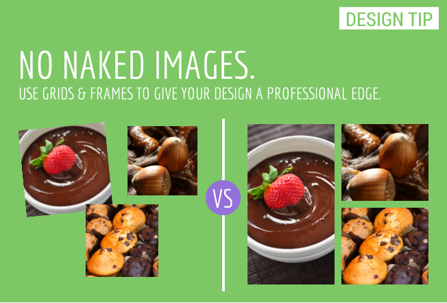
Design-made-easy program Canva uses a lot of beautiful and shareable design tips that don’t need much text to accompany them.


The point here is that visuals attract attention. It’s all about making sure that you use the right visual for your marketing to create an impact in your customer’s mind.
4. We’re wired for this stuff
Did you know that cute images arouse the same pleasure centers in your brain the same way sex, a good meal or drugs does? 90% of the information that come to our brain is visual. It’s also processed 60,000 times faster than text.
Hence, why your brain just loves visual content. This is why marketing company and blog, HubSpot, uses cheeky YouTube videos to teach marketing lessons. Their YouTube channel page uses humor to present a point in their videos. And what’s not to love about their Gangnam Style parody, aptly titled "Inbound Style"?
The work that they’re doing using visuals must be working as they’ve now got more than 200,000 likes on YouTube.
5. Everyone "Gets" Visuals
The great thing about visuals is that they’re in a universal language that everyone can understand and remember. Take a look at your social media feed and you’ll realize that what cuts the noise is probably an image or a video.
The reason is visuals will simplify complex ideas (infographics, graphs), tell a story or teach a concept (video scribes, illustrations) and overall, improve a reader’s experience. Dan Zarrella explains the effect of hashtags and quotes using two simple graphs.

He found that the effect of hashtags boosted retweets by 55% and tweets with quotation marks increased retweets by 30%.

But what if your clients are businesses? Can you use visual marketing successfully? Turns out, yes you can.
B2B email marketing company, Constant Contact, is killing it on Pinterest. Their “Quotes for Small Business Owners" board ranks #2 on Google, with more than 6,000 board followers. To top it off, they’ve neatly divided their page into 111 boards so there’s something is for everyone. The result? More than 21K followers on Pinterest.
6. Visuals are like roadmaps
A good visual strategy will show your readers what they should do next. Should they click on an “Add to Cart" button? Do they leave a comment? Where do they go next?
In this way, they build trust. They lay a roadmap for your visitors while humanizing your interaction with them, as demonstrated by the previous HubSpot video. Once people “like" you, they become better prospects and are more receptive to what you suggest.
Conclusion
Visual marketing should be one of your objectives in 2014. You may want to hire a graphics person to design visual elements. Yes, it could be an expensive investment but in the long run, it should pay off.
But, if you’re lacking in finances or more of a DIY person, there are easy-to-use online tools that you can use to create infographics, CTA banners, presentations, animations etc for free.
Don’t just stop there – make sure you also test your efforts. Measure what’s working and what’s not. You never know, 2014 could be the year that you go viral!