Explore Google Polymer: Transforming Web App Development
Along with Google Photos, Google has completely revamped Polymer, enhancing its performance and efficiency. Think of Polymer as a Software Development Kit (SDK) tailored for the Web, accelerating web application development through the adoption of Web Components.
Web Components enable us to create custom elements and tags for our websites. This post will explore how Polymer’s custom elements can streamline web app development, complemented by practical demos to showcase these elements in action.
Understanding Web Components
The easiest way to grasp Web Components is by looking at existing standard elements like <audio>. When you insert <audio> along with its source URLs into a webpage, web browsers automatically render this tag as an audio player, complete with play and pause buttons, a time rail, and a volume slider. Have you ever wondered how these player controls are constructed and styled?
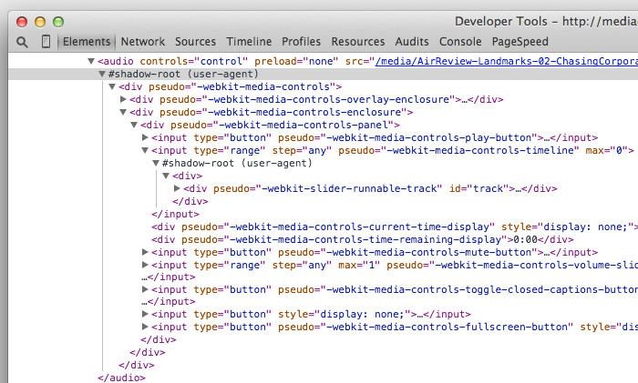
These UI controls are built using a feature known as Shadow Roots, or Shadow DOM. To see the Shadow DOM, open Chrome DevTools, click on the Cog icon, and then select Show user agent shadow DOM.
The image below displays how a stack of <div> and <input> elements secretly construct the player’s UI controls.

With Web Components, we can also create our own custom elements. Imagine building an element like <twitter> to seamlessly integrate a Twitter feed, or <chart> to display interactive charts.
These custom elements can support various attributes. For example, for the <twitter> element, you can set an attribute named username, which specifies the Twitter handle to display.
<twitter username="hongkiat"></twitter>
Exploring Custom Elements in Polymer
Polymer offers a comprehensive suite of elements designed to meet nearly every need in web application development. Google categorizes these into several groups: Iron Elements, Paper Elements, Google Web Components, Gold Elements, Neon Elements, Platinum Elements, and Molecules.
1. Iron Elements
Iron Elements comprise a set of foundational elements that are typically used to construct web pages, such as inputs, forms, and images. However, Polymer enhances these elements with additional capabilities.
For instance, the <iron-image> element, prefixed with ‘iron-‘, includes extra attributes not found in the standard <img> tag. These include preload, fade, and placeholder attributes, enabling features like:
<iron-image preload fade placeholder="http://lorempixel.com/600/400" src="https://www.hongkiat.com/img/awesome-image.jpg"></iron-image>
This setup initially displays a placeholder, then smoothly transitions to the actual image as it loads, creating a pleasing visual effect.
2. Paper Elements
Paper Elements reflect Google’s Material Design approach, which aims to unify the user interface and experience across its web and Android platforms. This group includes unique Material Design components like Paper and Floating Action Buttons (FAB).
Paper, a metaphor for the digital canvas underlying content, can be incorporated using the <paper-material> element with attributes such as elevation, which adds a shadow to suggest depth, and animated, which applies animations during changes in elevation.
The Floating Action Button (FAB) is a distinctive, circular button that floats on the interface, typically used for frequently accessed functions. Here’s how to add it:
 <paper-material elevation="1" class="paper">
 <iron-image sizing="cover" src="img/berries.jpg" class="image"></iron-image>
 <paper-fab icon="favorite" title="heart" tabindex="0" class="button"></paper-fab>
 </paper-material>
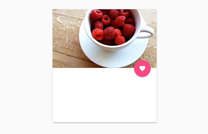
This results in an engaging user interaction: a photo with a ‘heart’ button that emits a ripple effect when clicked, acknowledging the user’s action.

By clicking the ‘heart’ button, you can like the photo, enhancing the user experience with a tactile feedback effect.
3. Google Web Components
Google Web Components seamlessly integrate with Google’s APIs and services like Google Maps, YouTube, and Google Feed, among others. These elements simplify interactions with Google services to just a few lines of code.
Here’s how you can display a Google Map with the <google-map> element:
<google-map latitude="37.422" longitude="-122.084058" zoom="19">
    <google-map-marker latitude="37.422" longitude="-122.084058" draggable="true">This is Googleplex</google-map-marker>
</google-map>
As shown, the <google-map> element utilizes latitude and longitude parameters to pinpoint the location. A nested <google-map-marker> marks a specific spot and displays text when interacted with.
To embed a YouTube video, simply use the <google-youtube> element:
<google-youtube video-id="VgmyVHYV1mE" height="360" width="640"></google-youtube>
You can tailor the element’s appearance and behavior with various attributes.
4. Gold Elements
Gold Elements are designed specifically for e-commerce applications, offering elements for displaying and validating credit card, email, phone, and ZIP code inputs to ensure accurate data entry and enhanced security. Here’s an example of integrating a Visa credit card input:
<gold-cc-cvc-input card-type="visa"></gold-cc-cvc-input>
5. Other Elements
This category includes Neon Elements for animations and special effects, Platinum Elements for enhancing offline capabilities and push notifications, and Molecules, which are wrappers for third-party libraries.
Editor’s Note: As of this writing, Neon Elements, Platinum Elements, and Molecules are still under development.
How to Integrate Polymer into Your Web Projects
Interested in using Polymer for your web development? Here’s a step-by-step guide to installing and integrating it into your web pages. Since many Polymer elements are interdependent, the most efficient way to install Polymer is through Bower.
Bower is a project dependencies manager that simplifies the installation of scripts or styles necessary for running your project. For more information on Bower, check out our previous post on how to install, update & remove web libraries easily with Bower.
To start with Polymer, open your Terminal, navigate to your project directory (create one if you haven’t already), and run the bower init command to create a bower.json file. This file will manage your project’s dependencies. Add the following lines to your bower.json:
"dependencies": {
  "polymer": "Polymer/polymer#^1.0.0",
  "google-web-components": "GoogleWebComponents/google-web-components#^1.0.0",
  "iron-elements": "PolymerElements/iron-elements#^1.0.0",
  "paper-elements": "PolymerElements/paper-elements#^1.0.0",
  "gold-elements": "PolymerElements/gold-elements#^1.0.0"
}
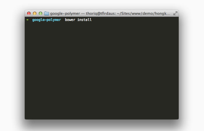
This configuration includes all the necessary elements from each group. Feel free to modify the dependency list by removing any elements you don’t need. Once your dependencies are configured, execute the bower install command to install them.

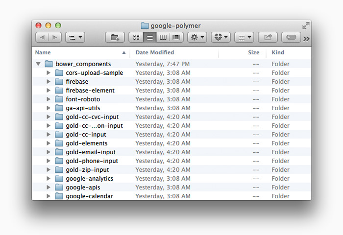
The installation process may take some time, as it involves downloading numerous files from the repositories. When complete, the files will be located in the bower_components folder.

To utilize Polymer components in your HTML file, open the document head and link the WebComponents.js polyfill for browsers that do not yet support Web Components, and import the component files using HTML Import.
Here’s an example:
<head>
  <script src="bower_components/webcomponentsjs/webcomponents.js"></script>
  <link rel="import" href="bower_components/iron-image/iron-image.html">
  <link rel="import" href="bower_components/paper-fab/paper-fab.html">
  <link rel="import" href="bower_components/google-map/google-map.html">
</head>
This setup allows you to incorporate elements such as <iron-image>, <paper-fab>, and <google-map> into your web pages.
Concluding Thoughts on Polymer
Polymer offers extensive capabilities and may require some time to fully grasp its custom elements and API. However, Web Components and Polymer are set to significantly shape the future of web application development. To stay ahead, continue exploring Web Components through the resources listed below.