Creating & Styling Progress Bar With HTML5
HTML5 brought us the progress bar element, making it easier to visually represent the completion status of tasks like uploads or downloads.
This guide will show you how to insert this element into your webpage, customize its appearance with CSS, and animate the progress meter for a dynamic user experience.
Let’s dive in.
30 Beautiful Progress Bar Designs, Vol. 1
As Internet broadband connections get faster, our internal waiting clocks run on shorter and shorter minutes. But there... Read more
Understanding the Basics
Integrating a progress bar is straightforward using the <progress> tag. The completion percentage is controlled by the value, alongside the min and max attributes to set the range, as shown below.
<progress value="10" max="100"></progress>
This native progress bar’s appearance may vary across different platforms. Here’s an example of how it might look on Windows and OSX.

Next, we’ll explore how to style this progress bar to achieve a uniform appearance regardless of the user’s platform.
Customizing the Progress Bar’s Look
In our CSS, targeting the <progress> element directly allows us to apply specific styles. For instance, we can change its background color, eliminate the default border, and give it rounded edges by setting a border radius equal to half of its height.
progress {
    background-color: #f3f3f3;
    border: 0;
    height: 18px;
    border-radius: 9px;
}
Different browsers, however, may interpret these styles in varying ways.
In Firefox, these custom styles alter the outer bar, but not the inner progress indicator itself.
For Chrome and Safari, the default browser or platform styling is overridden by the Webkit stylesheet. As a result, the modifications we’ve made might not be applied as intended.
This necessitates additional steps for compatibility.

In Chrome and Safari, the <progress> element is broken down into parts.
<progress>
    ┗ <div> ::-webkit-progress-bar
    ┗ <div>::-webkit-progress-value
To style both the bar and its progress indicator in these browsers, we introduce Webkit-specific pseudo-classes.
progress::-webkit-progress-bar {
    /* style rules */
}
progress::-webkit-progress-value {
    /* style rules */
}
Firefox employs its unique pseudo-class, ::-moz-progress-bar, to style the progress indicator.
progress::-moz-progress-bar {
    /* style rules */
}
Here are the comprehensive selectors to style the HTML5 progress bar for broader browser compatibility.
progress {
    /* style rules */
}
progress::-webkit-progress-bar {
    /* style rules */
}
progress::-webkit-progress-value {
    /* style rules */
}
progress::-moz-progress-bar {
    /* style rules */
}
Animating the Progress Bar
Now, let’s look at how to breathe life into our progress bar. Usually, a progress bar fills up from left to right as the operation advances.
We’ll set up the bar so it starts empty and fills up until it hits its maximum limit. As it fills, we’ll display the progressing percentage alongside. Here’s the basic structure we’ll use.
HTML
<progress id="progressbar" value="0" max="100"></progress>
CSS
For this example, we’ll rely on jQuery to animate our progress bar, so remember to include the jQuery script as follows.
<script src="js/jquery.js" type="text/javascript"></script>
Next, we prepare a script to animate the bar. We start by setting up variables for the progress bar itself, its maximum value, its current value, and the animation’s timing.
var progressbar = $('#progressbar'),
max = progressbar.attr('max'),
value = progressbar.val(),
time = (1000/max)*5;
Then, we define a variable called loading to house our animation function.
var loading = function() {

}
Within this function, we increment the value gradually. The speed of incrementation – and thus the speed of the animation – can be adjusted by changing the increment size.
value += 1;
After each increment, we update the progress bar with the new value.
addValue = progressbar.val(value);
We also display the current percentage alongside the progress bar for visual feedback.
$('.progress-value').html(value + '%');
To set the animation in motion, we periodically call the loading function using setInterval.
setInterval(function() {
    loading();
}, time);
However, without intervention, this process would continue indefinitely. To prevent this, we incorporate a check within our animation function to halt the animation once the maximum value is reached.
var animate = setInterval(function() {
    loading();
}, time);
And within the loading function, we add:
if (value == max) {
clearInterval(animate);
}
This addition ensures the animation stops once the progress bar is full.
Below are the complete scripts necessary to animate the progress bar dynamically.
$(document).ready(function() {
    var progressbar = $('#progressbar'),
        max = progressbar.attr('max'),
        time = (1000/max)*5,
        value = progressbar.val();

    var loading = function() {
        value += 1;
        addValue = progressbar.val(value);

        $('.progress-value').html(value + '%');

        if (value == max) {
            clearInterval(animate);
        }
    };

    var animate = setInterval(function() {
        loading();
    }, time);
});
Experience this dynamic feature in action and grab the source code from the links below.
Compatibility and Support
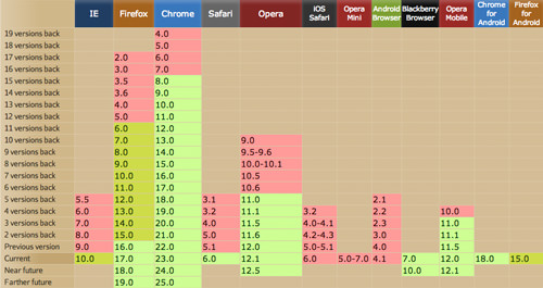
Per the insights from CanIUse.com, the HTML5 progress element enjoys robust support across major browsers, including Firefox 16+, Chrome 8+, Safari 6+, and Opera 11+.

For those browsers not yet on board, Lea Verou has crafted polyfills that mimic the progress element’s functionality, ensuring wider accessibility.
Additional Resources
To further your understanding of this versatile element, here are some invaluable resources:
- Cross Browser HTML5 Progress Bar in Depth by User Agent Man
- HTML5 file upload with progress from the FileZilla Project
- HTML5 Progress Documentation at W3.org