Maximizing User Engagement Through Effective UI Design Strategies
Every UI designer aims to engage their userbase. The ultimate goal of any website or mobile app is to offer valuable content that keeps visitors excited and interactive. Assessing engagement can be challenging without directly observing user interactions, but certain metrics can provide insight into user engagement levels.
This post will explore these metrics, explaining their significance and how they suggest increased user engagement. Additionally, it will offer strategies and tips for enhancing these metrics over time.
Engagement Metrics
Analytics programs offer a way to track data from all site visitors. Understanding these metrics, their causes, and methods for improvement can be challenging.
Google evaluates certain page metrics to determine if users find what they are searching for on a site. This evaluation is crucial not only for SEO but also for fostering a genuine user experience.
Some may consider SERP click-through rates and social shares as engagement metrics. While they do relate to engagement, they primarily reflect off-site activities rather than on-page user interaction.
The focus here is on metrics that can be directly influenced by design changes, including:
- Time on page
- Pages per visit
- Bounce rate
- Percentage of returning visitors
- Frequency of visits by returning users
These metrics are strong indicators of user engagement. For example, low bounce rates and an average of 2 or more pages per visit generally suggest deeper user engagement with the site. However, the interpretation of these metrics can vary greatly depending on the type of website.
Different User Strategies
Blogs, YouTube channels, and SaaS web apps engage their audiences in distinct ways. It’s important to recognize that each type of website attracts users who behave differently based on the content offered.
To boost engagement for user signups, simplifying the process can be effective. For instance, placing a signup form on the homepage, similar to what Code Academy does, can increase user interaction.

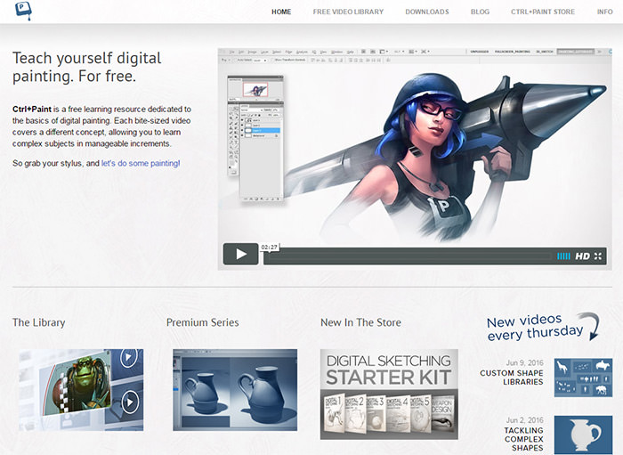
Alternatively, offering free products can entice potential customers to engage with the quality of freemium content. Websites like Ctrl+Paint and Proko, which specialize in video tutorials for aspiring artists, utilize this approach effectively.

For these sites, engagement metrics might include the total number of monthly signups or purchases. However, site managers may also monitor the total number of page views on specific pages, such as product previews or FAQ/info pages, to gauge engagement.
Understanding what you want users to do is the first step towards improving the engagement process. This insight provides a blueprint to follow for enhancing user interactivity.
Content Engagement on Blogs
The internet was originally designed as a medium for sharing and consuming content. This remains true today, with an unprecedented volume of content available online. But how do you craft content that encourages visitors to stay and engage? Here is a great article that discusses effective strategies for achieving this.
Shorter Paragraphs for Easier Content Consumption
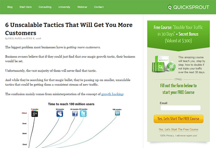
Writing shorter paragraphs can make readers feel more accomplished with each sentence they read. This approach encourages scrolling and gives a sense of easy consumption, in contrast to large blocks of text. The Quick Sprout blog, managed by Neil Patel, successfully employs this technique.

Related Stories for More Page Views
Increase page views by featuring related stories, popular stories, or recent stories in the sidebar or after each post. Visual elements like post thumbnails can capture attention faster than text alone. TechCrunch exemplifies this approach by displaying related posts in both sidebars and after post content, sometimes even embedding them within the post.

Brand Building for Better Visitor Retention
Visitors arriving from Google searches often leave quickly, as they’re typically seeking specific information. However, this doesn’t necessarily mean the content is lacking in quality. Building a trusted brand can significantly improve visitor retention. Over time, as your blog publishes consistent, high-quality content, it will become recognized as an authority. Pinch of Yum and WP Beginner are excellent examples of blogs that have achieved high levels of popularity and authority in their niches.

To reach this level of authority, continuous content creation is key. Building a brand takes time, but consistent publishing of great content will accelerate the process. A significant number of repeat visitors each month is a good indicator that you’re on the right track.
Customer Engagement on Product Websites
As highlighted in a blog post by Popcorn Metrics, one straightforward metric for product websites is the total number of active users. This measures the unique users who have logged into the site or taken an action (like updating their profile) within a set timeframe.
Enhancing this metric can be challenging without UX research and A/B testing. Here are some effective engagement strategies for product websites, such as using in-app messages and feature announcements within the dashboard.
Ask Your Customers for Feedback
The most valuable tip is to engage with users and seek their feedback. Understanding what users truly want, and identifying any features they find annoying, unnecessary, or overly complicated, can’t be fully achieved by analyzing metrics alone. Reaching out directly to users for their input can provide critical insights.
Create a Cycle of Growth
Websites like Stack Overflow and Quora, where the content benefits both members and anonymous visitors, illustrate an important point. On platforms where content is user-generated, increased engagement from users fosters a cycle of growth. A user on Quora highlighted this aspect, emphasizing that the product’s purpose significantly influences user engagement.

Study the Sales Funnel
For customer-reliant products, analyzing the entire sales funnel is crucial. Identifying how many people sign up for trials but don’t convert to paying customers can reveal areas for improvement. Reaching out for personal feedback can unveil surprising insights.
Pay Attention to Usability
Even with high-quality landing pages and signup funnels, the product itself must be usable and fulfill a need. Take Feedly as an example: while it offers robust features as an RSS reader, some users find its layout confusing and unintuitive, making simple tasks like adding a new feed more difficult than necessary.

Conduct User Research
Addressing usability issues, such as those found in Feedly, requires in-depth user research. While such studies can be comprehensive and sometimes costly, they provide invaluable insights for enhancing user engagement, often highlighting small but significant details that might have been overlooked.
Taking Steps Forward
Understanding your userbase is crucial for boosting engagement. Consider what actions you want users to take and how you wish them to interact with your content. This understanding can guide adjustments to page elements, such as color, size, position, and web copy, to enhance user interaction.
Metrics offer insights into current engagement levels, but the goal is to understand user behavior and how to influence it positively. Customer feedback and A/B testing are valuable tools for achieving the best outcomes.
If you’re uncertain where to start, explore the following resources for more ideas: