How to Increase Your Productivity With Mailbox App
Mailbox was in beta in early 2013 and rose to huge success almost overnight. Its waiting list had hundreds of thousands of people, watching the countdown timer reach you was fun! Its marketing and product strategy was so successful that Dropbox acquired them just a month and a half after the initial beta release.
The premise of Mailbox is to “put email in its place”. While this is very subjective – everyone has different ways of dealing with email – it’s hard to ignore the overwhelmingly positive reviews of the product.
I’ve been an avid user of it since I first laid eyes on the invite-only page. I finally got my invite on April 6 2013 and I haven’t looked back since. In this article, I’ll share some of the useful features of Mailbox, as well as some of the drawbacks I’ve found.
10 Best Google Gmail Alternatives
Gmail is a popular email service provider used by millions, however there are many features that it misses... Read more
Interacting With Emails
Mailbox stands head and shoulders above the rest in the way it allows you to interact with your emails. Only simple swipes are needed to archive, delete, defer or add an email to a list. No need to confirm the deletion, if you make a mistake, just shake your device (unless you’re using it on an iMac) to undo it.
Mailbox even supports multi-touch. You can swipe three emails at once to the right to archive all three of them. It’s simple and works remarkably well. Initially, I had some doubts about the long and short swipes.
To archive, you need to swipe right. To delete, you need to do a longer swipe to the right. Seems like it would cause issues, but in my 20 months of using it, I’ve never miss-swiped. The long swipe kicks in about three-quarters of the way in and visual queues make everything pretty clear.

As I mentioned, deferring (swipe right) is one of the best features of Mailbox. When you defer an email, you can choose some preset times (later today, this evening, tomorrow, next week, etc.) or you can choose your own date.
Once chosen, the email disappears from your inbox on Mailbox on all your devices and also from your Gmail inbox. It is placed in a special IMAP folder and will be sent back to your inbox when the time comes.
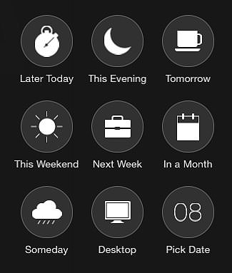
A third option is to add an email to a list. Adding emails to lists works a lot like deferring, but the emails do not get put back in your inbox automatically. You can create any number of lists and add emails to them easily by swiping fully to the left.
Navigating The Views
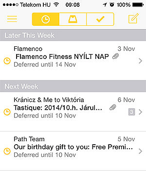
At the top of your email list, Mailbox provides icons to navigate between your inbox, your deferred items, and your archives. Switching back and forth is super-fast which is great if you want to take a quick peek at your upcoming deferred emails.
Swiping works in all of the views, not just the inbox. When you’re looking at your deferred emails you can swipe left to re-defer (I think I just made that up), or further left to add to a list. You can also swipe right to put it back in your inbox manually. Archived emails can be swiped right to delete or left to put them back in the inbox or defer them.
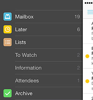
By tapping the hamburger icon, you can see a list of places to go. Spam sent and drafts are available here as well as in the lists section. While lists is a great feature, I don’t really use it, to be honest. My goal with Mailbox is to minimize clutter not create it and if I start creating lists I will over-complicate things.
I usually use them to create an “Information” list. I usually only have 3-4 emails in there like upcoming flight details, hotel reservations, and so on. This gives me easy access to essential information wherever I am, no searching is necessary.
That brings me to another well-oiled feature: searching. I was never happy with the search in the default mail application, it never seemed to find what I was looking for. The Mailbox search works beautifully. To access the search, pull down your inbox below the top.
It seems like it searches within the cached emails first which means it brings up some results instantly. After a second or two, you see search results coming in from the server itself.
Advanced Features
Swipes can be customized to your liking. For example, if you’d rather archive by swiping to the left, no problem. Never add emails to a list? Set the long-left swipe to star/unstar messages.
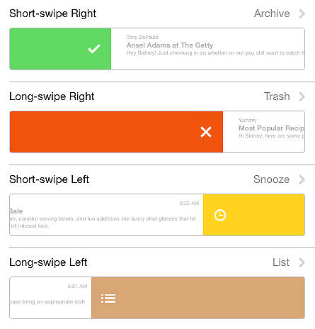
One great feature is that you can set what the snooze or defer swipe does by default. You can choose to show the picker, or you can choose a preset by default. Workday start/end can also be set up which will control when you get emails deferred until tomorrow and the time until you get “later today” emails.
There are quite a few more options, I suggest cruising through the settings section of the application to get a better picture of what it can do.
The Badge Count
The app icon – on all devices – shows a count of conversations that you have in your inbox. This can be changed to show ‘1′ for new messages, but this sort of defeats the purpose. It took some getting used to since the standard behavior in other apps is to show unread messages.
However, this was exactly what I needed at least. I may well have 100 emails I’ve read, the question is, do I need to act upon them? By deferring everything I do not need to act on and keeping everything I need to act on in my inbox, I can use Mailbox as a task manager pretty effectively.
I assume that this would be an issue for some people. Unfortunately, the only way around this is to either switch off the badge count or show ‘1’ for unread messages.
Mailbox On Different Devices
My biggest gripe with Mailbox was that there was no desktop version until recently. A while ago, the Android app came out which allowed our Android friends to use Mailbox, the iPad version came along as well, but the desktop version took its sweet time.
A few months ago, I received the desktop beta invite. To tell you the truth, it was a completely underwhelming experience – in a good way. Apart from interface differences due to a big difference in devices, the app is exactly the same. It looks great, it is great to use and I now have full cross-device Mailbox goodness.
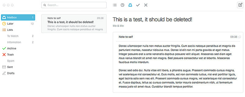
One of my worries with cross-device support was that the syncing would be sluggish. Almost all apps I’ve used have had issues with good cross-device support. My favorite bad example is ‘Reminders’ which is possibly the worst application from a syncing point of view (and from a number of other views).
Thankfully, Mailbox seemed to have thought things through as syncing is perfect. It is either done behind the scenes or when you open the app. In the latter case, it takes about 3-4 seconds and you see it happening, so you know what’s going on.
The Downsides Of Mailbox
I think it’s obvious that I am a fan of Mailbox, but it does have some flaws. The biggest concern many people have is privacy and it has to be acknowledged that this is a biggie. Mailbox provides these features by standing between you and your email provider. This means that they have access to all of your emails.
I think it is important to see both sides of the coin here. The reason that they can offer this service is that they do this. Sure, this does present a privacy concern but you always have the option of not using the service. I think it is important to know about this issue and make an informed decision about whether or not you want to share your emails with this company.
To many people, this is an instant red flag and they will not use the service and this is perfectly ok. Take a look at the Mailbox privacy policy (which is now the Dropbox privacy policy) and decide whether the app is for you.
The other objective issue with Mailbox is the badge count. If you want your badge count to reflect the unread message count and this is a dealbreaker, then the app is not for you.
If you’re into hardcore email organization and you have a bunch of tags and folders set up in Gmail with multiple custom rules, Mailbox is probably not for you. You could convert your work to Mailbox lists but if you rely on your rules heavily, it may wreak havoc on your workflow.
Conclusion
There is no doubt that mailbox is a highly focused, well-written application which – if it suits your workflow – you will love.
On the other hand, it does force a specific email workflow on you that you may not like. I consider this a pro, but others may well consider this a downside. This, coupled with a privacy policy that some might consider a nightmare will put a lot of people off.
I suggest at least giving the application a try. Above all, for me, it has taken away the sense of urgency created by lots of emails in my inbox – has given me peace of mind.