Learn Web Design with Skillshare – Review
Web design is a fast-changing industry, therefore continuous learning is one of the most important skills you need in order to stay relevant in the market. However, acquiring the necessary skills can be a serious challenge, especially with limited free time. Luckily nowadays, there are a lot of learning tools you can choose from.
Skillshare is one of these tools, more precisely it’s an online educational platform that can help you accomplish your professional learning goals. Skillshare has more than 17,000 online classes related to creative industries, design, technology, marketing, and other fields.
In this article, I reviewed their platform so that you can better decide if it’s worth a try.
Skillshare Tutors

Skillshare defines itself as an online learning community where you can learn and teach a class. Anyone can teach a class, which may not sound good at first but when you look at the teachers you’ll find many high-profile professionals among them.
So, teachers basically have to find their own audience and persuade them about their credibility. They mostly do that by summarizing their credentials and professional experience on their profile page.
On the screenshot below, you can see a teacher profile page. It belongs to Carlye Cunniff who is a Senior Experience Designer at Amazon and teaches UX design skills on Skillshare as a side project—the kind of professional you may want to learn from.

Apart from the teacher’s short resume, teacher profile pages also have sections for the teacher’s projects, courses, and discussions. It also has social features, such as links to the teacher’s social media profiles and website, and you can also follow teachers using the big blue +Follow button.
Skillshare Platform
Skillshare has a straightforward and intuitive platform. The universal search bar allows you to quickly look up classes, skills, or teachers. I run the “web design” search query, and got 6,894 results and the following screen:

The result page has many filters that let you further adjust the results to your needs. You can filter the classes according to subscription type (premium and free), freshness, class length, related skills, plus you can also look up the classes held by the teachers you follow.
There’s a big +Follow button next to the title of the result page, which means you could follow the “web design” search term if you want, which is a quite useful feature. You can see the classes in a grid layout that you can quickly scan through.
Skillshare Classes
Now, let’s look at the most important feature of the site—the classes. For this review, I chose three classes, all related to different parts of web design and taught by established professionals, covering the following topics:
- Well-converting homepage design by Dennis Field, InVisionApp’s product designer
- UX wireframes by the aforementioned Carlye Cunniff, Amazon’s senior experience designer
- Typographical composition by Ellen Lupton, a curator of contemporary design at the Cooper Hewitt, Smithsonian Design Museum in New York City
Classes are divided into shorter videos, so they adapt well to the tight schedule of a busy professional.
You can add notes to a class, create and upload your own class project, write a review, and also have a look at other student’s notes, projects, and reviews.
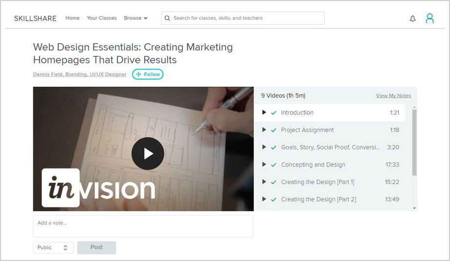
1. Web Design Essentials: Creating Marketing Homepages That Drive Results

- Duration: 1h 5m
- Number of videos: 9
- Tools you need: Photoshop or Sketch & a free InVisionApp account
- Final deliverable: An InVision prototype of a mobile app design
In this class, you can follow through how Dennis Field, InvisionApp’s product designer creates and prototypes a mobile app design.
In the first few videos, Dennis sets the goals of the project and explains the most important concepts related to homepage design, such as scannability, storytelling, user patterns, and mobile cues.
You can see him continuously sketching while speaking, which is a great thing because you can get an insight into the creative thought process he uses to accomplish the goals of his project.

When the sketch is done, Dennis moves the design from paper to PhotoShop, which is probably the most interesting part of the class.
And, when the PhotoShop design is done, he turns it into a clickable prototype using Invision App and explains how to add collaboration features to the final prototype to get feedback from team members and users. A ton of information and insight in little more than an hour, which is not a bad result.

2. Wireframing for UX Design: Sketch Your Big Idea

- Duration: 34m
- Number of videos: 7
- Tools you need: Pen and paper
- Final deliverable: A medium-fidelity wireframe
This class is a short introductory course into wireframing. It’s a bit more theoretical than the previous class, but it will give you a good understanding of UX wireframing and the principles of human-centered design.
The teacher, Carlye Cunniff shares several hands-on tips you can use in your own workflow, such as an idea generation exercise called “crazy eights”.
She also shows how to imagine, humanize, and sketch out the persona you’re making your wireframe for.

Carlye treats wireframes as communication tools, which seems to be a great approach. She also emphasizes the importance of creating several iterations for the same design and shows how to gradually move from low-fidelity (lo-fi) to high-fidelity (hi-fi) wireframes.
Besides being information-heavy, the class is also very encouraging, as Carlye asserts that first ideas are usually not the best ideas, so you don’t have to worry if you get a negative feedback. She also talks about how to narrow down your ideas, how to present your wireframe to your client, and many other useful things.

3. Typography That Works: Typographic Composition and Fonts

- Duration: 36m
- Number of videos: 10
- Tools you need: Any graphic design software, such as Illustrator or InDesign
- Final deliverable: A business card design
This class is sponsored by the Maryland Institute College of Art and held by its director, Ellen Lupton who is also a curator at the Cooper Hewitt, Smithsonian Design Museum in New York City. By attending, you can learn the fundamentals of typography and the art of choosing the best typefaces for each design.
Ellen discusses the main typefaces (sans-serif, serif, slab) and introduces you to the most important concepts of typography, such as ligature, tracking, kerning, and drop caps, by using real-life examples.
The most noteworthy thing about this class is that she also discusses bad practices, for instance she shows a handful of examples of bad layouts, bad scaling, and other “type crimes”.

You can learn indispensable things in this class that every designer needs to know, such as how to orientate typographical elements, how to create a coherent internal structure, why it’s bad to use too many kinds of emphasis, how to use line spaces to create texture, and many others. Ellen also gives tons of historical references and looks over how typography has evolved throughout the times.
In the class project, you will create your own business card, using the principles of typography Ellen constantly explains and showcases during the whole class. She also explains how to choose and mix typefaces, use different weights, and gradually add structure and contrast to your business card design.

Conclusion
Skillshare classes aren’t very long, so watching them is easily manageable even if you have limited free time.
Still, they provide a lot of knowledge and you also have the opportunity to get an inside view into the work process of practicing professionals — the kind of information that’s hard to find out in the wild
And, the class projects make you put your knowledge into practice at once, which is also something designers tend to like.