Moving Items in CSS Grid Layout [Guide]
Using the CSS Grid Layout Module in web design becomes more and more feasible as more browsers begin to support it. While creating layouts filling in grid cells, there might come a moment, though, when you want to achieve more complicated things.
For instance, you might want to slightly move around some of the grid items stuck in their grid areas. You also might want to move them out of the grid container (overflow), or over each other (overlap), or just… to some empty space around.
Read Also: Introduction to the CSS Grid Layout Module
So, in this post, I’ll show you how you can move, order, overflow, overlap, and size grid items when you use the CSS Grid Layout Module.
Create a CSS grid
First, let’s create a simple CSS grid with one row and three columns.
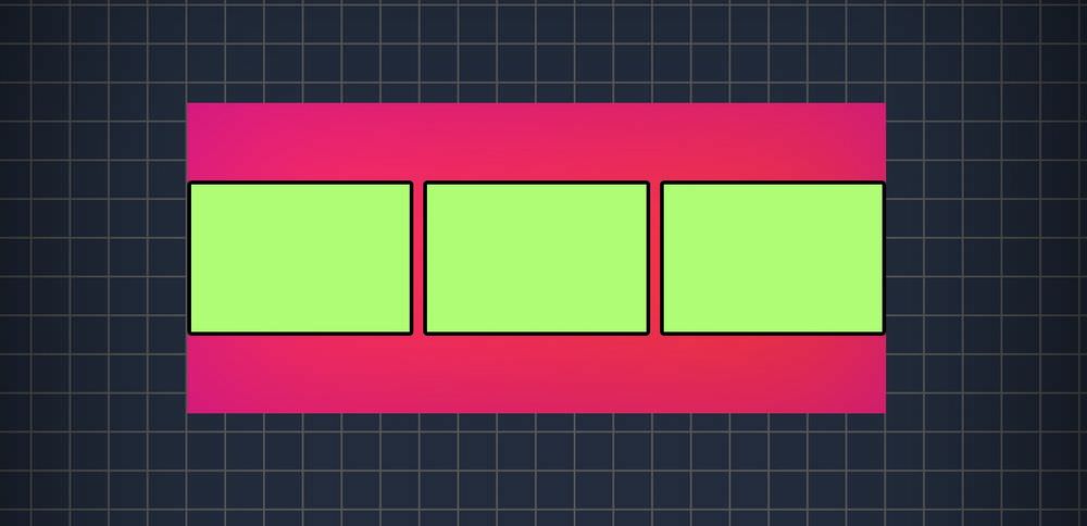
In the HTML, we create a bunch of divs where the grid container contains the three grid items.
<div class='grid-container'>
  <div class='grid-left'></div>
  <div class='grid-center'></div>
  <div class='grid-right'></div>
</div>
In the CSS, the grid container has the display: grid; property and the grid items have grid-area that identifies the names of the grid item areas.
We also add the grid-template-areas property to the grid container, in which the grid area names are used to assign the grid areas to the grid cells they represent.
All columns take the size of one fraction (fr) of the container width, ensuring the containment of the grid items.
.grid-container {
  display: grid;
  grid-template-areas: 'left center right';
  grid-template-columns: repeat(3, 1fr);
  grid-template-rows: 80px;
  grid-gap: 5px;
  width: 360px;
  background-color: magenta;
}
.grid-left {
  grid-area: left;
}
.grid-center {
  grid-area: center;
}
.grid-right {
  grid-area: right;
}
.grid-container div {
  background-color: lightgreen;
}
Overflow grid items
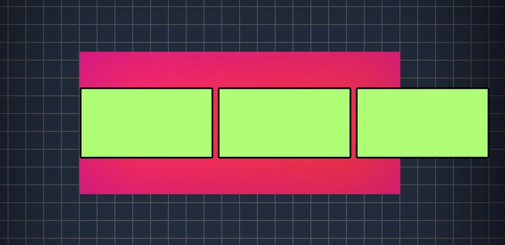
You can make a grid item overflow its grid container if it’s necessary for a layout. To achieve the overflow effect, you just need to use a different column size:
.grid-container {
  display: grid;
  grid-template-areas: 'left center right';
  grid-template-columns: repeat(3, 150px);
  grid-gap: 5px;
}
The sum of the column- and gap-size is bigger than the width of the container, which causes the grid items overflow their container.
Overlap grid items
A grid item can overlap (fully or partially cover) another grid item in the following cases:
- It’s set to span across (and over) the cell(s) of another grid item.
- Its size has been increased, causing it to overlap with the nearby grid item.
- It’s moved over on top of another grid item.
We’ll discuss the second and third cases later, in the “Sizing” and “Moving” sections.
First, let’s see the first case when a grid item spans across another one.
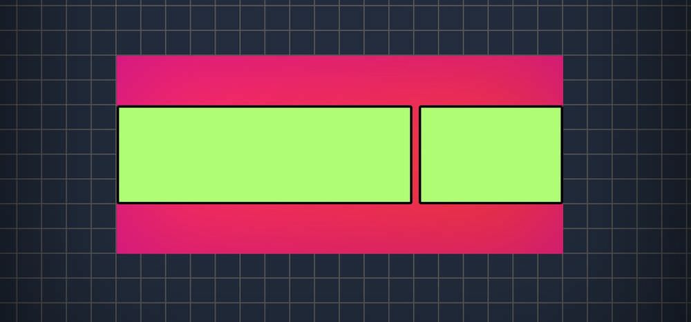
The grid item at the center has spanned over the left one, so only two items are visible on the screen.
.grid-center {
  grid-area: center;
  grid-column: 1 / 3;
}
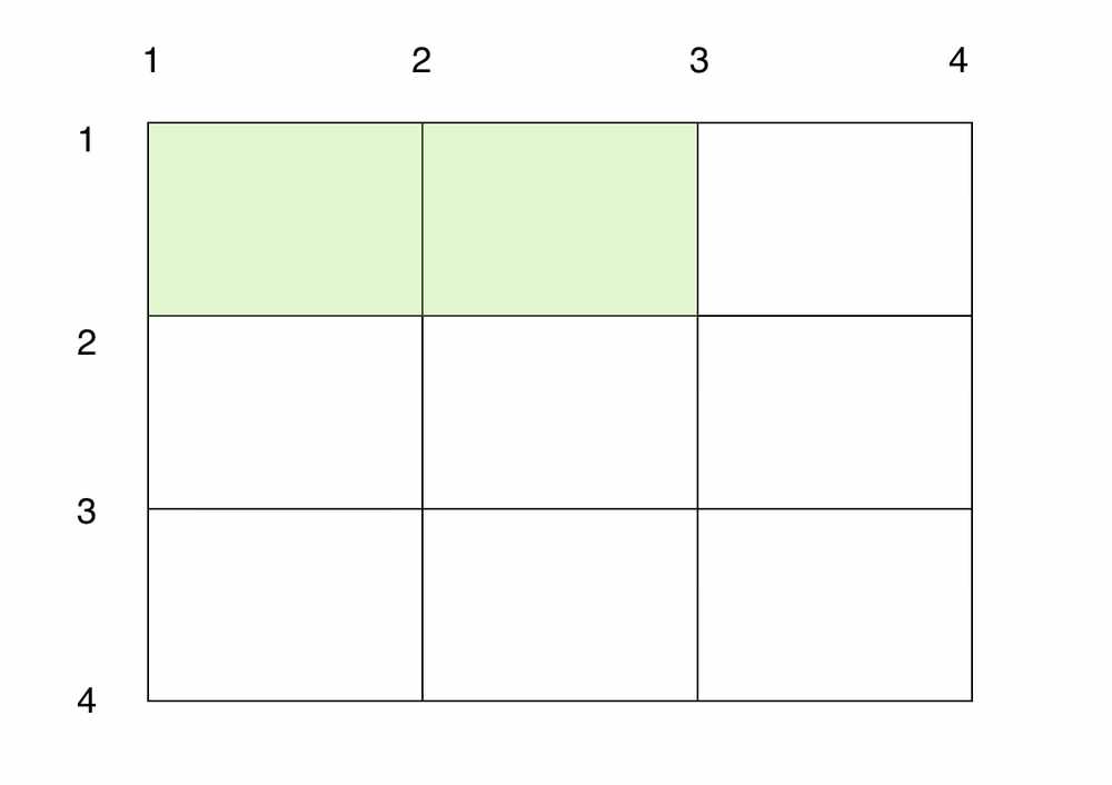
The grid-column and grid-row properties assign grid lines between which a column or row needs to fit.
On the below diagram, you can see how the grid-column: 1 / 3 CSS rule works: the center column spans between the grid lines 1 and 3. As a result, the center column overlaps the left one.
Move grid items
By moving, I mean moving the items slightly around. If you completely want to relocate an item into another grid cell/area I recommend you update the grid creation code.
Moving around grid items is simple. Just use the margin, the transform, or the position:relative; properties. See below how the items are moved using those properties.
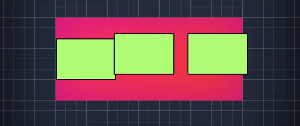
The center and right grid items can be moved (as shown above) in the following ways:
1. Using margin
Negative margins increase the dimensions of grid items, while positive margins trim them. By using a combination of both, you can slighlty move the grid items around.
.grid-center {
  grid-area: center;
  margin-left: -10px;
  margin-right: 10px;
  margin-top: -10px;
  margin-bottom: 10px;
}
.grid-right {
  grid-area: right;
  margin-left: 10px;
  margin-right: -10px;
  margin-top: -10px;
  margin-bottom: 10px;
}
2. Using transform
The translate() CSS function moves an element along the x- and y-axes. Using it together with the transform property allows you to change the position of a grid item.
.grid-center {
  grid-area: center;
  transform: translate(-10px, -10px);
}
.grid-right {
  grid-area: right;
  transform: translate(10px, -10px);
}
3. Using position
Using the position: relative; rule with the specified top, bottom, left, and right properties can be used for moving around grid items as well.
.grid-center {
  grid-area:  center;
  position: relative;
  bottom: 10px;
  right: 10px;
}
.grid-right {
  grid-area: right;
  position: relative;
  bottom: 10px;
  left: 10px;
}
Order grid items
Grid items are rendered on the screen in the order they appear in the HTML source code.
In the previous section, when the center item was moved left, it was placed on top of the left item by the browser. This happened because in the HTML, <div class='grid-center'> comes after <div class='grid-left'>, hence the center item is rendered after (and over) the left one.

However, we can change the order grid items using the z-index or the order CSS properties.
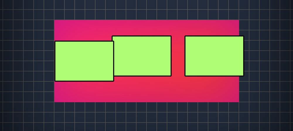
Using the z-index: 1; rule, the left grid item got a higher stacking context.
.
grid-left{
  grid-area: left;
  z-index: 1;
}
As in the CSS Grid Layout module, changing the element order in HTML doesn’t affect the grid layout, you can also put <div class='grid-center'> before <div class='grid-left'> in the HTML. Only do this, though, if the updated HTML code doesn’t harm accessibility.
Size grid items
If you use auto-sized rows or columns for a grid item (using auto, fr, gr units), it will shrink to make space for its neighbouring item that has grown in size only if said item was not sized by transform or a negative margin.
Remember, in our sample grid, all three columns take one fraction (fr) of the grid container. Take a look at how all three items look like after the left one is resized in two different ways.
1. Sized with width and height
Here, we change the size of the left item using the width and height properties. As a result, it stays inside the grid container.

.grid-left {
  grid-area: left;
  width: 200px;
  height: 90px;
}
2. Sized with transform
Here, we change the size of the left item using the transform property. As a result, it overflows the container and the grid gap also disappears.

.grid-left {
  grid-area: left;
  transform: scalex(1.8);
}
Read Also: How to Integrate Simple CSS Grid Layouts into WordPress