Native CSS Masonry Grid
One popular layout style on the web is the masonry layout, often used in image galleries and portfolio websites to display images or items of varying sizes.
Traditionally, creating a masonry layout required JavaScript libraries, such as the popular Masonry.js by DeSandro and MiniMasonry. However, with CSS Grid, you can now create this layout using pure CSS.
In this article, we will explore what a CSS Grid masonry layout is and provide some examples to help you understand how it works. Let’s get started.
Getting Started
CSS Grid is a native CSS layout system that provides a grid-based framework where you can define rows and columns and place items within this grid. The masonry layout can be created by combining CSS Grid with certain properties that allow items to span multiple rows or columns, creating the masonry effect. Let’s start with a simple example to understand the basics of creating a masonry layout using CSS Grid.
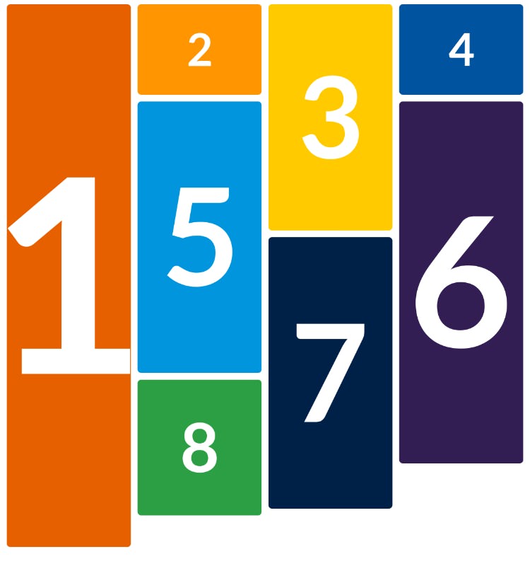
First, we have the HTML. We have a container with eight items. Each item has a different height and width so that we can see the masonry effect more clearly.
<div class="masonry">
    <div class="gallery">
        <figure>
            <img src="images/image-1.jpg" width="600" height="1200" />
        </figure>
    </div>
    <div class="gallery">
        <figure>
            <img src="images/image-2.jpg" width="400" height="200" />
        </figure>
    </div>
    // 6 more items...
</div>
And, the CSS, as follows:
.masonry {
    display: grid;
    grid-template-columns: repeat(6, 1fr);
    grid-template-rows: masonry;
    gap: 10px;
}
// More stylistic styles...
The grid-template-columns property defines six equal columns, the gap property adds space between the grid items, and the grid-template-rows: masonry; property creates the masonry layout based on the available space within the grid container.
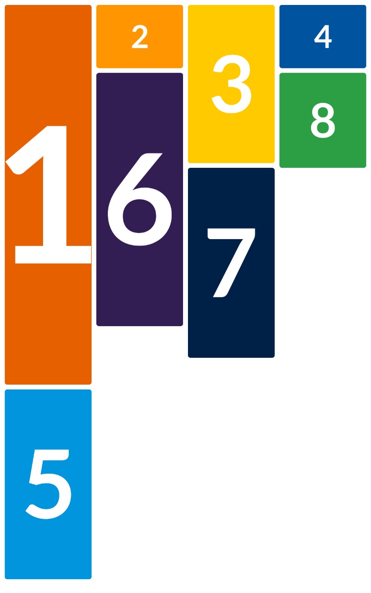
You can adjust the layout behavior using the masonry-auto-flow property. When set to next, this property displays items in order along the grid axis instead of placing them in the track with the most free space. As shown below, the items are placed in order from left to right, top to bottom, regardless of the available space.
Making It Responsive
One of the advantages of using CSS Grid is that it allows you to create responsive layouts with ease. You can use media queries to adjust the grid layout based on the screen size. For example, you can change the number of columns in the grid based on the screen width to ensure that the layout looks good on different devices.
@media (max-width: 1200px) {
    .masonry {
        grid-template-columns: repeat(4, 1fr);
    }
}
@media (max-width: 640px) {
    .masonry {
        grid-template-columns: repeat(2, 1fr);
    }
}
You can also change the repeat() value to use auto-fill and minmax() functions to create a responsive layout that automatically adjusts the number of columns based on the available space. The minmax() function allows you to set a minimum and maximum size for the columns, ensuring that they don’t get too small or too large.
.masonry {
    display: grid;
    grid-template-columns: repeat(auto-fill, minmax(200px, 1fr));
    grid-template-rows: masonry;
    gap: 10px;
}
That’s it! You now have a responsive masonry layout that adjusts based on the screen size. You can experiment with different values for the minmax() function and the gap property to achieve the desired layout for your project.
Browser Support
It’s important to note that CSS Grid with the masonry layout is still in the experimental stage and not yet supported in mainstream browsers.
| Browser | Version | Support |
|---|---|---|
| Google Chrome | Not supported | |
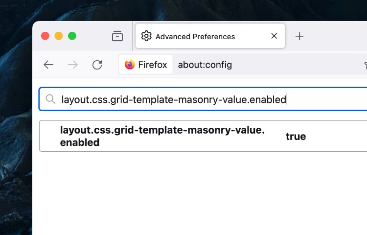
| Firefox | 77-131 | Experimental. Can be enabled from config. |
| Safari | Technology Preview | Supported |
| Microsoft Edge | Not supported | |
| Opera | Not supported | |
| Safari on iOS | Technology Preview | Supported |
| Android WebView | Not supported | |
| Samsung Internet | Not supported |
As shown in the table, you can view the masonry layout in the Safari Technology Preview or Firefox.
If you’re using Firefox, type about:config in the address bar, search for the configuration name, and set it to true. The update will take effect immediately, so you can refresh the page without needing to restart the browser.
The status of browser support may change, so it’s a good idea to check the latest updates from the respective browser documentation or support pages.
Wrapping Up
The CSS Grid masonry layout is a powerful tool that allows you to create complex grid-based layouts with ease. By combining CSS Grid with media queries and other CSS properties, you can create responsive masonry layouts that look great on all devices. While the masonry layout is still in the experimental stage, it is worth experimenting with to see how it can benefit your projects.
Last but not least, here’s a CodePen demo for you to try out. Enjoy!
See the Pen CSS Grid Masonry by HONGKIAT (@hkdc) on CodePen.