30 Professional Looking e-Commerce Sites For Your Inspiration
Learn how to create a professional-looking eCommerce website design with this comprehensive guide. Boost your online sales today!
A well-thought-out and perfectly designed eCommerce website is a guarantee of success. But it takes a lot of effort, knowledge as well as careful planning to provide a rich shopping experience, turning shopping into a pleasant and invigorating process.
Planning for Your e-Commerce Site
When planning for your eCommerce website, there is a lot of things to consider and set up: detailed product information, quality product images, a simple and transparent checkout process, adequate product filters and search options, reliable customer service options, variety of payment options, user-friendly navigation and catchy website design with a focus on the products – the deeper you get, the more dilemmas you face. Not the easiest task, right?
That’s why before you design your new eCommerce project or improve your current online shop, take a look at the collection of catchy eCommerce websites to get some ideas. You might be able to find workarounds for some of the problems you have from these sites.
How to Improve Your E-Commerce (Online Store) UI
Discover top tips for optimizing your eCommerce website for success. Increase sales, improve user experience and stay ahead... Read more
More on E-Commerce
Nau
This eCommerce design presents a creative way of website navigation done in the form of a collage, which makes it really easy to find the needed product.
The website looks trustworthy, as it provides a great variety of customer care services and contact options: phone number, mailing address, e-mail, and even live chat. The product images are also huge and attractive.

Red Velvet Shop
Cool typography together with the muted color scheme and bright images add a little touch of style to this eCommerce design. Everything is neat and clear.

Zaino
Everything is perfect about this website: catchy images, informative and detailed product description pages, convenient product filters that make product searching fast and easy.
The hot pink and green go well together, and the use of stitching and bright colours creates a pleasant and funny atmosphere.

WhimsyDog
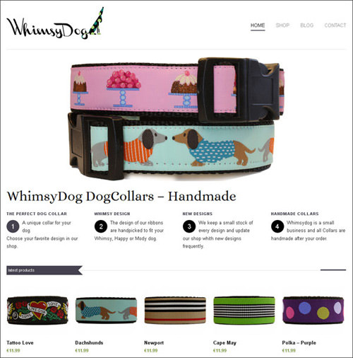
The minimalist website design of this Custom Dog Collar Shop speaks for itself. The Home page slideshow, featuring high-quality, striking images, catches a user’s attention within the first few seconds.
The product description page provides an opportunity for customers to leave reviews on different products.
TensionWIRE
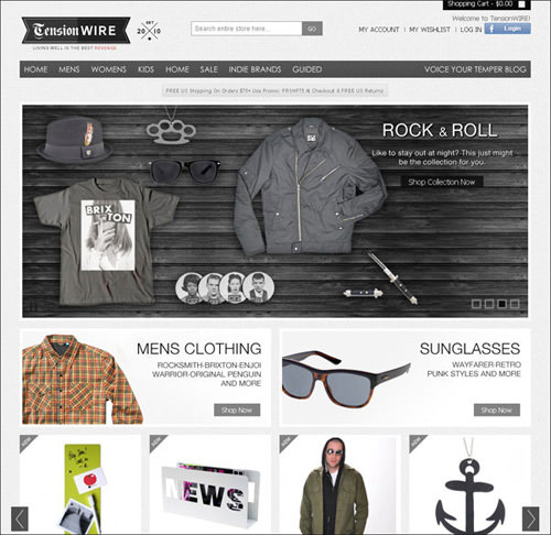
This online shop is characterized by a muted color scheme, eye-catching image slideshow, big product images, and descriptive product pages. The design is worth your attention.
Jenier Word Of Teas
This website design has been chosen to demonstrate to you how many ways of contact the Tea Shop provides: phone number, contact form and mailing address.
The phone number is placed on the most easy-to-find places: in the website header and footer. The customers will definitely trust the site and are more likely to do business with it.

Normanniae
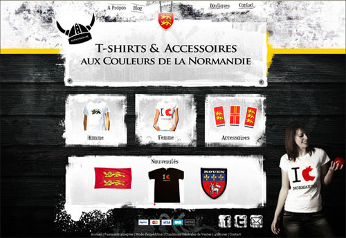
This online shop attracts with its unusual background color, attractive images, yet providing user-friendly navigation as well as a simple checkout process.
Art & Mabel
The website belongs to Art and Mabel, a shop which offers personalized gifts for children. The home page is clean and stylish, without being overloaded with distracting elements, yet informative enough.
Due to the easy-to-use website navigation, the whole order process is simple and transparent.

Millets
Here is another eCommerce website with an interesting background. Simple user-friendly navigation, well thought-out layout, high quality images, a variety of customer service options and payment options – everything makes this online shop stand out among others.

The Russian Store
The Russian Store design looks really simple, yet informative. The unobtrusive color scheme combined with the striking images will definitely create a good impression on each customer.

MINGA BERLIN
Here is one of the most laconic eCommerce website designs which leaves and impression with the simplest navigation and high quality product images. Minimalist design is always a win.

Just Cuckoos
This eCommerce design is created in a minimalist style and meets the most significant requirements: extensive product filter, huge and detailed product images, various means of contact, namely phone number, e-mail address, mailing address, and contact form, etc.
The green used is an accent color which has a strong emotional correspondence with safety.

Rex Monkey
Here is one of the most creative and striking eCommerce websites! The home page provides user-friendly navigation, a contact section, really HUGE product images, descriptive product information, a simple checkout process and much more to provide customers with a rich shopping experience.

The Coffee Hopper
This online store, selling coffee and tea, impresses with its flawless and well thought out design. The color scheme is perfectly balanced.

Redington
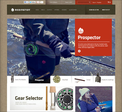
This online store sells fishing equipment and apparel. It’s really obvious that its owner thought through his categories and navigation elements very carefully: it is easy to move around the site, browse different categories and get to the shopping cart.
VIF Jeans
At first sight this eCommerce design may seem a bit complicated and overloaded, but after browsing a little you’ll find it rather convenient and attractive.

Black Goat Cashmere
This simple, yet stylish online shop design illustrates the products, raw materials and production process in their fullest, providing some interesting extra information.

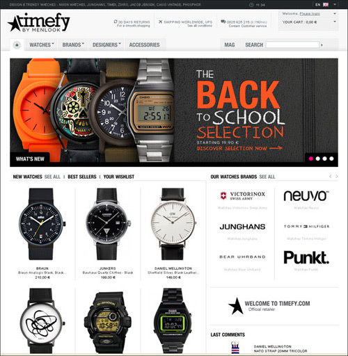
Timefy
Timefy online store sells fashionable watches providing a convenient search feature with a great number of filters for let customers refine their results.
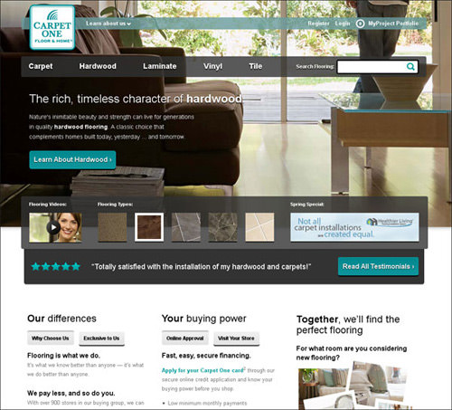
Carpet One
This design is remarkable for its winning slideshow where images perform the function of the background. Must admit, it’s a rather good solution to place the Testimonials sections just right after the header and navigation section.
Kids Plan-it
The yellow and green color scheme of this online store evokes pleasant and cheerful feelings. There is more to it than meets the eye, as the website sells furniture for children.

Wild and Bare
Here is another catchy website selling tea and tea gifts online. It delivers with a splendid landing page featuring an attractive background slideshow. That’s what makes this online store stand out among others.

Timeless Design
A brilliant minimalist design with a decent layout gives a touch of class to this furniture online store. Easy navigation, descriptive product pages, Next/Previous product links and other handy features provide a pleasant shopping experience.

JOY
JOY managed to create a splendid, perfectly balanced and informative landing page. At the top we can see contact information, a little lower, there is shipping information and special offers.
The slideshow featuring fashion images simply mesmerizes the shoppers, whereas stunning high quality images just keeps them viewing the collections and well, shop!

Controliss
This blinds store impresses with its collage-style navigation featuring some eye-catching images. The additional info is hidden to not overwhelm the design, but it is expandable by the customers.

Hello Lucky
The slideshow is a very popular feature of effective eCommerce design, that’s what makes it attractive and stylish. And Hello Lucky is one of the best examples.

Poco Nido
While the customer info links and payment methods are presented at the bottom of the page, the whole home page design looks roomy and not overloaded. It makes you want to click around and see more.

Lecoqsportif
Here is one of the extraordinary designs for an online clothes store. The background slideshow catches the visitors’ attention, while the product pages, done in minimalist style, are clean and simple.

Reed & Barton
As you have noticed, this website is designed in grayish colors, but it uses orange as an accent. Interestingly enough, Orange has very high visibility and stimulates customers to make quick decisions.

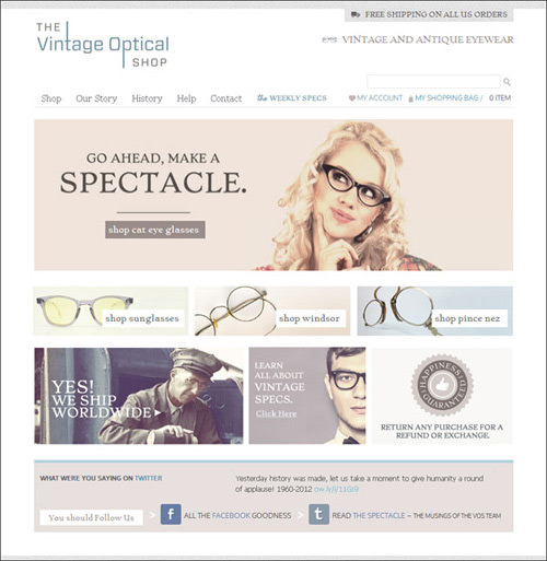
Vintage Optical Shop
This online store sells vintage eyeglasses, and the whole design is also created in the same way. This style is emphasized by vintage style images, textures, icons, buttons and etc.
Faucet Face
White is dominating in this online store design. And there is something behind that, as the company sells safe, non-chemical leaching glass bottles. They chose white, as it is often associated with purity, safety and clearness.

Chateau Sophie
This online store design impresses with its creativity and details. Flowers, butterflies, bows, lace, fanciful frames and statues – that’s what makes this design really special and vibrant.

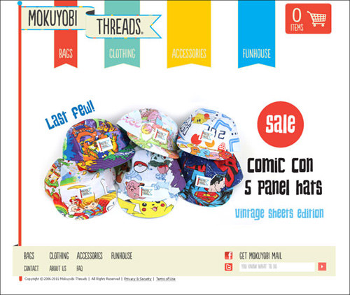
Mokuyobi Threads
This eCommerce design is colorful and energetic, yet simple and clear. Red, being an emotionally intense color, has very high visibility and brings text and images to the foreground.
Love Culture
Here’s one more fashion store website that catches the eye with its rich design and professional images. Decent navigation provides invigorative shopping experience.
