Creating an Interactive Online vCard Using Sass & Compass
Today, we’re going to continue our discussion on Sass. This time, we’ll take a practical approach and build an online vCard using Sass along with Compass.
The goal is to make the vCard easily adjustable for color and size. We’ll utilize several Sass and Compass features, including Variables, Mixins, Operations, Selector Inheritance, Nested Rules, and Compass Helpers. If you missed our previous posts in this series, it’s a good idea to check them out before continuing.
Planning and Wireframing
Planning is essential when working with Sass and Compass. It’s important to have a clear vision of the final result, whether it’s a page or a website. Browsing sites like Behance or Dribbble can provide inspiration. After gathering ideas, draft them on paper or create a wireframe, like the example below.
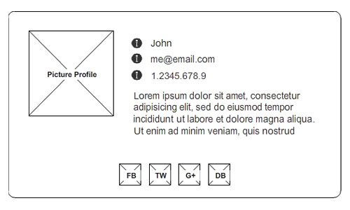
As shown in the image above, our vCard will include contact info about ‘John’ – a profile picture, some information such as his name, email address, phone number, and a brief description of who he is or what he does. This will be our ‘bio’ section.
Below that, we’ll have his social identities in the form of social buttons, which will make up our ‘social’ section.
Preparing Assets
Before we start coding, let’s get some essentials ready. By now, you should have Sass and Compass installed on your machine.
If you’re unsure whether you have them installed, you can run the command sass -v or compass -v in the Command Prompt or Terminal. Alternatively, you can use an application like Scout App if you prefer working with a GUI.
We will also need a few assets, such as font icons and social media icons, which you can get from sources like ModernPictograms.
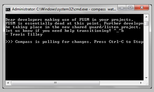
Lastly, since we are using Command Prompt/Terminal for this tutorial, navigate to your directory and start the Compass project with these commands: compass init and compass watch.
HTML Markup
Below is the HTML markup for our vCard. It’s straightforward, with all sections wrapped within logical HTML5 tags like <section>.
<div class="vcard">
  <section class="bio cf">
    <img src="images/me.jpg" width="80" height="80">
    <div class="detail">
      <ul>
        <li class="name">Thoriq Firdaus</li>
        <li class="email">me@email.com</li>
        <li class="phone">(+62)1.2345.678.9</li>
        <li class="desc">Lorem ipsum dolor sit amet, consectetur adipiscing elit. Suspendisse dolor neque, eleifend at pellentesque quis, convallis sit amet tellus. Etiam et auctor arcu.</li>
      </ul>
    </div>
  </section>
  <section class="social cf">
    <ul>
      <li class="social-facebook"><a href="#">Facebook</a></li>
      <li class="social-twitter"><a href="#">Twitter</a></li>
      <li class="social-google"><a href="#">Google+</a></li>
      <li class="social-dribbble"><a href="#">Dribbble</a></li>
    </ul>
  </section>
</div>
As you can see, the social identities in the ‘social’ section are structured within list elements so we can easily display them side-by-side. Each is given a class name following this convention: social-facebook, social-twitter, social-google, and so on.
Compass Configuration
We need to configure Compass a bit by uncommenting a few lines in the config.rb file, as follows:
# You can select your preferred output style here (can be overridden via the command line):
output_style = :expanded

# To enable relative paths to assets via compass helper functions. Uncomment:
relative_assets = true

# To disable debugging comments that display the original location of your selectors. Uncomment:
line_comments = false
If you cannot find the config.rb file, you probably haven’t run the command compass init in your project directory.
Importing Files
Since we will be using Compass, we need to import it using:
@import "compass";
I prefer to reset default browser styles so that the output renders more consistently. Compass has a Reset module based on Eric Meyer’s CSS reset, which can be imported using:
@import "compass/reset";
However, I prefer using Normalize, which also comes in Sass/Scss format. Download the file here, save it in your sass working directory, and import it into your stylesheet:
@import "normalize";
Recommended Reading: Reviewing CSS Style Priority Level
Variables
We will have a few constant values in the stylesheet, so we will store them in variables. These two variables below will define the base color of our vCard.
$base: #fff;
$dark: darken($base, 10%);
The $width variable below will define our page’s width; it will also serve as the basis for defining other element sizes.
$width: 500px;
$space: $width / 25; // = 20px
The $space variable, as you can see, will be the default spacing or column size in our vCard, which in this example is 20px.
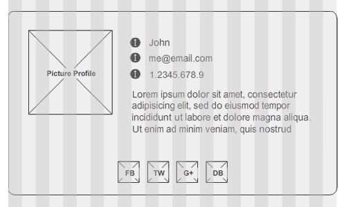
Compass also has helpers to detect image size, and we will make use of this feature on our profile picture, as follows:
$img: image-width("me.jpg") + (($space / 4) * 2);
The extra addition of (($space / 4) * 2) in the code above is to calculate the total image width, including the border that will frame the picture. A frame generally has two sides; top and bottom / left and right, which is why we multiply the division result by 2.
Selector Inheritance
There are a few selectors in our stylesheet that share the same styling rules. To avoid repetition in our code, we will specify these styles initially and inherit them with the @extend directive whenever needed. This method, in Sass, is known as Selector Inheritance, a very useful feature that is missing in LESS.
.float-left {
  float: left;
}
.box-sizing {
  @include box-sizing(border-box);
}
Styles
Once everything necessary is set up, it’s time to style our vCard, starting with a background color for our HTML document:
html {
  height: 100%;
  background-color: $base;
}
vCard
The following styles define the vCard wrapper. If you have worked with LESS before, this code will look familiar and be easy to understand.
.vcard {
  width: $width;
  margin: 50px auto;
  background-color: darken($base, 5%);
  border: 1px solid $dark;
  @include border-radius(3px);
  ul {
    padding: 0;
    margin: 0;
    li {
      list-style: none;
    }
  }
}
The wrapper’s width inherits the value from the $width variable. The background color is darkened by 5% from the base color, while the border color is darkened by 10%. This coloring is achieved using Sass color functions.
The vCard will also have 3px rounded corners, achieved using Compass CSS3 Mixins: border-radius(3px).
Bio Section
As noted earlier in this tutorial, the vCard can be divided into two sections. These nested styles below define the first section, which contains the profile picture and some details (name, email, and phone).
.bio {
  border-bottom: 1px solid $dark;
  padding: $space;
  @extend .box-sizing;
  img {
    @extend .float-left;
    display: block;
    border: ($space / 4) solid #ffffff;
  }
  .detail {
    @extend .float-left;
    @extend .box-sizing;
    color: darken($base, 50%);
    margin: {
      left: $space;
      bottom: $space / 2;
    }
    width: $width - (($space * 3) + $img);
    li {
      &:before {
        width: $space;
        height: $space;
        margin-right: $space;
        font-family: "ModernPictogramsNormal";
      }
      &.name:before {
        content: "f";
      }
      &.email:before {
        content: "m";
      }
      &.phone:before {
        content: "N";
      }
    }
  }
}
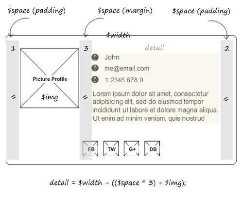
There is one thing in the code above that requires your attention. The width in the .detail selector is specified with this equation: $width - (($space * 3) + $img);.
This equation dynamically calculates the .detail width by subtracting the profile picture width and the spaces (padding and margin) from the total width of the vCard.
Social Section
The styles below are for the second section in the vCard. There is no difference with plain CSS here, only now they are nested, and a few values are defined with variables.
.social {
  background-color: $dark;
  width: 100%;
  padding: $space;
  @extend .box-sizing;
  ul {
    text-align: center;
    li {
      display: inline-block;
      width: 32px;
      height: 32px;
      a {
        text-decoration: none;
        display: inline-block;
        width: 100%;
        height: 100%;
        text-indent: 100%;
        white-space: nowrap;
        overflow: hidden;
      }
    }
  }
}
In this section, we will display the social media icons using the image sprite technique, and Compass has a feature to do that job faster.
First, we need to put our icons in a special folder – let’s name the folder /social/. Back in the stylesheet, concatenate those icons with the following @import rule.
@import "social/*.png";
The social/ above refers to the folder where we store the icons. This folder should be nested within the image folder. Now, if we look in our image folder, we should see a sprite image generated with random characters, like social-sc805f18607.png. At this point, nothing happens on the front-end until we apply the styles with the following line:
@include all-social-sprites;
Final Result
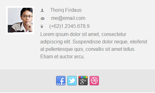
Finally, after all the hard work, we can now see the result like this:
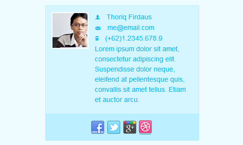
If we later think that 500px is too wide, we only need to change the value in the $width variable – for example, to 350px – and the rest will adjust accordingly. You can also experiment with the color variable.
Conclusion
In this tutorial, we have shown you how to build a simple online vCard with Sass and Compass. This is just an example, however. Sass and Compass are indeed powerful, but sometimes they are not necessary. For instance, when working on a website with a few pages and fewer lines of styles, using Sass and Compass may be considered excessive.
Further reading: Official Sass Language Documentation
This post concludes our Sass series, and we hope you enjoyed it. If you have any questions regarding this subject, don’t hesitate to add them in the comment box below.