How to Create a Datalist That’s Instantly Searchable
Dropdown lists are a neat way for providing options for an input field, particularly when the list of options available are long. A user can choose the option they want by typing into the field, or look through the options that may be a match for what they are looking for. Being able to search through the options, however, is the ideal solution.
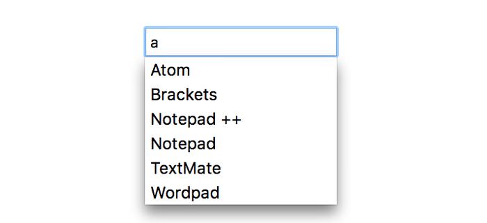
This behaviour can be achieved with the <datalist> HTML element that displays input suggestions for different controls, such as the <input> tag. However <datalist> only shows the available options when the user have already typed something into the input field.
We can make an input field more usable if we enable users to access the full list of options at any time during the input taking process.
Read Also: Exploring HTML5 Form Input Types: Date, Color, and Range
In this post, we’re going to see how to create a drop-down list that’s searchable at any time using the <select> and <datalist> HTML elements and a little JavaScript.
1. Create a Datalist with Options
First, we create a datalist for different text editors. Make sure that the value of the list attribute of the <input> tag is the same as the id of the <datalist> tag – this is how we bind them to each other.
<input type="text" list="text_editors">
<datalist id="text_editors">
    <option value="Atom">Atom
    <option value="Brackets">Brackets
    <option value="Notepad ++">Notepad ++
    <option value="Notepad">Notepad
    <option value="Sublime Text">Sublime Text
    <option value="TextEdit">TextEdit
    <option value="TextMate">TextMate
    <option value="Wordpad">Wordpad
</datalist>

2. Make the Datalist Visible
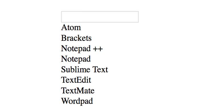
By default, the <datalist> HTML element is hidden. We can only see it, when we start to type an input into the field the datalist is attached to.
However there is a way to "force" the content of the datalist (i.e. all of its options) to appear on the webpage. We only need to give it a suitable display property value other than none, for instance display:block;.
datalist {
    display: block;
}
The displayed options aren’t yet selectable at this point, the browser only renders the options it finds inside the datalist.

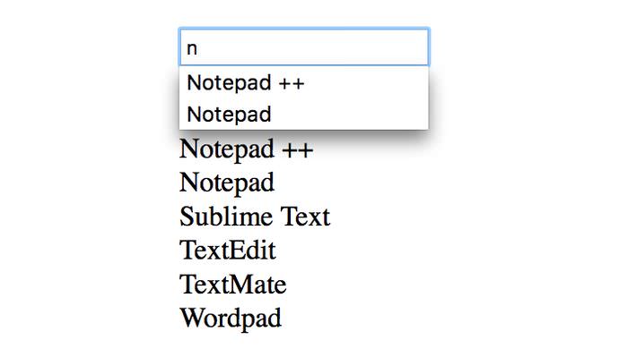
As aforementioned, due to the built-in behaviour of the <datalist> element, a part of the options already appear and are selectable, but only when the user starts to type in a string to which the browser can find a matching option.

We also need to find a mechanism to make all options (on the above screenshot displayed under the dropdown datalist) selectable at any other point of the input taking process – when users want to check out the options before they type anything, or while they’ve already taken something into the input field.
3. Bring in the <select> HTML Element
There are two ways to enable users to see and select all the options whenever they want:
- We can add a click event handler to every option, and use it to select an option when it’s clicked on, or we can also transform the options into a real drop-down list, which, by default, is selectable.
- We can wrap the options of the datalist with the
<select>HTML element.
We’ll choose the second method, as it’s simpler, and it’s allowed to be used as a fallback mechanism in browsers that don’t support the <datalist> element. When a browser can’t render & display the datalist, it renders the <select> element with all of its options instead.
By default, the select element doesn’t appear in browsers that does support datalist, that is, until we force the datalist to render its content with the display: block; CSS rule.
So, when we wrap the options from the above example (where datalist has display:block) with the <select> HTML tag, the code looks like below:
<input type="text" list="text_editors">
<datalist id="text_editors">
    <select>
        <option value="Atom">Atom
        <option value="Brackets">Brackets
        <option value="Notepad ++">Notepad ++
        <option value="Notepad">Notepad
        <option value="Sublime Text">Sublime Text
        <option value="TextEdit">TextEdit
        <option value="TextMate">TextMate
        <option value="Wordpad">Wordpad
    </select>
</datalist>

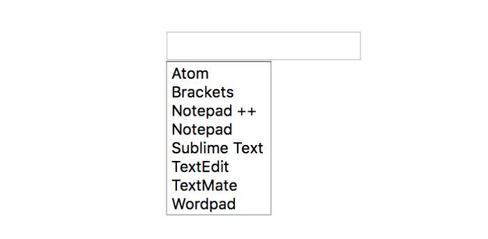
<select>To see all options of select in the dropdown list, we need to use the attributes multiple to show more than one options, and size for the number of options we want to show.
<select multiple size=8>

multiple attribute to the <select> tag4. Add a Toggle Button
The full drop-down list is supposed to appear only when the user clicks a toggle button next to the input field, while the user types the working datalist is shown. Let’s change the display value of the datalist to none, and also add a button next to the input field, which will toggle the display value of the datalist, and consequently trigger the appearance of select.
datalist {
	display: none;
}
We also need to add the following button above the datalist in the HTML file:
<button>▼</button>
Now let’s see the JavaScript. First, we define the initial variables.
button = document.querySelector('button');
datalist = document.querySelector('datalist');
select = document.querySelector('select');
options = select.options;
Next, we need to add an event listener (toggle_ddl) to the click event of the button which will toggle the appearance of the datalist.
button.addEventListener('click', toggle_ddl);
Then, we define the toggle_ddl() function. To do so, we need to check the value of the datalist.style.display property. If it’s an empty string, the datalist is hidden, so we need to set its value to block, and also to change the button from a down pointing arrow to an arrow pointing up.
function toggle_ddl(){
    /* if DDL is hidden */
    if(datalist.style.display === ''){
        /* show DDL */
        datalist.style.display = 'block';
        this.textContent="▲";
    }
    else hide_select();
}
function hide_select(){
    /* hide DDL */
    datalist.style.display = '';
    button.textContent="▼";
}
The hide_select() function hides the datalist by setting the datalist.style.display property back to an empty string, and changing the button arrow back to point downwards.
In the final setup, if the input fields hold a previously selected option and the drop-down list has also been triggered by a later button click, the previoulsy selected option also needs to be shown as selected in the drop-down list.
So, let’s add the following highlighted code to the toggle_ddl() function:
function toggle_ddl(){
    /* if DDL is hidden */
    if(datalist.style.display === ''){
        /* show DDL */
        datalist.style.display = 'block';
        this.textContent="▲";
        var val  = input.value;
        for(var i=0; i<options.length; i++) {
            if ( options[i].text === val ) {
                select.selectedIndex = i; break;
            }
        }
    }
    else hide_select();
}
function hide_select(){
    /* hide DDL */
    datalist.style.display = '';
    button.textContent="▼";
}
We also want to hide the drop-down list when the user is typing into the input field (at the time the working datalist will appear).
/* when the user wants to type into text field, hide DDL */
input = document.querySelector('input');
input.addEventListener('focus', hide_select);
5. Update Input when an Option is Selected
Finally, let’s add a change event handler to the <select> tag, so that when the user selects an option from the drop-down list, its value will be displayed inside the <input> field as well.
/* when user selects an option from DDL, write it to text field */
select.addEventListener('change',fill_input);
function fill_input(){
    input.value = options[this.selectedIndex].value;
    hide_select();
}
Drawbacks
The main drawback of this technique is the absence of a direct way to style the <datalist> element with CSS (the appearance of the <datalist> and <select> tags vary across different browsers).
Also, in Firefox, the input text is matched against options that contains the input characters, while other browsers match options that begin with those characters. The W3C spec for datalist doesn’t explicitly specify how the matching should be done.
Other than that, this method is good and works in all major browsers, whereas in browsers where it may not work, users can still see the drop-down list, only the suggestions won’t appear.
Check out the final demo with a bit of CSS styling below: