Promoting Yourself Via Print: Ideas, Tips And Examples
Opportunity knocks at the oddest of places: you could be at a big conference for design professionals where potential clients are everywhere, or at a coffee shop talking to a local business owner in need of creative services, or even at at a music festival that’s perfect for spreading the word, guerrilla-style, about your skills.
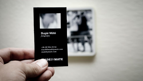
(Image Source: Bugar Mate)
You know your online portfolio proves your design chops, but sometimes taking out your smartphone or tablet to showcase your website just isn’t convenient. Often times, you’ll be in a situation where you’re pressed for time and need to make a memorable impression on the spot.
Every Opportunity Counts
Whether you’re a graphic designer, web designer, artist or photographer, you know how important it is to stand out from the crowd when it comes to getting your name out there.
And when it comes to assembling a portfolio kit together to send to potential employers, you’ll need to include not just your contact information, but also samples of your work.
In this post, we are showcasing some inspiring ways you can use print products to spread the word about what you do, while “wowing” someone who could use your creative skills somewhere down the line.
1. The Business Card
The first obvious go-to for any creative professional is a business card, but thinking outside of the box will make a huge impact on potential clients.
Your business card isn’t just a way to pass along your phone number on a rectangular piece of glossy cardstock; it’s also an opportunity to give someone a sense of your capabilities.
20 Impressive Business Card Designs: Vol. 2
Discover unique and creative business card designs to make a lasting impression. Improve your professional image with these... Read more
Here are some tips to make full use of your business cards:
- Use your card as your canvas and showcase an example of your work.
- Take advantage of double-sided printing and use the back of your card, too.
- Alternate sizes or materials that are related to your craft, style or interests are also good ways to give someone an idea of your personality, creativity, or business. Instead of the standard high gloss UV coating, try using a matte finish instead.
- Rounded corner cards or folded cards are also interesting ways to make your business card stand out.
Examples:
Graphic designer Mark Dormand used the back of his card to show his illustration work.

Dennis Ventrello designed his business card as a mini-resume as part of his self-promotional package.

Dane Holmquist is a talented illustrator, graphic designer and typographer – you can tell by the way he’s designed his own letterpress business card.

Artist Bubi Au Yeung illustrates her creative style with examples of icons she’s designed on the back of her business card.

Bugar Mate‘s business card has been die-cut to resemble the viewfinder of a camera.

Mackey Saturday‘s unique letterpress business cards are made of laser-etched wood veneer with metallic ink.

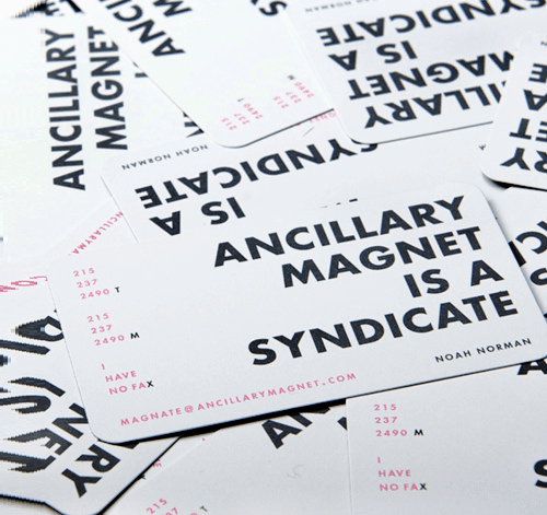
Multimedia professional Noah Norman named his business Ancillary Magnet, then used business card-sized magnets as a way to share his contact information.
Jamie Reed‘s version of the classic “Wooly Willy" cleverly shows off his fun personality and graphic design abilities.

This business card designed by Luis Cabrera for a small film production company was printed on thin plastic and die-cut to look like a section of film.

Karen Cornish‘s fold-out meishi (Japanese-style business cards) illustrates her design and bilingual skills.

This business card for Brazilian cargo transport company TAM designed by Eduardo Quadra and Eduardo Araujo cleverly folds into a little box.

Company Folders, Inc. demonstrates what they do best with a miniature presentation folder card with pockets.

2. Stickers
Everyone loves freebies, so why not give away free stickers of your work, logos, and other designs? Many artists bring them along to music festivals, trade shows and other events to stick around or hand out as fun self-promotional tools.
Examples:
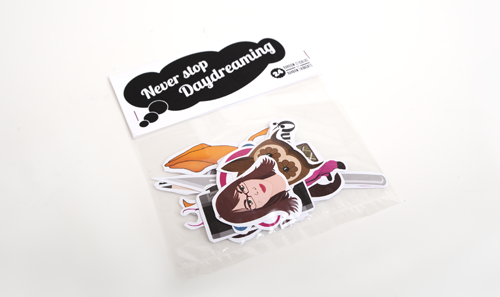
Designer Melissa Piombo‘s sticker pack.

Courtney Nienke created promotional stickers out of her illustration work.
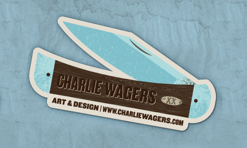
Graphic designer and illustrator Charlie Wagers designed these die-cut stickers in the shape of a pocketknife – a handy tool he’s been known to carry around – to hand out at an art, design and music festival.
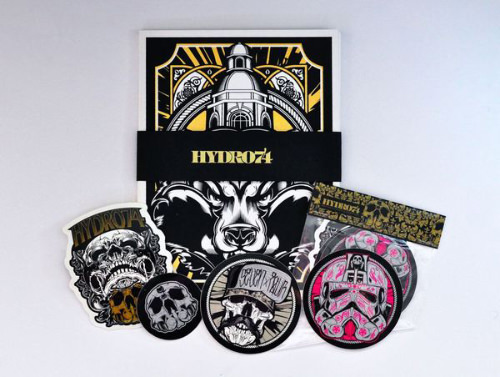
Joshua M. Smith, who designs as Hydro74, created a collection of silk screen prints and stickers as giveaways at trade shows and gallery events.
Fine artist Ana Bagayan made sticker sets of her latest collection of works as a giveaway on her blog.

3. Greeting Cards
The holidays are the perfect time to say “thanks" to your clients for their business! Sending a greeting card is a great way to stay fresh in their minds the next time they may need your services. Alternatively, you can also design free cards to give to friends, family and clients as a way to promote yourself.
A Look Into: Evolution Of Greeting Card Designs
Greeting cards have been around for hundreds of years dating back to ancient China and Egypt. It's how... Read more
Examples:
Singapore-based design studio Lemongraphic created a holiday card to send to clients.

French design agency Murmure created this all-white greeting card to wish their clients the best in 2012.

Raw Toast Design created clever holiday greeting cards that also promote their services.

4. Postcards
If you’re looking for a way to promote yourself but feel a business card is too small a canvas, a 4 x 6" (10.16 x 15.24 cm) or 5 x 7" (12.7 x 17.78 cm) postcard will give you plenty of space to get your message across.
Many creative professionals leave their promotional postcards at local art galleries or coffee shops as freebies that also function as advertisements. Whether you’re a painter, graphic designer or photographer, postcards are a great way to raise awareness of your upcoming show openings.
Using Movie Postcards In A Creative Way
One of the most common forms of entertainment is watching movies. And of course, they need to get... Read more
Tips:
- Use the front of the card to show your work and print the gallery’s name and address.
- Show dates and your contact information on the backside.
- Before leaving your promotional items anywhere, make sure you have the approval of the business owner or manager.
Examples:
Argentinian designer Gabriel Farsetti created these graffiti-inspired vector full-color postcards and used rounded edges to set them apart.
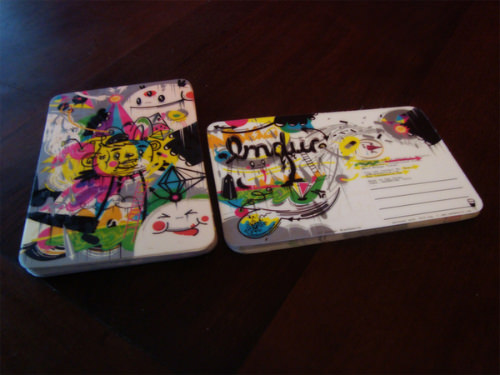
Irene in Singapore put together a clever way to promote her design work and find a job in the United States by creating a postcard to mail to creative directors. She used a dashed line to indicate that the postcard should be cut into sections.
If the recipient was not hiring, they could keep her information as a business card and share the second business card piece with another creative professional who could potentially need Irene’s services. The graphic designer even created custom stamps – a great way to complete the look!

5. Booklets & Brochures
Networking events are ideal for bringing booklets that are portable, but still provide enough estate to show examples of your work. A half-page booklet, CD-sized accordion fold booklet or even a DVD booklet using bookweight paper are all perfect for when you’re on-the-go. A handful of them can easily be thrown into your bag and taken to trade shows or conferences.
Full-page or landscape sized booklets are also great for self-promotional portfolio kits to send out to ad agencies or other companies who may be hiring and may be interested in seeing your samples printed on a larger scale. And when it comes to printing your resume, brochures are good alternatives to the standard letter-size page.
50 Creative Printed Brochure Designs, Vol. 2
If you liked the first collection of fantastic printed brochure designs we had earlier, here's another batch, ample... Read more
Examples:
Canadian designer Hyun Cho used a CD-sized square booklet for his portfolio.

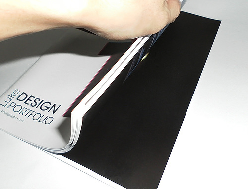
Luke Kin used a full-sized booklet as his design portfolio.
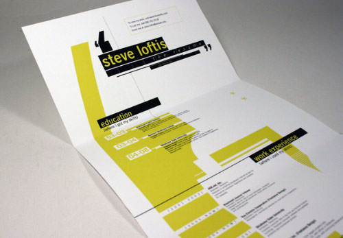
Instead of a standard-sized page, Steve Loftis used a tri-fold brochure for his resume.
As part of her self-promo kit, Yu Ping Chuang used an accordion-style full-page booklet for her portfolio.

6. Posters
People often tear out interesting magazine ads or pages featuring our favorite bands or actors, then tack them up onto their walls for inspiration or to represent who they are and what they like. Take advantage of this.
Creating self-promotional posters to give away at events or public places is a great way to inspire others with your own designs and advertise yourself. An 11" x 17" poster is the perfect size – it’s affordable to print; folds or rolls up into a manageable size; and can be displayed on a wall without taking up too much space.
Examples:
This self-promotional poster by Jontue Hollingsworth (a.k.a. Headron Collider) illustrates his photography, design, and typography skills and “focuses on the idea of brand identification and what we as humans determine as beautiful."

This promotional poster by TinyTwiggette Design features a fun and playful illustration of animals while giving a sense of the designer’s creative style.

As part of his self-promotional mailer kit, New Zealand graphic designer Adam Wouldes created a punchy “Ice Cream’s Overated" poster which includes his website address and contact information.

British graphic designer Andrew Groves created this vector promotional poster that’s fun, humorous, and cheeky. Who wouldn’t want to brighten up the day with this colorful piece?

Johnny Kotze, managing creative director and CEO of South Africa design studio, The Motel, handed out this illustrated and screen-printed poster to agencies to promote his services.

Soy Han created a fold-out poster about himself and his work as a self-promo.
