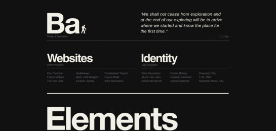
Showcase Of Beautiful Black And White Websites
Deciding the best fit from the sea of colors can sometimes be a tough call for web designers. But the good news is – when we ran into color choosing and matching block, we have tools like Adobe Kuler to help us with the decision making. How about designing a Black and White website?
Assuming designing websites in black and white is easier to pull off because you do not need to go through all the painstaking tasks of color choices, and matching is a wrong perception. Black and White web design does not make things any easier, at least that’s what we think. It’s a bold and challenging move. Why? Well, at the end of the day, you are limited to only black, white, and everything in between to create a decent and nice-looking website.
If you are already tired of creating colorful and vibrant color websites, why not challenge a black/white or dual-tone website for a change? Here we have compiled a collection of beautiful and inspiring Black and White websites for your inspiration.
Full list after the jump!
Portfolios and Personal Websites
With portfolios and personal websites, black and white just looks classy. Though colorful things and works are always welcome, the black and white layouts throw some kind of amazing vibe towards the person visiting the website. On the one hand, it shows a certain amount of elite and high-class sense, and on the other, it also shows a continuous flow of ideas which is evident from the minimal use of colors.
Let’s not forget the soothing effect it has on the eyes of the visitors, here are some of the most amazing black and white portfolio and personal websites.
Allday

Arnau Beelen

Leah Haggar

Marc Ecko

Marcin Kaniewski

Michael Dick

Pixel Urban

Urban Edge Design

SJ Hunter

Blakeallendesign

Patrick Fry

Corporate Websites
In the corporate world, it’s all about standing out and doing things with flair. With zillions of others competing with you in the same niche, you have to have an edge in some way or the other. And we can safely assume that a website is the only identity of your business that has the most widespread reach among your customers. In such cases, having a classy-looking Black and White website would surely boost one’s chances of fetching more customers.
No doubt, quality of service comes first, but as they say, the first impression is the last impression. So corporate organizations should try their level best to ace their first impression. The Black and White color scheme not only is very soothing to the eyes of people viewing it, but it also gives a silent indication of your sense of design, imagination, and minimalism.
Bliaafully Aware

Circus

DesignGive

Dragon Interactive

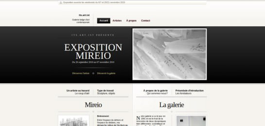
Its Artist

Kineda

SOFA

Master Grinding

Multitouch-Barcelona

Post Machina

Red Chilli

RGA

Black Estate

Uber Stealth

Toshiedo

The Old State

Your Majesty

Zero Fee

Blogs and Magazines
We have blogs and magazines all around us. Some are focussed on technology, some on design stuff (like the one you’re reading right now, of course), and the rest are personal blogs. With blogs, the only thing that has relevance is readability. Blogging is all about presenting and communicating your ideas to the world. It is your silent speech, your gesture of being yourself on the internet.
So, how effectively are you communicating your ideas to the people out there? And that’s where comes the importance of choosing the right design and color scheme for your blog.
With Black and Whites, it is always the best bet. It has been seen that black and white colors tend to improve the readability of text over computer screens. So if one wants to get noticed on the interwebs, we would definitely recommend a great looking Black and White blog design
Hell-Cat

Soyour Style

Lonely Prevvy

The Pretty Reckless

Too Pix Creative

Urbanlandscape Lab

Visual Box

XQS Band

Coda Coza

Demain Jarrete
