20 Wrist-Worthy Smartwatch UI Redesigns
For any new hardware released, the software and UI design within makes or breaks the product. As much as we hate poorly designed mobile UI, we are attracted to UI that work smoothly, are well thought-out and look beautiful when being used.
There are many talented designers out there who are showcasing their take on smartwatch UI design. In this post, you will find 20 such examples. Some of these are concept designs for particular apps such as the weather app, clock app, music app and fitness apps, while others are complete reimaginings of existing UI.
Let us know which of the following resonated well with you.
Read more: 20+ Apple Watch GUI kits & templates to download
#1 @Abhinav Chhikara
Swipe up to get more details on the weather, or leave it by default to see just the weather temperature.

#2 @Gary Keeler
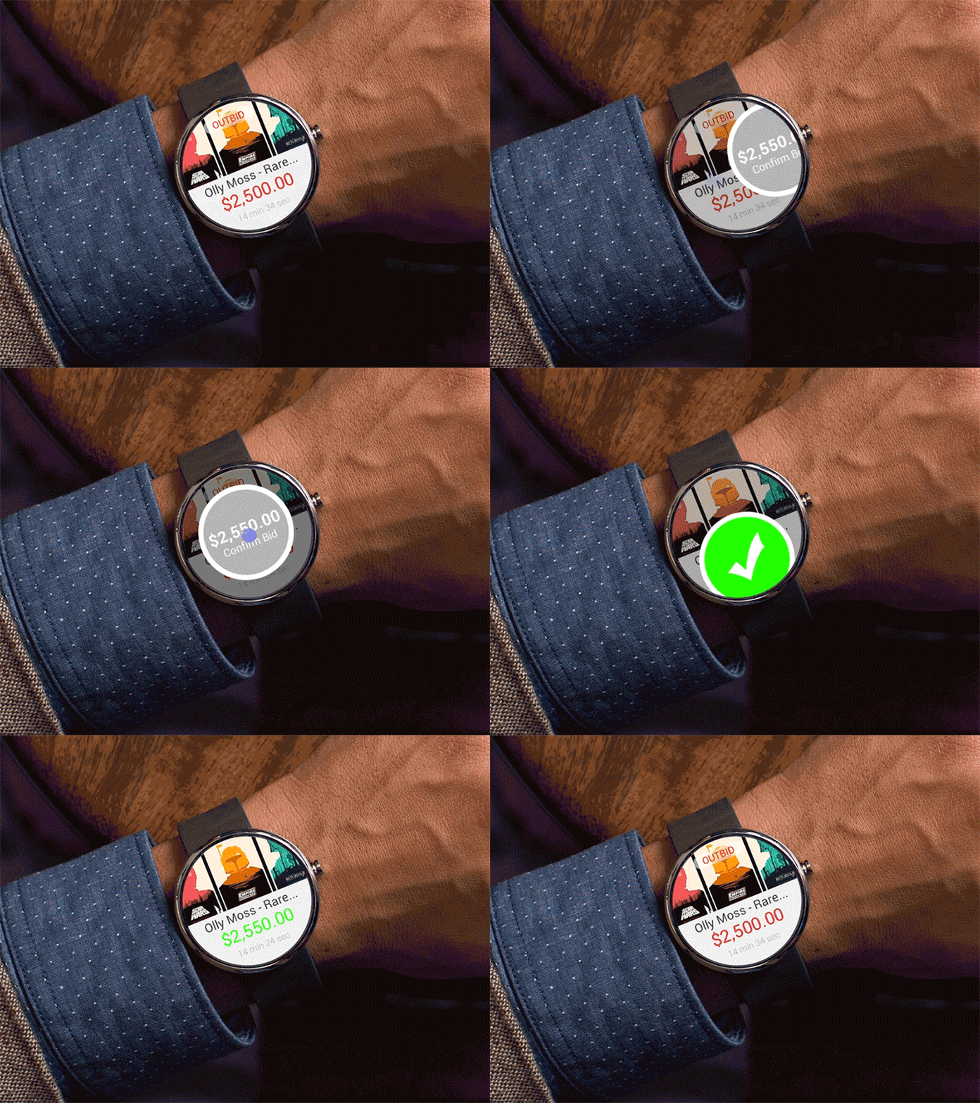
On this gif you can see process of confirmation some action on Ebay. The animation looks pretty awesome.
#3 @Mihail Shelkunov
On the image you can see the redesigned concept of the Suunto watch. It allows song-switching, determining your location, and turning on navigation.

#4 @Rasam Rostami
3ange is a concept of a sci-fi watch face. The corners of triangle show the time and it changes every 5 seconds.

#5 @Jan Erik Waider
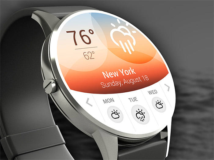
This weather app shows temperature and weather conditions for three days ahead. The gradient on the background is supposed to adapt to the current weather situation and change color.
#6 @Ramotion
The gif shows how the watch looks like showing time and then up pops a notification.

#7 @Ramotion
See live data about your health on the screen of your smartwatch. Here you see the blood pressure data displayed with a graph in the background.

#8 @Radek Jedynak
This UI shows a list of contacts when you choose one of the lists. You can call or send a message to the person easily.

#9 @Riste Lazoroski
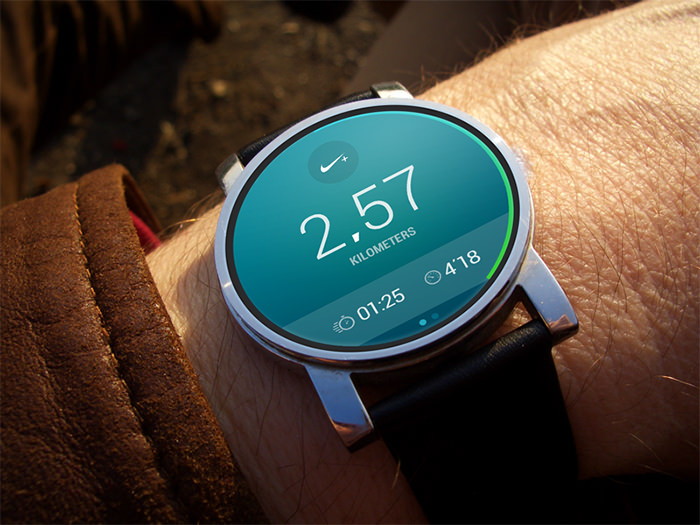
The screen showcases the number of kilometers the user ran as well as the time. This is used with the Nike app. The color is also a refreshing touch.
#10 @Daniel Keller
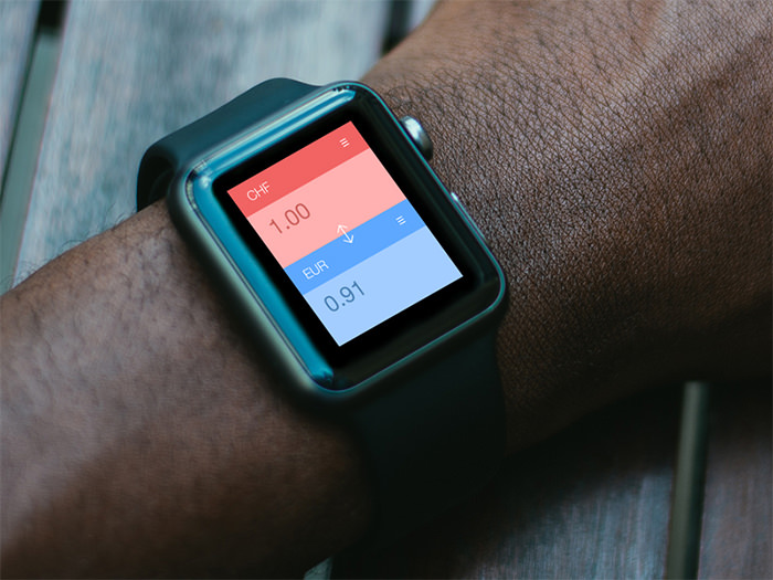
This design of a currency converter app is flat and minimalistic but simple is best when it comes to handling numbers and figures.
#11 @Amit Jakhu
Here is a simple concept of a music player on a smartwatch. It has the ability to play, pause, repeat, and shuffle songs. The album cover on the background looks amazing too.

#12 @Ruben Rodrigues
The screen shows the time and the favourite apps of the user on 8 points near the edge of the screen.

#13 @Studio-JQ
Huge typography in use here, in both fonts and icons. The image in the background is a nice subtle touch.

#14 @Impekable
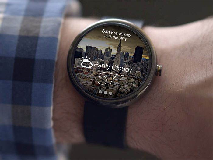
This weather app features a background of your current location, eg San Francisco here, plus the local weather information. White typography makes the whole design look minimalistic and cool.
#15 @Carl Hauser
It looks like a home screen for smartwatch. A nice wallpaper with time and weather information. This design is definitely banking on the less is more feel.

#16 @Steven David
For users who require daily medication, this is a good UI that features the medication name and dose, when the time has come to down the next set of pills.

#17 @Nicolás J. Engler
This smartwatch interface is clean yet informative. It shows weather conditions and temperature on a beautiful background.

#18 @Atif Ahmed Akkhor
Super clean and minimalistic UI in white. Inspired by BRAUN watches, the screen displays time, date, weather, and notifications about missed calls and messages.

#19 @Ali Attarwala
Sleek, simple, and flat, this watch interface features a red line on the edge as a progress bar for a process.

#20 @Yecid Sanmartin
Here’s a nice concept design featuring the look and feel of a time, weather and temperature you would normally see on a mobile app instead of on a watch.
