How to Make an Animated SVG Speedometer
A gauge meter is a tool that visually indicates a value within a given range. In computers, a “disk space indicator” uses a gauge meter to show how much disk space is used from the total available. Gauges have zones or regions across its range, each differentiated by its own color. In front-end development, we can use the <meter> HTML5 tag to display data within a specific range.
In this post, we’ll make an SVG gauge meter of semi-circular shape, and animate it. Take a look at this preview GIF that shows how the final version will work in Firefox:
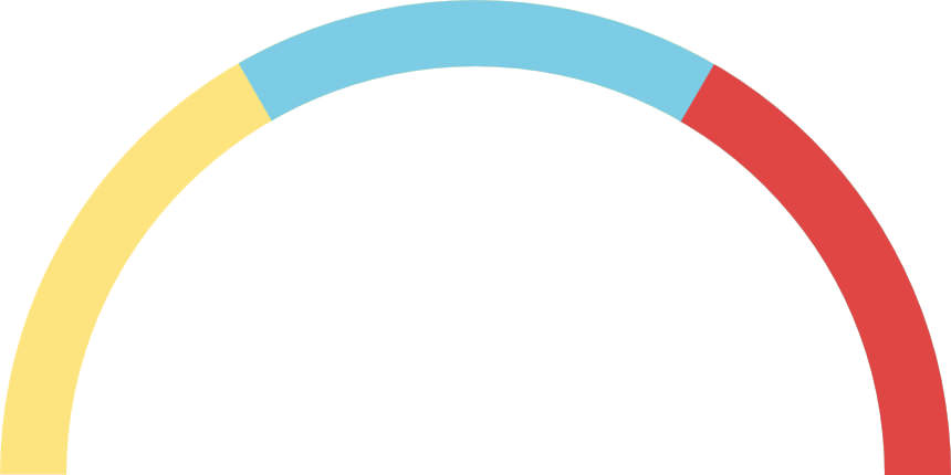
The meter’s range is 0-100, and it displays three equal zones in yellow, blue and red. You can change the range and the number of the zones according to your needs.
For explanation purposes, I’ll perform manual calculations, and use inline SVG attributes/properties in the following steps.

My final demo, however, uses CSS and JavaScript for the calculation and insertion of SVG properties in order to make it more flexible.
1. Draw a circle
Let’s draw a simple circle in SVG. HTML5’s new <svg> tag allows us to add SVG right into the HTML code. Inside the <svg> tag, we add the <circle> SVG shape like this:
<div id="wrapper">
  <svg id="meter">
    <circle r="150" cx="50%" cy="50%"></circle>
  </svg>
</div>

In CSS, let’s add width and height properties to the wrapper, both greater than or equal to the diameter of the circle (it’s 300px in our example). We also need to set the width and height of the #meter element to 100%.
#wrapper{
  width: 400px;
  height: 400px;
}

#meter{
  width: 100%;
  height: 100%;
}
2. Add outline to the circle and remove fill
With the help of the stroke and stroke-width SVG properties we add an outline to the circle, and by using the fill="none" property we remove the circle’s fill as well.
<circle id="low" r="150" cx="50%" cy="50%" stroke="#FDE47F"
stroke-width="60" fill="none"></circle>

3. cover only half of the circle
The stroke-dasharray SVG property creates a dashed outline, and takes two values, dash length and gap length.
For the semi-circle outline, the dash length value needs be equal to the circle’s semi-circumference, so that the dash covers half of the circle’s circumference, and the gap length value needs be either equal to or more than the remaining circumference.
When it’s more, it will be converted to the remaining circumference by the browser, hence we will use the full circumference value for the gap length. This way we can avoid calculating the remaining circumference.
Let’s see the calculations:
where r is the radius. For a radius of 150, the circumference is:
If we divide it by 2, we get 471.24 for semi-circumference, so the value of the stroke-dasharray property for a semi-circle outline in a 150 radius circle is 471, 943. This semi circle will be used to denote the Low Range Zone of the meter.
<!-- Low Range Zone (Yellow) -->
<circle id="low" r="150" cx="50%" cy="50%" stroke="#FDE47F"
stroke-width="60" stroke-dasharray="471, 943" fill="none">
</circle>
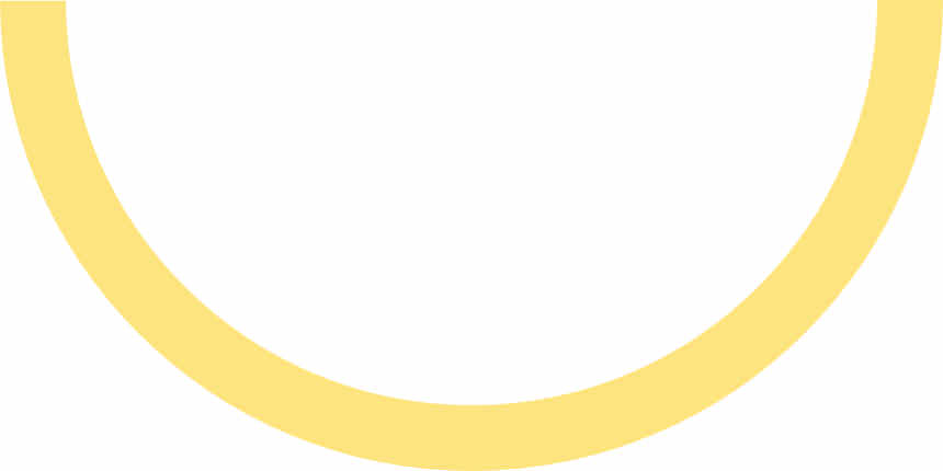
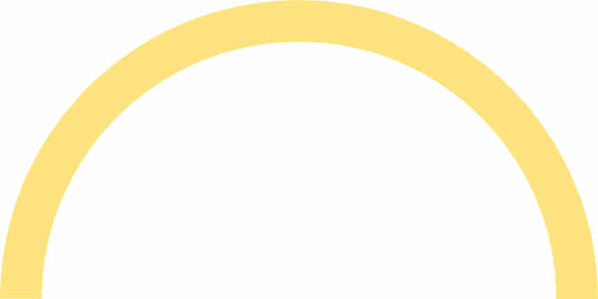
As can you see, it’s upside down, so let’s turn the SVG up by adding the transform CSS property with the value of rotateX(180deg) to the <svg id="meter"> HTML element.
#meter {
  transform: rotateX(180deg);
}
4. Add the other zones
The middle zone (blue) has to cover the ⅔ portion of the semi-circle, and ⅔ of 471 is 314. So, let’s add another circle to our SVG by using the stroke-dasharray property again, but now with the value of 314, 943.
<!-- Low Range Zone (Yellow) -->
<circle id="low" r="150" cx="50%" cy="50%" stroke="#FDE47F"
stroke-width="60" stroke-dasharray="471, 943" fill="none"><
/circle>

<!-- Average Range Zone (Blue) -->
<circle id="avg" r="150" cx="50%" cy="50%" stroke="#7CCCE5"
stroke-width="60" stroke-dasharray="314, 943"
fill="none"></circle>
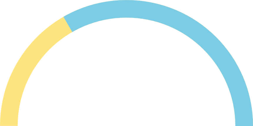
The final zone (red) has to cover the last ⅓ part of the semi-circle, and ⅓ of 471 is 157, so we will add this value to the stroke-dasharray property of the third circle.
<!-- Low Range Zone (Yellow) -->
<circle id="low" r="150" cx="50%" cy="50%" stroke="#FDE47F"
stroke-width="60" stroke-dasharray="471, 943" fill="none">
</circle>

<!-- Average Range Zone (Blue) -->
<circle id="avg" r="150" cx="50%" cy="50%" stroke="#7CCCE5"
stroke-width="60" stroke-dasharray="314, 943" fill="none">
</circle>

<!-- High Range Zone (Red) -->
<circle id="high" r="150" cx="50%" cy="50%" stroke="#E04644"
stroke-width="60" stroke-dasharray="157, 943" fill="none">
</circle>
5. Add The Meter Outline
Let’s add a grey outline to the meter in order to make it look better. The dash length of the outline circle needs to be equal to the semi-circumference. We place it before all the other circles in the code, so that it will be rendered first by the browser, and therefore will be displayed beneath the region circles on the screen.
The stroke-width property needs to be a little bit greater than that of the other circles, in order to give the appearance of a real outline.
<!-- Meter Outline (Grey) -->
<circle id="outline_curves" r="150" cx="50%" cy="50%"
stroke="#f6f6f6" stroke-width="65"
stroke-dasharray="471, 943" fill="none">
</circle>

<!-- Low Range Zone (Yellow) -->
<circle id="low" r="150" cx="50%" cy="50%" stroke="#FDE47F"
stroke-width="60" stroke-dasharray="471, 943" fill="none"><
/circle>

<!-- Average Range Zone (Blue) -->
<circle id="avg" r="150" cx="50%" cy="50%" stroke="#7CCCE5"
stroke-width="60" stroke-dasharray="314, 943" fill="none">
</circle>

<!-- High Range Zone (Red) -->
<circle id="high" r="150" cx="50%" cy="50%" stroke="#E04644"
stroke-width="60" stroke-dasharray="157, 943" fill="none">
</circle>
Outline Ends
As the outline doesn’t cover the ends of the semi-circle, we also add 2 lines of about 2px to the ends by adding another circle with a dash length of 2px and a gap length of the semi-circumference minus 2px. Therefore the value of the stroke-dasharray property of this circle is 2, 469.
<!-- Outline Ends (Grey) -->
<circle id="outline_ends" r="150" cx="50%" cy="50%" stroke="#f9f9f9"
stroke-width="65" stroke-dasharray="2, 469" fill="none"></circle>
Mask
Now let’s add another circle after the low, average, and high range zones. The new circle will function as a mask to hide the unnecessary zone regions when the gauge meter will be operated.
Its properties will be the same as those of the outline circle, and its stroke color will also be grey. The mask will later be resized with Javascript to reveal the zones beneath it in response to an input slider.
The combined code so far is as below.
<!-- Meter Outline -->
<circle id="outline_curves" r="150" cx="50%" cy="50%"
stroke="#f6f6f6" stroke-width="65"
stroke-dasharray="471, 943" fill="none">
</circle>

<!-- Low Range Zone (Yellow) -->
<circle id="low" r="150" cx="50%" cy="50%" stroke="#FDE47F"
stroke-width="60" stroke-dasharray="471, 943" fill="none">
</circle>

<!-- Average Range Zone (Blue) -->
<circle id="avg" r="150" cx="50%" cy="50%" stroke="#7CCCE5"
stroke-width="60" stroke-dasharray="314, 943" fill="none">
</circle>

<!-- High Range Zone (Red) -->
<circle id="high"  r="150" cx="50%" cy="50%" stroke="#E04644"
stroke-width="60" stroke-dasharray="157, 943" fill="none">
</circle>

<!-- Mask -->
<circle id="mask" r="150" cx="50%" cy="50%" stroke="#f6f6f6"
stroke-width="65" stroke-dasharray="471, 943" fill="none">
</circle>

<!-- Outline Ends -->
<circle id="outline_ends" r="150" cx="50%" cy="50%"
stroke="#f9f9f9" stroke-width="65" stroke-dasharray="2, 469"
fill="none">
</circle>

If we want to reveal a region under the mask, we need to reduce the size of the mask’s dash length. For instance, when the value of the stroke-dasharray property of the mask circle is 157, 943, the arcs will stand in the following state:
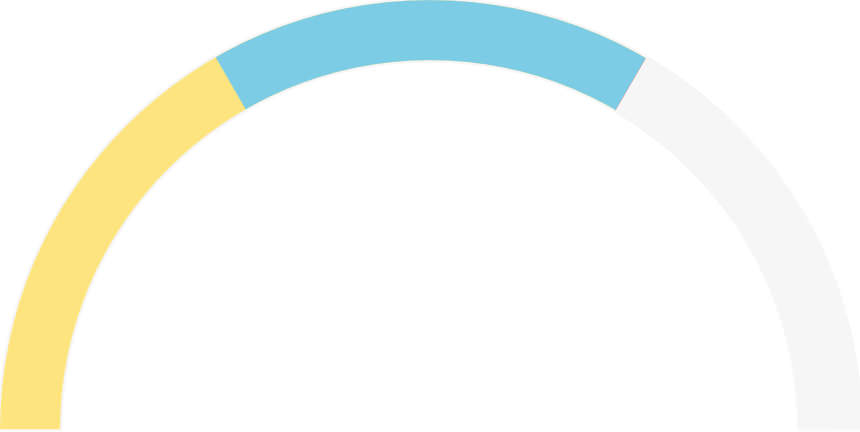
So, all we have to do now is to adjust the stroke-dasharray of the mask using JavaScript for animation. But before we do that, as I mentioned before, for my final demo I used CSS and JavaScript to calculate and add most of the SVG properties.
Below you can find the HTML, CSS, and JavaScript code that leads to the same result as above.
HTML
I added a needle image (gauge-needle.svg), a range slider (input#slider) to the user input, and a label (label#lbl) to display the slider value in the range of 0-100.
<div id="wrapper">
    <svg id="meter">
        <circle id="outline_curves" class="circle outline"
        cx="50%" cy="50%"></circle>

        <circle id="low" class="circle range" cx="50%" cy="50%"
        stroke="#FDE47F"></circle>

        <circle id="avg" class="circle range" cx="50%" cy="50%"
        stroke="#7CCCE5"></circle>

        <circle id="high" class="circle range" cx="50%" cy="50%"
        stroke="#E04644"></circle>

        <circle id="mask" class="circle" cx="50%" cy="50%" >
        </circle>

        <circle id="outline_ends" class="circle outline"
        cx="50%" cy="50%"></circle>
    </svg>
    <img id="meter_needle" src="gauge-needle.svg" alt="">
    <input id="slider" type="range" min="0" max="100" value="0" />
    <label id="lbl" id="value" for="">0</label>
</div>
CSS
The CSS code below adds style rules to the SVG, as SVG shapes can be styled the same way as HTML elements. If you want to read more on how to style SVG with CSS, take a look at this post. For styling the slider, check out this post.
#wrapper {
  position: relative;
  margin: auto;
}
#meter {
  width: 100%; height: 100%;
  transform: rotateX(180deg);
}
.circle {
  fill: none;
}
.outline, #mask {
  stroke: #F1F1F1;
  stroke-width: 65;
}
.range {
  stroke-width: 60;
}
#slider, #lbl {
  position: absolute;
}
#slider {
  cursor: pointer;
  left: 0;
  margin: auto;
  right: 0;
  top: 58%;
  width: 94%;
}
#lbl {
  background-color: #4B4C51;
  border-radius: 2px;
  color: white;
  font-family: 'courier new';
  font-size: 15pt;
  font-weight: bold;
  padding: 4px 4px 2px 4px;
  right: -48px;
  top: 57%;
}
#meter_needle {
  height: 40%;
  left: 0;
  margin: auto;
  position: absolute;
  right: 0;
  top: 10%;
  transform-origin: bottom center;
  /*orientation fix*/
  transform: rotate(270deg);
}
JavaScript
In the JavaScript, first we calculate and set the dimensions of the wrapper and all arcs, then we add the appropriate stroke-dasharray values to the circles. After that, we will be binding a custom event to the range slider in order to perform the animation.
/* Set radius for all circles */
var r = 250;
var circles = document.querySelectorAll('.circle');
var total_circles = circles.length;
for (var i = 0; i < total_circles; i++) {
    circles[i].setAttribute('r', r);
}

/* Set meter's wrapper dimension */
var meter_dimension = (r * 2) + 100;
var wrapper = document.querySelector("#wrapper");
wrapper.style.width = meter_dimension + "";
wrapper.style.height = meter_dimension + "";

/* Add strokes to circles  */
var cf = 2 * Math.PI * r;
var semi_cf = cf / 2;
var semi_cf_1by3 = semi_cf / 3;
var semi_cf_2by3 = semi_cf_1by3 * 2;
document.querySelector("#outline_curves")
    .setAttribute("stroke-dasharray", semi_cf + "," + cf);
document.querySelector("#low")
    .setAttribute("stroke-dasharray", semi_cf + "," + cf);
document.querySelector("#avg")
    .setAttribute("stroke-dasharray", semi_cf_2by3 + "," + cf);
document.querySelector("#high")
    .setAttribute("stroke-dasharray", semi_cf_1by3 + "," + cf);
document.querySelector("#outline_ends")
    .setAttribute("stroke-dasharray", 2 + "," + (semi_cf - 2));
document.querySelector("#mask")
    .setAttribute("stroke-dasharray", semi_cf + "," + cf);

/* Bind range slider event*/
var slider = document.querySelector("#slider");
var lbl = document.querySelector("#lbl");
var mask = document.querySelector("#mask");
var meter_needle =  document.querySelector("#meter_needle");

function range_change_event() {
    var percent = slider.value;
    var meter_value = semi_cf - ((percent * semi_cf) / 100);
    mask.setAttribute("stroke-dasharray", meter_value + "," + cf);
    meter_needle.style.transform = "rotate(" +
        (270 + ((percent * 180) / 100)) + "deg)";
    lbl.textContent = percent + "%";
}
slider.addEventListener("input", range_change_event);
The Custom range_change_event() Function
The behaviour of the meter is performed by the range_change_event() custom function that is responsible for the adjustment of the mask size and the animation of the needle.
It takes the slider value (user input) which’s between 0-100, converts it to the semi-circumference equivalent (meter_value) of a value between 471-0 (471 is the semi-circumference for radius 150), and sets that meter_value as the dash length of the mask’s stroke-dasharray property.
The range_change_event() custom function also rotates the needle after converting the user input (coming in the 0-100 range) to its degree equivalent of 0-180.
270° is added to the needle’s rotation in the above code because the image I used is of an upright needle and I had to initially rotate it 270° to make it lie flat to its left.
Finally, I bound the range_change_event() function to the range slider, so that the gauge meter can be operated with it.
Check out the demo or take a look at the source code at our Github repository.
Read more: Click here to check out more SVG animations