How to Synchronously Test Your Website on Multiple Browsers & Devices
When building a responsive website we’ll need to test it in multiple screen-sizes to make sure that the site layout is rendered properly on those varying screen-sizes. We can use screen-size and device emulator in Chrome which is pretty handy. However, nothing beats testing the website on a real device since it provides an environment that’s as close as to our users.
Testing on multiple devices also pose a problem though. Say we have three devices to test the site on, we may end up having to constantly refresh each browser in every of these devices everytime we’ve just made a change which, as you can imagine, is cumbersome.
The idea of synchronized testing has emerged to address this situation and make the workflow more streamlined. There is a Grunt plugin called BrowserSync to perform this, and we are going to show you how to deploy it in your project, in this post.
Recommended Reading: Viewport Emulation With Chrome’s Device Metrics
BrowserSync is open-source and actively developed. It is cross-platform. You can use it in Windows, OS X and Linux. Ghostlab, on the other hand, is only available in OS X and Windows. BrowserSync is free which helps if you have little to no budget to work with.
Without further ado, let’s see how BrowserSync works.
Installation
To start off, we are going to use Grunt. We will need to make sure that the grunt-cli is installed as well the plugin, Grunt BrowserSync. This plugin syncs a number of interactions that occur on the website including page scrolling, populating form fields, and clicking on links.
All these actions will be reflected in the other browsers and devices as they are happening. Type the following command to install BrowserSync in your working directory:
npm install grunt --save-dev
npm install grunt-browser-sync --save-dev
Configuration
Once installed, load BrowserSync within the Gruntfile.js, this way.
module.exports = function (grunt) {
    grunt.initConfig({
        browserSync: {
            bsFiles: {
                src : [ 'index.html', './css/*.css' ]
            },
            ghostMode: {
                clicks: true,
                forms: true,
                scroll: true
            },
            options: {
                server: {
                    baseDir: "./"
                }
            }
        }
    });

    // load npm tasks
    grunt.loadNpmTasks( 'grunt-browser-sync' );

    // define default task
    grunt.registerTask( 'default', ['browserSync'] );
}
This configuration will monitor the style.css as well as the index.html, and automatically refresh the browser when it detects a change on these files. We also enable ghostMode to sync interactions on the website such as scrolling, and clicking.
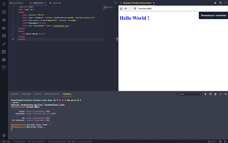
It’s all set. Now, we run the grunt to initiate the browserSync task that we’ve already set in the config.
grunt
Unlike the older version, the new BrowserSync will now setup everything for use including the static server and provides the URLs where it lives to reload our site.

And you can see from the following animated GIF, all updates, changes, and interactions are synced in real time in the browser as change the index.html and style.css.

Further Resources
Here are more resources to dig further into Grunt and “Synchronized Testing”.
- Meet Grunt: The Build Tool for JavaScript — Code+
- Synchronized Cross-device Mobile Testing — HTML5 Rocks