Optimize Your jQuery UI Accordion with Custom Themes
In this tutorial, we’ll walk you through the process of creating a custom theme for the jQuery UI Accordion. We’ll leverage various CSS techniques, including structural selectors, box-sizing, and CSS3 gradients, to enhance your CSS skills.
By the end of this guide, you’ll have a functional and visually appealing accordion element on your website.
Keeping Your CSS3 Code Markup Slim
Web developers can save a lot of time using more sophisticated CSS3 syntax. Users who visit your page... Read more
Understanding HTML Markup for the Accordion
To kick things off, let’s start by creating a div element with the id accordion. This div will serve as the container for all the content within our accordion.
  <div id="accordion">
  </div>
For demonstration purposes, we’ll populate the accordion with five sections focused on web-related topics like HTML5, CSS3, Sass, Dreamweaver, and jQuery. Feel free to replace these with any content you’d like, just make sure to adjust the markup accordingly. Below is the markup for these five topics:
  <h4><a href="#">HTML5</a></h4>
  <div>
    <p>
      <strong>HTML5</strong> is a markup language used for structuring web content. It's the fifth version of HTML and is still under development as of July 2012.
    </p>
  </div>
  <h4><a href="#">CSS3</a></h4>
  <div>
    <p>
      Unlike CSS2, CSS3 is modular, allowing for easier updates and backward compatibility. <em><strong>Source:</strong> <a href="http://en.wikipedia.org/wiki/Css">Wikipedia</a></em>
    </p>
  </div>
  <h4><a href="#">Sass</a></h4>
  <div>
    <p>
      <strong>Sass</strong> extends CSS3 by adding features like nested rules and variables, making CSS more enjoyable to write.
    </p>
  </div>
  <h4><a href="#">Dreamweaver</a></h4>
  <div>
    <p>
      <strong>Adobe Dreamweaver</strong> is a web development tool originally created by Macromedia and now developed by Adobe Systems.
    </p>
  </div>
  <h4><a href="#">jQuery</a></h4>
  <div>
    <p>
      <strong>jQuery</strong> is a widely-used JavaScript library that simplifies client-side scripting. It was first released in January 2006.
    </p>
  </div>
Each section is made up of an h4 element, which serves as the header, and a div element that contains the content. These are all nested within the accordion div we created earlier.
At this stage, we’re only focusing on the HTML markup. The accordion won’t be functional until we add the necessary JavaScript and CSS.
Setting Up the jQuery UI Accordion
To build our accordion, we’ll be using the jQuery UI library. First, make sure to include both the jQuery and jQuery UI libraries in the head tag of your HTML file. You can link these files directly from the CDN as shown below:
  <script type="text/javascript" src="https://ajax.googleapis.com/ajax/libs/jquery/1.7.2/jquery.min.js"></script>
  <script type="text/javascript" src="https://ajax.googleapis.com/ajax/libs/jqueryui/1.8.21/jquery-ui.min.js"></script>
After including the libraries, add the following script to initialize the accordion:
  $(function() {
    $("#accordion").accordion();
  });
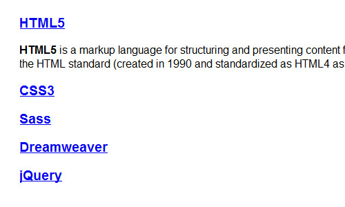
At this point, your accordion should be functional. Clicking on a section header will expand its content, and clicking on another header will collapse the previously expanded section.
While the accordion is working, it still lacks visual appeal. Let’s move on to styling it.
Implementing Basic Styles
To start, we’ll use Normalize.css to reset default element styles and ensure cross-browser consistency. Next, we’ll set a background color in the html tag and remove the default underline from links, as well as the outline when they are active or in focus.
  html {
    height: 100%;
    background: #e3e3e0;
  }
  a {
    text-decoration: none;
  }
  :focus, :active {
    outline: 0;
  }
Further Reading: Understanding CSS Priority Levels
Additionally, we’ll apply the border-box model for box-sizing across all elements, as shown below:
  * {
    -moz-box-sizing: border-box;
    -webkit-box-sizing: border-box;
    box-sizing: border-box;
  }
Further Reading: Understanding CSS Box-sizing
Customizing the Accordion’s Appearance
Let’s begin by styling the accordion sections. First, we’ll set the width of the accordion’s div container to 300px and center it on the page.
  #accordion {
    width: 300px;
    margin: 50px auto;
  }
Next, we’ll style the accordion’s content with a light gray background and dark gray text. We’ll also set the font size to 10pt.
  #accordion .ui-accordion-content {
    width: 100%;
    background-color: #f3f3f3;
    color: #777;
    font-size: 10pt;
    line-height: 16pt;
  }
By default, the content is wrapped in a paragraph tag, which has top and bottom margins. We’ll remove these margins and replace them with 20px of padding.
  #accordion .ui-accordion-content > * {
    margin: 0;
    padding: 20px;
  }
If the content includes links, we’ll set their color to dark gray (#777.
  #accordion .ui-accordion-content a {
    color: #777;
  }
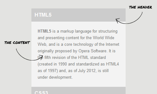
Moving on, let’s style the accordion headers. These are h3 tags that also have default top and bottom margins, which we’ll remove.
  #accordion .ui-accordion-header {
    background-color: #ccc;
    margin: 0px;
  }
We’ll also style the anchor tags within the headers. The text will be white, indented by 10px, and the font size will be reduced to 12pt.
  #accordion .ui-accordion-header a {
    color: #fff;
    line-height: 42px;
    display: block;
    font-size: 12pt;
    width: 100%;
    text-indent: 10px;
  }
Lastly, we’ll give each header a unique color using structural selectors. For the first header, we’ll use the :first-of-type pseudo-class.
  #accordion .ui-accordion-header:first-of-type {
    background-color: #fa9300;
    background-image: linear-gradient(to bottom, #fa9300 0%, #dc621e 100%);
  }
How to Select Headers 2 to 4 Using the :nth-of-type(n) Selector
If you want to select the second to the fourth headers in your HTML document, you can use the :nth-of-type(n) selector. Here’s how:
  /* For the second header */
  #accordion .ui-accordion-header:nth-of-type(2) {
    background-color: #389abe;
    background-image: linear-gradient(to bottom, #389abe 0%, #2a7b99 100%);
    /* Additional browser-specific gradients removed for readability */
  }

  /* For the third header */
  #accordion .ui-accordion-header:nth-of-type(3) {
    background-color: #f87aa0;
    background-image: linear-gradient(to bottom, #f87aa0 0%, #c86585 100%);
    /* Additional browser-specific gradients removed for readability */
  }

  /* For the fourth header */
  #accordion .ui-accordion-header:nth-of-type(4) {
    background-color: #a8b700;
    background-image: linear-gradient(to bottom, #a8b700 0%, #82922a 100%);
    /* Additional browser-specific gradients removed for readability */
  }
Selecting the Last Header Using the :last-of-type Selector
If you want to select the last header, or in this case, the fifth header, you can use the :last-of-type selector. Here’s how to do it:
  /* For the last header */
  #accordion .ui-accordion-header:last-of-type {
    background-color: #b3bec4;
    background-image: linear-gradient(to bottom, #b3bec4 0%, #95a0a4 100%);
    /* Additional browser-specific gradients removed for readability */
  }
Now that we’ve applied the styles, let’s take a moment to examine the results.
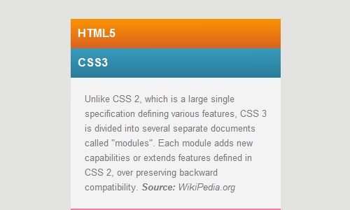
It’s starting to look good! However, if you’re still confused about how structural selectors work, we recommend reading our previous post, CSS3 First-of-type, for a more detailed explanation.
Final Touches to the Accordion
Let’s add some finishing touches to our accordion. Even a single pixel can make a significant difference in the final appearance.
  /* Adding borders and text shadow to accordion header */
  #accordion .ui-accordion-header a {
    text-shadow: 1px 1px 0px rgba(0,0,0,0.2);
    border: 1px solid rgba(0, 0, 0, .2);
    border-top: 1px solid rgba(250, 250, 250, .2);
  }
In the code snippet above, we added borders on all sides using the rgba color mode. The borders are essentially black, but we’ve reduced the intensity to 20%, making them semi-transparent and creating a darker version of the background.
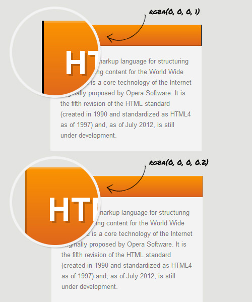
We applied the same logic to the border-top, but used white instead of black to create a highlighting effect.
If you look closely, you’ll notice that the top border doesn’t seem quite right. To address this, we’ll use a trick to mimic the appearance of a top border.
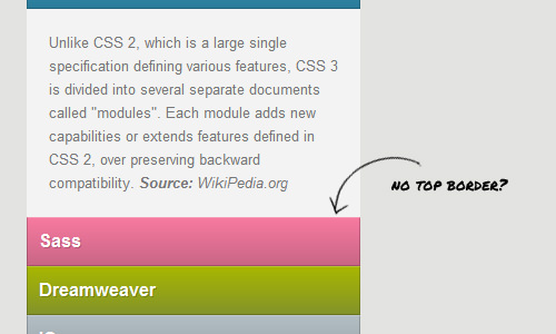
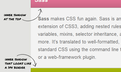
We’ll add an inner shadow with a negative vertical length. However, we don’t need this shadow for the last section, so we’ll remove it. Additionally, we’ll add another inner shadow at the top to create the illusion of a header shadow.
  /* Adding inner shadows to accordion content */
  #accordion .ui-accordion-content {
    box-shadow: inset 0px -1px 0px 0px rgba(0, 0, 0, .4),
    inset 0px 1px 1px 0px rgba(0, 0, 0, .2);
  }

  /* Removing inner shadow for the last section */
  #accordion .ui-accordion-content:last-of-type {
    box-shadow: inset 0px 1px 1px 0px rgba(0, 0, 0, .2);
  }
Supporting Internet Explorer
Let’s not forget about Internet Explorer. Unfortunately, the :nth-of-type selector isn’t supported in versions IE6 to IE8. For better compatibility, you can use Mootools and Selectivizr.js.
Insert the following lines of code before your jQuery and jQuery UI scripts:
  <script type="text/javascript" src="js/mootools.js"></script>
  <script type="text/javascript" src="js/selectivizr.js"></script>
You can now check out the live demo and download the source code for our accordion using the links below:
Concluding Thoughts
We’ve covered all the steps in this tutorial. New selectors like :nth-of-type and properties like box-sizing in CSS3 offer numerous advantages and solve many challenges in web design.
For instance, we used the :nth-of-type selector to target each accordion header without needing extra classes. We also utilized box-sizing to eliminate the need for calculating element widths. Additionally, by using CSS3 gradients for the headers, we reduced the number of HTTP requests.
Thank you for reading this tutorial. I hope you found it informative and enjoyable.