Understanding Flexbox: A Modern Approach to UI Design
In a previous post about CSS3 Box-sizing, we discussed that HTML elements are essentially “boxes”. Traditionally, when positioning these boxes to the right or left, the float property was used.
.main {
  float: left;
}
.sidebar {
  float: right;
}
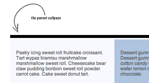
However, a major downside of this technique is that the direct parent element of .main and .sidebar will collapse, as shown below.

To counter this effect, CSS clearfix is often applied to the parent element.
Introduction to the Flexible Box Module
As this issue became common in web design, the W3C introduced a new module called Flexible Box, or simply Flexbox. However, this module is still in the draft stage and has undergone several changes over the years.
As of the time of writing, this module is fully supported in modern browsers like Chrome and Opera, according to CanIUse.com. Now, let’s explore how this module works.
To demonstrate the Flexbox feature, let’s start with the HTML structure. We’ll use a div container that holds two other div elements, like so:
<div class="cf">
  <div class="col left">
    <p>Pastry icing sweet roll fruitcake croissant. Tart wypas tiramisu marshmallow
    marshmallow sweet roll. Cheesecake bear claw pudding bonbon sweet roll powder carrot cake.
    Cake sweet donut tart.</p>
  </div>
  <div class="col right">
    <p>Dessert gummies sweet roll. Dessert gummi bears soufflé cotton candy icing.
    Lollipop wafer lemon drops toffee chocolate.</p>
  </div>
</div>
In this example, the left column represents the main content section, while the right column is the sidebar. Notice that the left column contains more content than the right column.
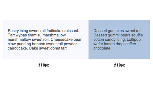
Traditionally, we would position these columns using floats in the stylesheet. We would float the columns, specify the appropriate width, and include a CSS clearfix, as shown below:
.cf:before,
.cf:after {
  content: "";
  display: table;
}
.cf:after {
  clear: both;
}
.cf {
  *zoom: 1;
}
.old .col {
  float: left;
}
.old .left {
  width: 310px;
}
.old .right {
  width: 210px;
}
This is what the result typically looks like:

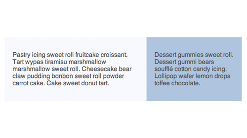
With the Flexbox module, the process becomes much simpler. You only need to set the parent’s display property to flex:
.flex {
  display: -webkit-flex;
  display: flex;
}
Interestingly, Flexbox automatically determines the appropriate width for the child div elements without needing explicit width settings in the stylesheet. Here’s how it looks:

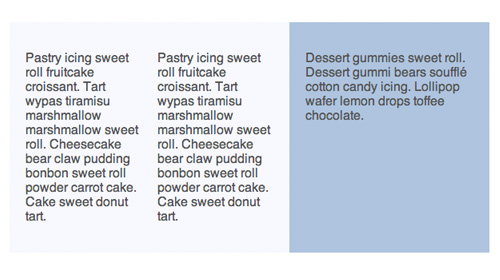
You can also apply Flexbox to child elements. For example, applying Flexbox to the left column will divide the content inside it into flex items:

Understanding Flexbox Syntax
There are several syntax variations within the Flexible Box module, which have evolved over the years. For instance, in 2009, the specification used display: box, which later changed to display: flexbox in 2011. Therefore, it’s advisable to wait until this module is finalized before implementing it widely on websites.