UX vs. UI – Which Should You Focus?
Web design can get complicated, especially when it’s difficult to know where to put your focus. As a designer, having a concrete goal to work towards is vital. Reaching that goal is how we measure our success.
But when the question revolves around our main focus for a page or a site overall, answering that question is what enables us to set our goal. Web designers, old and new, beginners and skilled, face the issue of whether to put their main focus on the user interface (UI) or the user experience (UX).
To figure out what deserves our primary attention, it’s important to understand the difference between the two, as well as how they influence each other.
Why Experience Design is The Next Big Thing
A scary article about the death of web design swept through the internet this summer making the web... Read more
Comparing UX And UI In Web Design
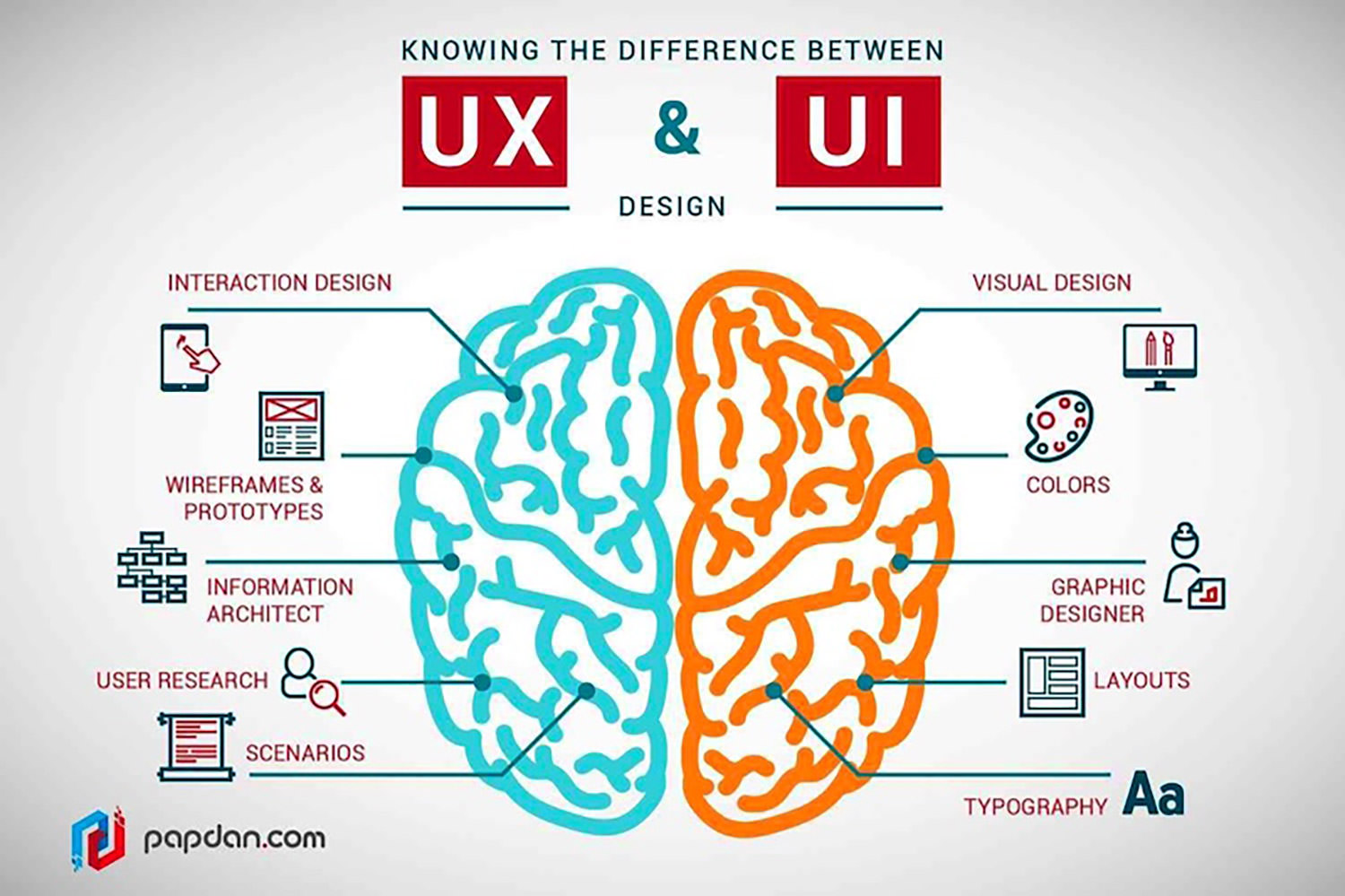
UX and UI have many things in common. The first and most important thing is that both of these aspects are critical to good web design. In very basic terms, UI centers on the visual aspects of web design and how a user interacts with the site.

Traditional user interface elements include the following:
- Menu
- Navigation
- Clickable links
- Scroll bars
- Check boxes
- Lead generating forms
- Breadcrumbs
- Buttons
- Image carousels and sliders
- Filters
- Search bars
- Comment boxes
- Loaders
- Modals
- Notifications
There are plenty more, but these are some of the most common elements that make up UI. On the other hand, the user experience is a more whole-cloth approach to web design, and draws on different layers to promote a good experience overall. Some elements that go into good UX include:
- Aesthetic appeal of the site as a whole and individual elements
- Font, color, and graphic choice
- Sizing, spacing, and use of negative space in the layout
- How easy the site is to use, and how enjoyable it is, too
- Ease of ability to find the necessary information/complete the necessary action
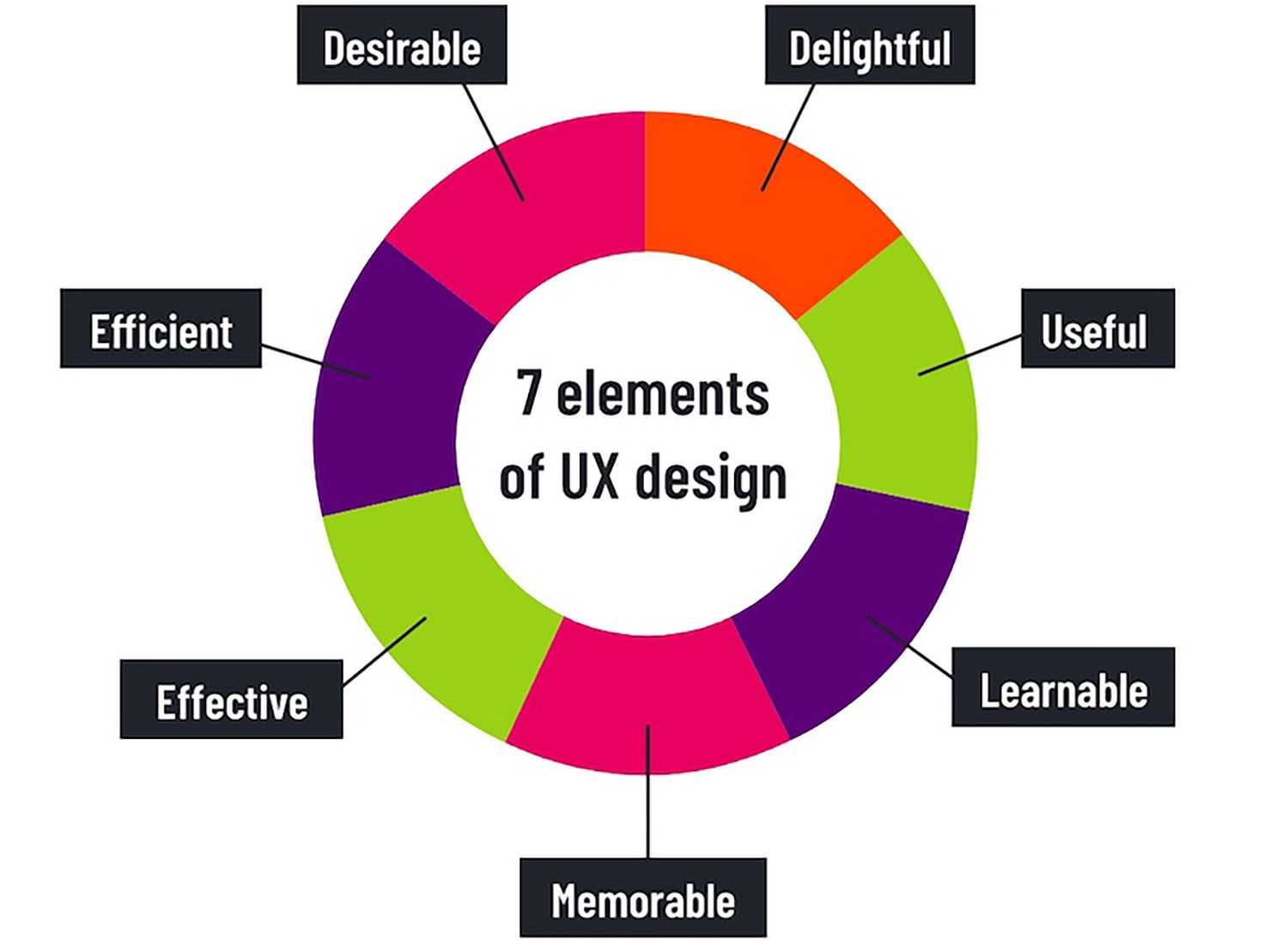
On the whole, great UX looks at more emotion-based reactions. Author Steve Krug lists the elements of good UX as including:

Form and function both require consideration for both UI and UX. With desirability and delightfulness listed as vital components along with usefulness and efficiency, it’s obvious that UX needs both aesthetic appeal and workability. And a user interface that is ugly or ungainly isn’t as enticing to interact with as one that is visually appealing.
So visual choices such as fonts, graphics, and colors, are all impacted by both UX and UI. In fact, the choices we make on a visual level, especially when it comes to colors, can heavily impact how the viewer feels about both the UX and UI, and that branding colors influence on emotions can turn a negative UX/UI experience into a positive one.

Comparing UI and UX in this way makes it clear that it’s about more than just which individual aspects of web design belong to which discipline. There’s definitely some overlap, but there is just as definitely a difference in focus.
And since focus is what helps us to set our design goals for each project we undertake, it’s a good idea to understand the goal of both UI and UX.
The Goal of Good UI
As mentioned, UI is about connections made with the website visitor, and allowing for an interchange between site and viewer. Basically, the main goal of good UI is to promote interactivity and user friendliness.
The skill set of a primarily UI-focused designer would center on areas such as information design, motion design, and integration with branding. UI designers will also have an understanding of how their work ties into the overall UX.
The Goal of Good UX
The goal of good user experience design covers a much broader range, with many more details and subheadings than UI. Combining usability with desirability, aesthetic appeal with function, and making it easy for new users as well as creating a draw for returning ones, great UX is built by focusing on what enhances the experience and creates value for the user.

Basically, good UX is determined by whether the user has a good experience — in short, UX is accurately named!
Describing The Difference
The overlap between UX and UI should be obvious by now. But it may still be difficult to explain exactly what the difference is between the two.
That could be because, at least to some designers, it isn’t a question of comparison but of contrast.
For example, Craig Morrision, the associate creative director at Truvani, says, "There is no difference between UX and UI design because they are two things that aren’t comparable to each other…the user experience is made up of a bunch of different components, user interface design being just one of them, that when combined together make up the user experience."
Ultimately, UI is a component of UX, and can heavily influence the larger goal.

How UI Influences UX
Just as important as understanding the goals of each of these individual pieces of web design is understanding how they influence each other.
It’s possible to have good UX without good UI — but it’s difficult, since bad UI often leads to a disappointing and frustrating user experience.
On the other hand, it’s also possible to have stellar UI design and still have a poor overall UX, because some other aspect of the web design has fallen short.
So, now that we’ve got the similarities and differences all cleared up, what about the main question: which one should a designer focus on?
Narrowing Design Focus
There’s a case made for the fact that UI and UX require different, if overlapping skill sets. But setting that aside, if you’re a web designer who is responsible for all aspects of the design, it’s important to know which one to focus on.
Or rather, which one to focus on first — and when — and to what degree. UI vs. UX may seem like a "chicken or egg" scenario: which one deserves attention first? But it’s more a case of working through design in a logical fashion, while still keeping an eye on the end game at all times.
Your UI design will influence your UX. So while designers work on the interface components of the website, UI requires their first attention — but as they complete components, the designs should be checked for usability, aesthetics, and all the other details mentioned above.
Keeping individual UI in line will contribute to a great overall user experience. It’s less a case of “chicken or the egg” and more a case of “one thing at a time.”