10 Things Travel Websites Can Teach You About UX Design
Has it ever crossed your mind that you can still grow professionally while you are planning your vacations? Popular travel websites, booking and checkout forms, trip planners and hotel timetables are all excellent sources to enhance your knowledge in the field of user experience design.
While selecting the best locations, hotels and scheduling your trip, it’s a good idea to pay attention to what works and what does not, what inspires you and what makes you immediately jump to another site. Your reactions, delights and aversions are all great hallmarks of the efficiency of the site’s user experience design.
In this article you can learn 10 lessons about user experience you can pick up from popular travel sites.
UX in a Nutshell and What User Experience Designers Do
The context of our online interactions has dramatically changed lately, and in the recent years we have encountered... Read more
The Difference Between UI and UX
UX is not UI, it’s like an unwritten law. When you read about a website’s usability, you need to think about its user interface (UI). User Interface is a set of various visual elements such as menus, buttons and icons that your visitors use (click on, hover on, tap on) when they interact with your website.
Usability is a quality that describes User Interface (UI). Usability shows the efficiency of the UI such as how easy it is to use a website (learnability), how fast users can achieve specified goals (efficiency), how easily they can recollect their memories about the way the site works (memorability), and how pleasant it is to use (user satisfaction).
Usability is one aspect of a more complicated notion called user experience (UX). User experience involves everything that affects the experience of the user – either negatively or positively. A good UX meets every need of prospective customers – good usability and many other things.
According to the user-experience research firm Nielsen-Norman Group:
“In order to achieve high-quality user experience … there must be a seamless merging of the services of multiple disciplines, including engineering, marketing, graphical and industrial design, and interface design.”

1. Give Users A Place to Start
First and foremost, you need to give your visitors a place from where they can start. It’s usually the home page that receives the most clicks, not just because it’s the main entrance to a site but when users come from a search engine, the next click will most likely be the home page.
Therefore you need to offer an engaging content and layout on the home page if you want to keep your visitors on your site.
Booking.com‘s home page proves that they understand their customers’ needs well. Just think about it. What do you want to do on a travel site? You either know where you want to go and want to look up the possibilities as fast as you can, or you are unsure about the location of your trip and need some inspiration.

Booking.com placed an overall search form on the left-hand side of its home page for those who are sure about their future trip. The visitors don’t have to waste their time browsing through irrelevant content. This leaves them with an increased determination and a boosted self-confidence.
The remaining space on the screen over the fold gives a lot of inspiration to the less determined: three big pictures of popular locations (Abu Dhabi, New York City, and Dubai) provide suggestions, an AJAX stream about the “Just Booked” trips shows what other users are currently up to, and there’s even a small section that ensures prospective customers about the free cancellation policy.
On Booking.com’s home page everybody gets the necessary incentive and positive feelings to move on on the site before even touching the scroll bar.
2. Make Your Navigation Obvious
If you want users to stay on your site you need to provide them with an obvious and easy-to-use navigation.
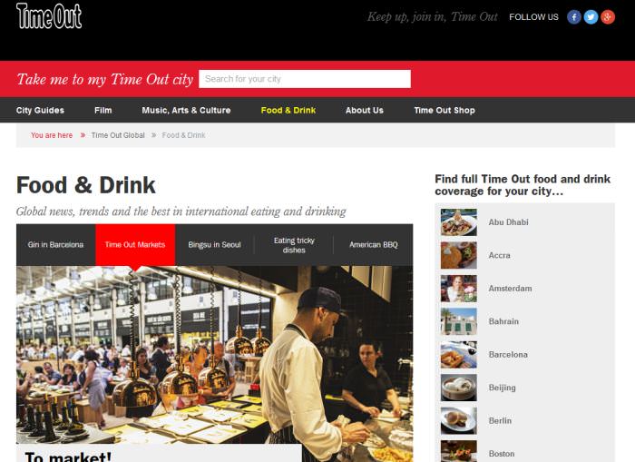
TimeOut.com‘s navigation is like a smart hostess: it gives visitors valuable help when they need it but doesn’t annoy them. If you take a look at the picture below, you can see that the navigation system has four different elements: a huge, easily recognizable search bar, a main menu with clearly defined items (City Guides; Film; Music, Arts & Culture; Food & Drink; About Us; Time Out Shop), a well-designed breadcrumbs bar, and a sidebar listing of the most popular cities.

TimeOut designed its navigation system in such an intuitive way that gives visitors further incentives to explore the site. The small thumbnail right next to every sidebar item gives a visual key, the short description under the Food & Drink headline ensures visitors that they are on the right spot, the breadcrumbs make it super-easy to move on, and the top search bar helps users jump to the next location if they are bored with the current one.
Each element supports the other ones – a clear sign of great UX design.
3. Use High Impact Imagery
The screenshot below is of one of TripAdvisor‘s restaurant profile pages. I’m sure that you already read that stock photos doesn’t make a good user experience: they usually bore visitors and don’t motivate them to move forward in the conversion funnel.

The alternative of stock photos is high-impact imagery that provokes strong emotions in the users. And we all know that increased emotions lead to higher customer loyalty.
Travel websites usually all use high quality pictures, but TripAdvisor takes it to the next level by encouraging users to add their own photos to each restaurant. This way TripAdvisor spices up its content with user-generated images that usually are more interesting for the average travel site visitor than photos taken by professionals.
Peer pressure is one of the strongest motivations after all. TripAdvisor also keeps its visual content fresh by adding high-impact photos shot by users.
4. Keep It Simple
Less is usually more so it’s always a good idea to keep things simple, and focus on only relevant information. The world is so full of distractions that your visitors will surely be grateful if you save them from the unnecessary fluff.
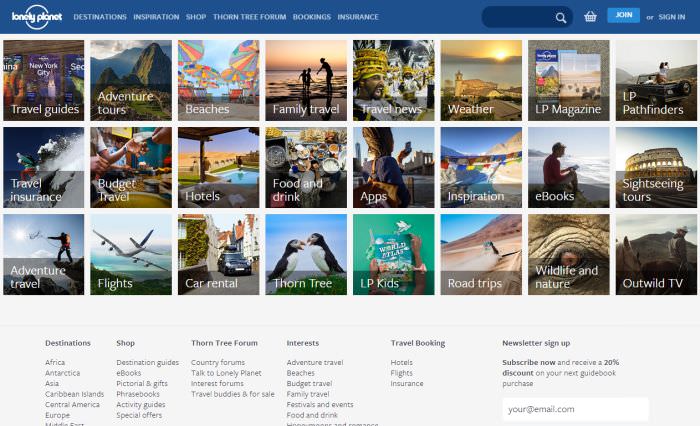
“Keep it simple” is the UX principle that Lonely Planet seemingly followed on its home page. The most important topics that intrigue their users are arranged in a tidy grid of attractive thumbnails supported by one-or two words long headlines.

LonelyPlanet’s home page is especially smart from the aspect of user experience as the thumbnails also serve as navigation while they give users an easily understandable visual key.
The grid is responsive thus it works on every viewport. On mobile and tablet size the thumbnails look like icons of mobile apps which is a familiar layout to all mobile users, and familiarity is also something that gives comfort to visitors therefore raising their engagement with the site.
5. Use Action Verbs
You are most likely familiar with action verbs from career sites. Action verbs don’t only engage recruiters scanning through resumes but also websites visitors browsing through the web.
The popular accommodation-sharing social network, AirBnB uses them everywhere on its site. Belong anywhere, Rent, List your space, Discover places, Explore the world, See where people are travelling, Share your experience, etc.

Action verbs are incredibly efficient because they move users from a passive state to an active one. Positive experiences always require activity on behalf of the user; that’s why adventure parks are so popular.
After all what do you remember more? Something you did by yourself or something you just read in a book? See? Interaction engages you too. So if you want to increase your site’s user experience, don’t hesitate to use action verbs where they are appropriate.
6. Streamline Your Forms
As too complicated forms often lead to an instant abandonment the smartest thing you can do for your users’ experience is to streamline the forms on your site as much as it’s possible. What do I mean under streamlining?
You can see an excellent example if you take a peek at Priceline.com‘s universal search form on their home page. Priceline’s search forms are hidden inside a handy horizontal tabbed navigation section.

The tabs contain five different search forms related to the five areas (Hotels, Flights, Cars, Vacation Packages, Cruises) the company is involved with.
The really cool thing here is that users don’t have to bother with stuff they are not interested in, they can jump right to the search form they need. Therefore they are not burdened with extra data fields, the form fields are kept to an absolute minimum, which means increased efficiency, reduced annoyance, and fast understanding – the best user experience ever.
7. Make Impact with Personal Stories
You can increase user engagement with the smart use of personal stories, like you’re actually experiencing it, on the home page of GoBackpacking.com.

The adventures of real people are always more interesting than over-refined marketing babble. Your visitors don’t want to read the same tiring cliches they can read on your competitor’s site – they can even generate the same low-impact blether by themselves after all.
Reviews, ratings, directed and moderated comments, statuses, blog posts, personal stories, recommendations, all add personality to your site therefore introducing high-quality information your visitors can emotionally connect to.
GoBackpacking populates its home page with personal stories of its users which makes visitors immediately immerse in the content of the site without even knowing it.
8. Include Related Products
Related, recommended and popular product widgets are used by all the big e-Commerce players, so it’s not a big surprise that travel sites also take leverage of them.
HotelTravel.Com solves the task in a very tricky and efficient way. Its recommendation engine takes the location the visitor looks for – in our case it’s Hong Kong – and shows some more hotel options recommended by other users. The related hotels are also the recommended ones, a 2-in-1 solution which is always a good idea.
The designers of HotelTravel.Com took one more step further and they placed the related products into a handy accordion that enables the user to group recommendations according to four different criteria (Best Value, Best Service, Best Room Standard, Best Location).

To make the widget visually interesting the rating, the price, a small thumbnail and a short quote from the latest review are also included to give the maximum help to visitors to decide which accommodation suits the best to their needs.
9. Talk About Benefits
Showing visitors the benefits they can gain on your site is always more user-friendly than pestering them with dry facts that makes them fall asleep.
On Booking.com‘s home page we can see a smart utilization of this UX design principle. On the right-hand side of the screen you can see the “Why Use Booking.com?” section which includes six benefits that are all in accordance with the values of the average traveler (low price, board range of choice, ease of use of the interface, populated reviewing system, quality customer service, and 24/7 availability).
Of course these values are drafted in a more engaging way and come with links where prospective customers can move on. The “Why Use Booking.com” widget is in fact the enhanced version of the regular “Features” section of an average small business website but it includes many supporting elements.

The colourful icons, the highlighted links, and the specific data (such as “701,118 properties worldwide”) all make the users believe that they are on a professional website they can trust. The showcase of popular locations from Sydney to Dublin on the left-hand side and the small widget of the third-party ReviewCentre all support the experience and build trust.
10. Provide Social Proof
When people talk about social proof they usually mean social media widgets like Facebook Likebox which is also a great element of well-designed UX, but TripAdvisor‘s home page provides a great example how other forms of social proof work.
The concept of social proof is based on a psychological principle that says people are more likely to do something if they see others around them do the same thing. External validation is a great motivation for most of us, so wise designers build social proof into their sites in a way that encourages visitors to repeat the behaviour of their fellow users.
On TripAdvisor the engaging social content is built into a handy tab navigation with three sections: Hotel Reviews, Photos made by users and Forums. The title of the widget is “What travellers are talking about” which is less pushy than the average subtitle on commercial sites; it therefore catches the visitor’s eye at once.

The Hotel Reviews section is designed in a smart way that makes the content easy to digest: a small profile photo and the ranking of the reviewing user, the name of the reviewed hotel, a short citation from the review itself, and a rating icon that well suits to the general design of the site.
Free UI Kits For Designers, Vol. 1
Looking for more UI kits to expand your web designer's library of awesomeness? Well, you came to the... Read more