Small Business Web Design for Service Industries: A Guide
Small businesses are the engines of local economies, all of them with their own unique client base and goals. Designing websites for them requires specific strategies.
These days most small businesses operate in service industries, or with other words in the tertiary sector of the economy, such as restaurants, plumbers, beauty therapists, lawyers, and others — they also make up the majority of clients for freelance web desiners.
In this post, I’d like to share some tips that can help you design high-converting service industry websites. There’s no such thing as the perfect website but there are trends you can adopt to make a design much more targeted to a particular audience.
Read Also: Boost Your Small Business with Visual Content
Highlight contact details
I mention the contact info first, because for most service businesses this is the most important feature. Whether the site is for a lawyer, accountant, plumber, taxidermist, or astrologer, the shared goal for all of them is to drive more business.
Some visitors may use a website to learn about a company and what type of services they offer, but other visitors may want to find a quick way to get in touch and set up an appointment.
You need to place contact details in an easy-to-recognize position without dominating screen.
Example 1: Hansen Heating & Air
Take for example the Hansen HVAC website that uses colorful banners and graphics to grab your attention.
In the top-right corner you’ll notice two banners that sit adjacent to each other. The first banner offers a telephone number, while the second banner links to a contact page.
Both are viable options to get in touch and schedule an appointment, but some customers may prefer e-mail over telephone (and vice-versa). Offering both leaves the choice up to the visitor which ultimately puts the power in their hands.

Example 2: Reginelli’s Pizza
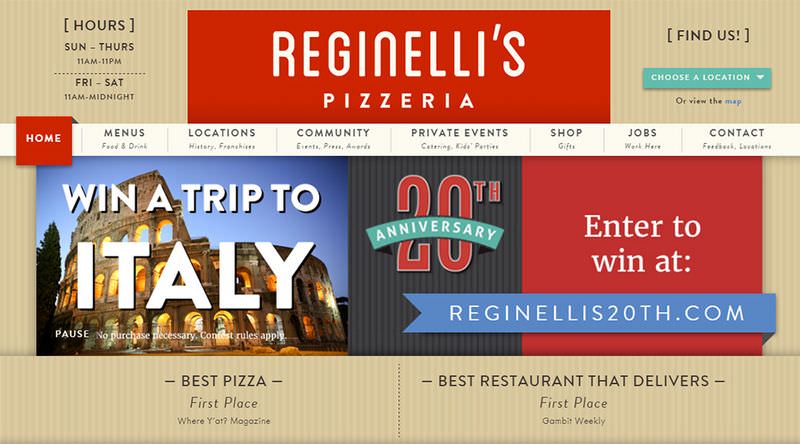
Visitors get even more info in the header of Reginelli’s Pizza website. The logo sits firmly in the center with two primary sections for contact info. The left side features hours of operation, and the right side offers a quick store locator.

Once you select the location, you’re given a live map view of that branch location plus the store’s telephone number.

Always consider the user experience when you design something like this. Contact details should be the first one on your list of priorities, and always be located above the fold.
How much information you give, depends on your industry. For example, if a plumbing business doesn’t have a main office then the postal address may not be as valuable.
In many ways this boils down to common sense. Place yourself in the shoes of your visitors who just know a company name and only want to find answers to their questions. These details should be prominent, and even the easiest items to find on the page.
Feature your services
There will always be visitors who aren’t exactly sure what your company does. For a large pizza restaurant this may not be a problem. But compare this to an HVAC company or an SAP data specialist, and now you’ve got visitors who probably have questions.
Text is always good, and detail is always valuable. But at first glance you may need to offer visuals in lieu of lengthy paragraphs.
Try to use photos, icons, and customer testimonials to sell the service quickly. This content will never replace a detailed breakdown of the service, but it can encourage new visitors to dig a bit deeper into the website.
Example 1: Joe’s Crab Shack
Take a look at the home page for Joe’s Crab Shack. It uses a fullscreen photo of sample platters to encourage browsing, and help sell the restaurant. The maxim "show, don’t tell" applies here. When designing a service business website, I would always encourage showing visitors what you do before telling them.
Photos are the best means of visual communication because they’re real and immediate. And they don’t always have to show off the products to be effective.

Example 2: Massage Therapy Center
The Massage Therapy Center uses a photo of a client along with the exterior of the building. These two photos work well together because they help sell two different ideas:
- What this company does
- Where it’s located / what it looks like

People want to see "real world" photos so they know the company is legit, and what to look for if they show up to the office location in person.
There’s plenty of good reason for designers to learn photography, but even if you’re not a pro you can still decorate a business page with photos from a smartphone. And there’s no shortage of free stock photo resources online either. I’d encourage all designers to give high priority to visuals in their business projects.
Read Also: 40+ Websites to Download Royalty-Free Images
Powerful branding
People often remember small businesses by their name. Recommendations and local Google searches often turn up the same names. Building a brand around these names will help sell people on the services and on the people behind the business.
Recommended Reading: Why Proper Brand Design is Important
Example 1: Williams Mechanical
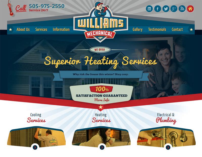
Williams Mechanical has some incredible branding for such a generic name. While the name itself may not be memorable on first glance, it can grow on you thanks to the smart vector icon and the stunning typography.
The website uses big broad colors and text effects to draw your attention to the logo. It stands out because it’s meant to stand out. And this is crucial for service businesses.

If customers remember the name “Williams Mechanical”, they’ll be more likely to search for them in the future, and they’ll be more likely to recommend them to friends.
Also the blue, yellow, and red colors set up a clear color theme that relies on ribbons and faux perspective throughout the layout. Angular shapes break up the content so that the layout flows nicely down the page.
2. Brown’s Court Bakery
For a much simpler example, check out the website of Brown’s Court Bakery. This layout uses grunge lettering and minimalist design patterns to keep visitors focused on the content.
Typography plays a much larger role here where the only prominent visuals are the page photos. Everything else falls in line with unique font styles and clever use of whitespace. But this minimalist design is part of the overall branding for the bakery.

Play to the strengths of the business, and be willing to adapt your design strategy based on existing branding if needed.
Action-based navigation links
Create a navigation menu that targets the needs & wants of a typical visitor. These links could relate to specific services offered or more information about the company & its location. The goal is to consider what clients want to learn, and to present links with labels that make sense.
Example 1: Benold’s Jewelers
Benold’s Jewelers is a local jewelry shop offering bridal jewels, fashion items, and repairs. Their navigation menu clearly defines these sections along with other common areas like the pricing page.

Consider what each visitor might be looking for, and tally up the most common ideas. Your goal should be to offer the best solutions for each customer based on their individual needs.
Example 2: The Great Divide Campground
By splitting content into more generic topics, the user has an easier time sorting through what they want to find (and how to find it).
These are all very strong actionable links based on what readers need to learn. There’s no ambiguity, and most visitors should be able to answer their own questions based on these navigation links.

And that’s really the goal of any website: to provide information to questions. Service businesses need to answer questions clearly because that information isn’t likely to be anywhere else on the Internet. This is why a strong, clearly-labeled navigation is a must.
Wrapping up
These tips should get you on the right track to building high-quality service business websites. It’s never been more imperative for local businesses to launch their own websites, and the Internet is only growing in popularity.
Whether you’re designing a site for your own business or working with small business clients, these tips can be applied to all industries to encourage growth & online client acquisition.