20 Beautiful Wedding Invitation Website Designs
Marriage, for many, still is one of the most important events of their lives. So it is not surprising that many couples will put a lot of time, effort, and creativity into the wedding plans, as well as how to invite their friends to the wedding.
We have previously featured traditional printed wedding cards as well as incredibly creative wedding invites, and if you love those compilations, then you might like this one too. In this showcase we’ve put together the sweetest, most romantic and best wedding website designs you can find.
Each site carries the couple’s love story, their photos, wedding proposal, the wedding venue and time, their gift list and RSVP. What is different is how they are designed, sometimes by professionals, sometimes with the bride and/or groom’s personal touch. Scroll down and enjoy the showcase. For better engagement, visit the sites to take in the full inspiration experience.
Pittman: Courtney & Brendan
This site tells all about the couple, the proposal, and the wedding itself. I like the idea of the interactive photos in the beginning, which change as you mouse over them.

Knot: Ross & Jess
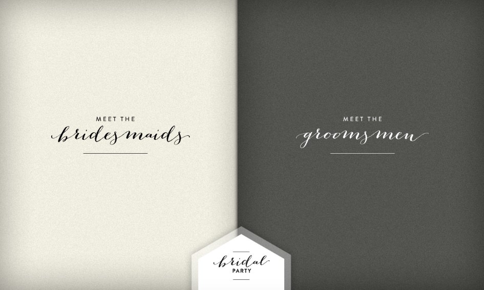
This site makes great use of beautiful textures and fonts. Click on each label to see the infographic stories of how the couple met, the wedding party, the registry, and also more pictures, of course.


Grayden and Jenny
The header of this wedding site is actually an invitation to the wedding. The story of their love is told really creatively here: first you’ll get to know how they lived before they met, and then when their paths intertwined.


Karl and Gina
This website is designed as a funny, whimsical retelling of their wedding. The cartoon elements are hard to miss too. It includes information about traveling, the registry, and the wedding itself.

Gopal and Seema
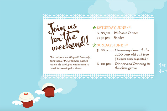
This simple site is just an invitation to the wedding with details of when and where the big day is going to be. Social buttons allow visitors to follow the bride and groom on social networks.

Tori and Sean
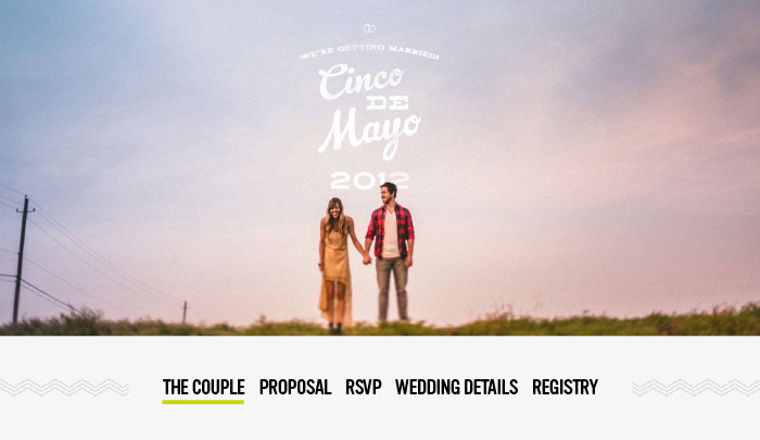
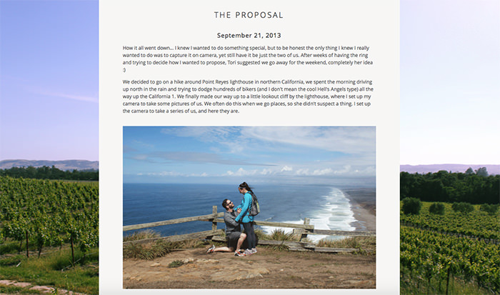
Here’s how Tori and Sean met and how they wed. All the nitty-gritty details are organized neatly and kept up top. The big photographic background looks fantastic, and the couple even mentions who their bridesmaids and groomsmen are.

Simon met Lucy
This site uses a great color combination of grey and pink. The interactive logo that moves and a counter that shows how much time has left for the big day makes the site an eye-catching affair.


Joy and Tom
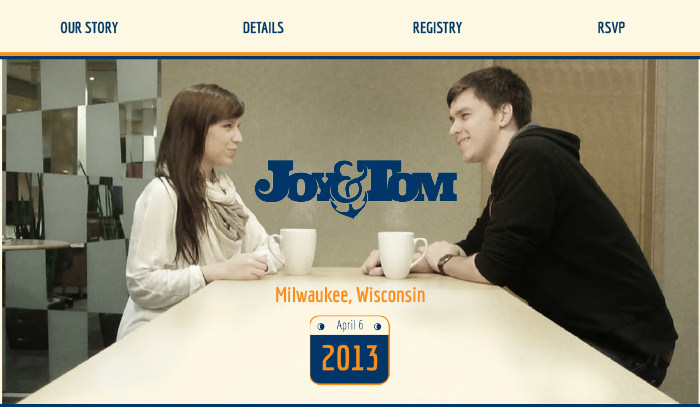
Joy and Tom decided to use a beautiful cinemagraph on their wedding site. By scrolling down, you’ll get the gist of their journey (the guy gets out of the friend zone in this one) through some fun storytelling.

Spencer and Harper
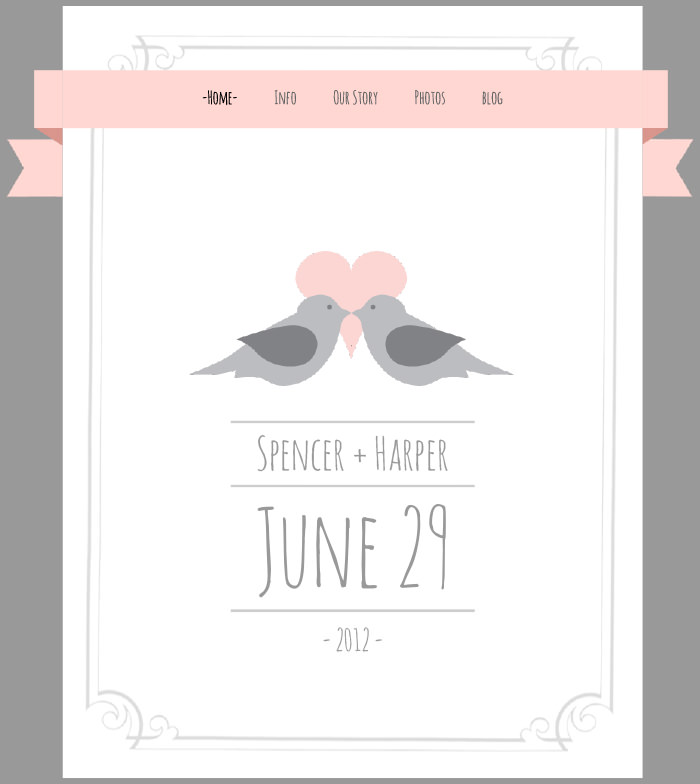
This simple and elegant wedding website looks like a postcard – with two cute doves, which are very much in love like the newlyweds.
Jess and Russ
A unique site designed in dark colors, beautiful illustrations, and parallax scrolling to tell you Jess and Russ’s love story.


Kelly and Eric
This wedding site is quite simple: a photography background showing the couple, a simple menu on the top, and a counter. The shot of the two lovebirds stays no matter which other page you load.


Cecilia and Jonathan
This wedding site is made by the same principle as the previous one, showing the couple fullscreen. However, this one comes with a beautiful tune by Sam Smith. Feel the love.


Judie and Z
Single page Judie and Z’s classy website was designed by the talented bride. It’s a mix of fonts overlaid on high-quality, romantic images. This site has since been nominated for many awards.

Katie and Luke
Katie and Luke’s site looks quite simple, using flat designs and a perfect choice of colors. In their “Out Story” section, visitors can mouse over the hearts on the timeline to find bits and pieces of their love story.


Ashley and Jeremy
This site has a nice romantic feel, much like a wedding album, thanks to beautiful fonts, photos, and the light, airy background. The proposal gets a timeline design that is apt for storytelling.


Tyler and Tayler
I love how this site looks. You can follow through with how the couple met and see their love story and wedding pictures, along with a real-time Instagram feed.


Casper and Danél
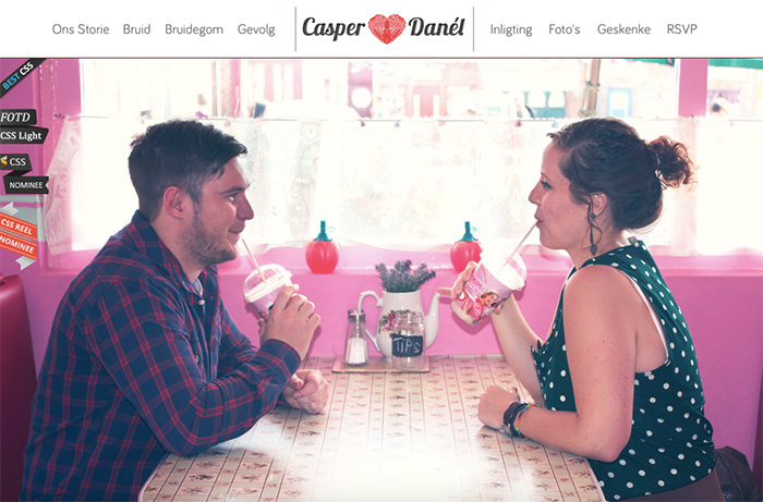
The story of Casper and Danel love is shown as a creative timeline and full of pictures of the bride and groom. This site has been nominated for many awards.

Helen and Josh
This site is my favorite wedding invitation in this whole showcase. I won’t spoil it for you; just go to the site and scroll up until you reach the canopy.
Mariene and Vincent
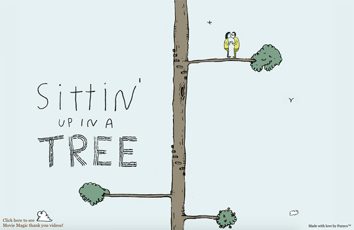
This funny site is made in blue night colors, and it exudes the personality of the bride and groom. Catch the dance showdown between the bridesmaids and groomsmen. It’s also a multi-award nominee.


Artem and Julia
This site was designed by the bride and developed by the groom. It’s available in two languages: Russian and English. Scrolling down, you will move along with a cartoon couple in a balloon. Follow the story of their love.

