Experience YouTube’s Awesome New Material Design Update
Google has been hard at work rolling out a new Material Design based look for all of its apps and services. Now, after undergoing months of alpha and beta testing, the Material Design update is hitting YouTube as well, and Google is giving everyone the ability to preview the changes.
To access to YouTube’s Material Design preview, all you need to do is visit this website and click on the Go To YouTube button. Once done, your YouTube will automatically be defaulted to the Material Design look.
Read Also: How to Enable “Material Design” in Google Chrome

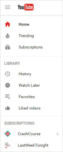
The first thing you’ll notice about the Material Design-based YouTube is the cleaner looking sidebar, which now sports icons that are more in line with Android’s design style.
On top of that, this Material Design-based YouTube is built on Google’s own Polymer framework. According to Google, this framework allows it to develop new features for the video streaming site at a faster pace.

Finally, the Material Design-based YouTube brings with it Dark Theme. As the name implies, Dark Theme is a setting found under your profile that lets you toggle the colour of YouTube’s background between black or white.

This allows you to browse YouTube at low light locations for an extended period of time without straining your eyes.

If YouTube’s new look and feel is unappealing to you, you can choose to go back to the old YouTube style simply by selecting the"Restore classic YouTube"option found in your profile menu.

Read Also: 10 Beautifully Designed YouTube Channels